Tuesday, 21 May 2019

‘The Experts’ by Sophie Franz.


‘The Experts’

Created by Sophie Franz.

Published by Retrofit Comics.

Full Colour - 28 pages £1.99 (digital copy) $5.00 (physical copy).


The Story - ‘The Experts is a foreboding story of 3 "experts" on an isolated station, investigating the strange water creatures that live in the area, even as the investigators lose touch with their superiors and even what exactly they are doing at the base.’

‘Before the fog rolled in.’

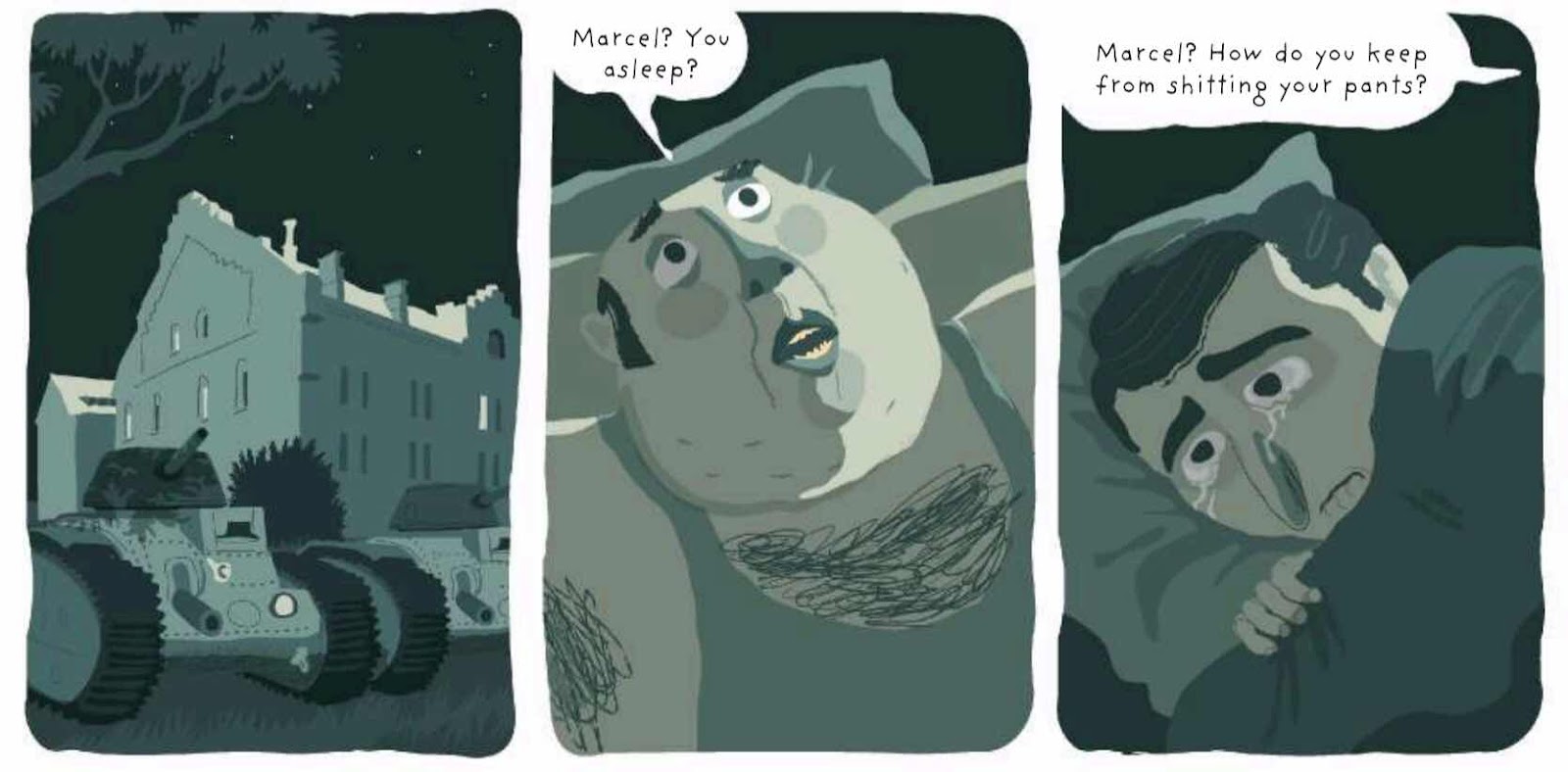
The Review - This is some crazy fucked up shit! What kind of cheese had Sophie Franz been eating before bedtime to produce this unnerving and disturbing story.

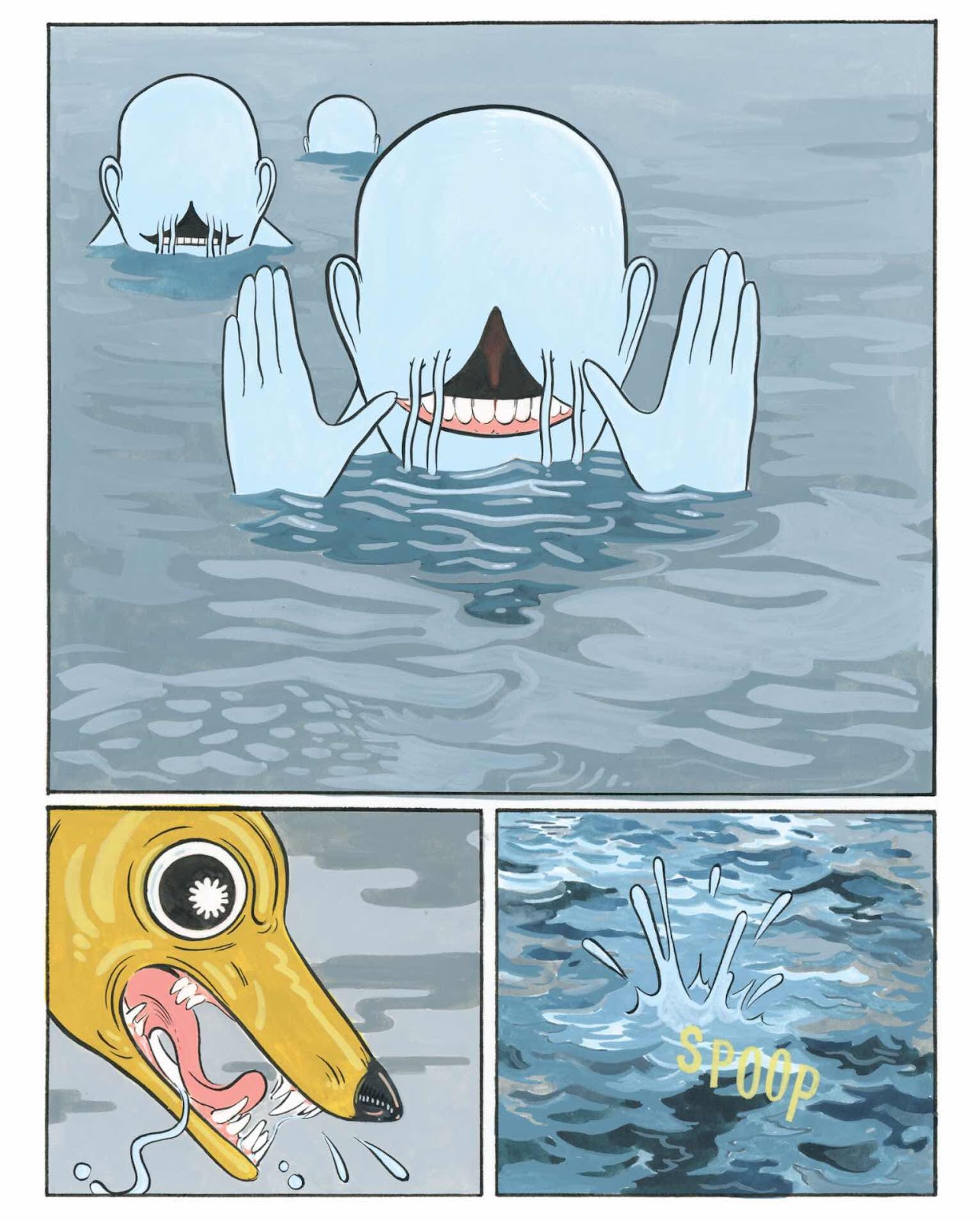
Some of the moments in this short comic are straight out of an anxiety dream that I could now have CAUSED BY YOU RETROFIT COMICS!

Some examples;

Pens that don’t seem to have any ink and leave no mark on paper.

Fingers being bitten off by strange mutant fish.

Amphibious grinning humanoids who watch you from the ocean.

Trusting dogs to get in a rowing boat and go do the weekly shopping.

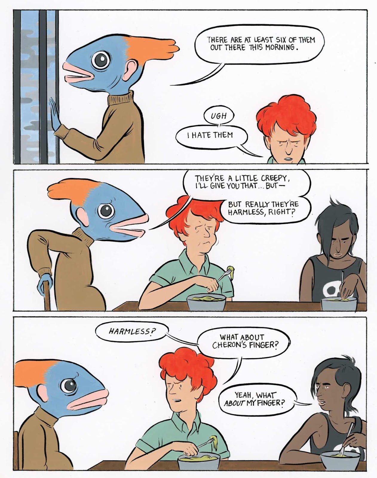
My head has turned into a fish!

Why, oh why!


What kind of makes it all too real is the clean line and straightforward art style that Sophie employs on this book. Nothing takes place at night or in the shadows. All that weird stuff is full and in your face.

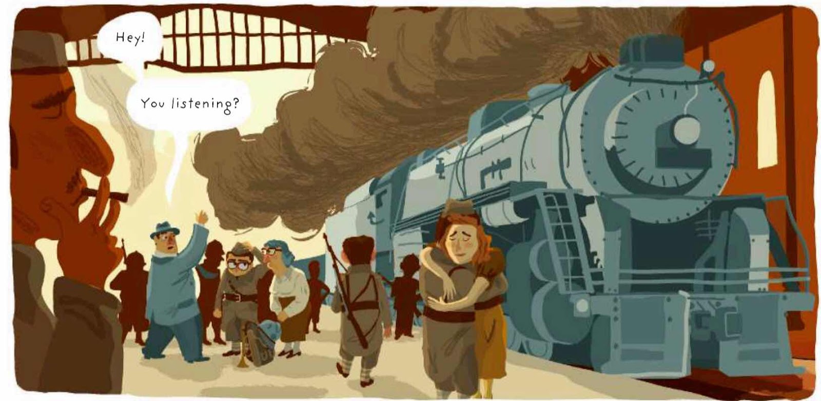
This book also speaks to how loneliness can cause you to lose your mind. This so-called scientific team are unable now to know what is reality as they float helplessly in the middle of the sea surrounded by strangeness and with mostly Baby Food to eat.

‘I’ve either lost something or I’m lost.’

This was a sinister and possibly prophetic read. I really enjoyed that stories like this take chances and for the most part pull off that mood and tone. I think what had put me off reading this initially, a fact I now regret and wish I’d jumped in earlier, was the slightly under-rendered cover. It seems neither iconic and mondo nor detailed and scary. A small matter nonetheless.

Highly recommended.


I’ve had this for a while to review and keep meaning to get round to looking at it. I may have made the mistake of reading it whilst on a bout of jet lag induced insomnia sitting in a hotel lounge at 2am.

I am also currently very eerily near the sea. I’ll be back in a minute...........


Whilst you are waiting for me to return to my towel and clothes why not pop over to https://retrofit.storenvy.com/collections/936408-retrofit-comics-print/?page=2 and buy yourself a copy.

It’s also available on ComiXology here https://www.comixology.co.uk/The-Experts/digital-comic/381925?ref=c2VyaWVzL3ZpZXcvdGFibGV0L2dyaWRMaXN0L09uZVNob3Rz

You can follow this company on Twitter @Retrofitcomics 

You can also find the creator Sophie Franz on Twitter failing to tweet @sophie_franz (I’m a little concerned she’s taken a boat trip.)


Many thanks for reading.

Monday, 20 May 2019

‘The Solitary Divide’ by Lisa Nguyen.


‘The Solitary Divide: Prologue 1’

Art and Story by Lisa Nguyen.

Full Colour - 29 pages.

(Originally presented as a webcomic at  http://solitarydivide.com ).

The Story - ‘Alex woke up from one nightmare only to be involuntarily thrown into another. The dead are now roaming the Earth, and she has lost everything and everyone close to her. While others insist that there is strength in numbers, she believes differently. Alex must now learn how to live in the new world and how to utilize survival skills and prepping techniques while coming to terms with her former self.’

The Review - I came across this on the Comichaus tablet application. It’s a recent addition to the Small Press Comics library that sponsors the podcast I’m on with Vince Hunt and Dan Butcher. As part of the community that is building up around this comics delivery system the Comichaus app encourage reviews. So here we go.

This is a comic that has it’s origins in an ongoing webcomic. The webcomic has been running since last year and is now into the second ‘Prologue’.

From a design point of view I would say that the multiple uses of the cover image on the following two interior pages was a stylistic and design mistake. It makes for quite a boring series of pages where other newer pieces of art could easily have been used. It also feels like there is an element of padding going on?


I don’t think anyone would disagree with me when I say that ‘The Solitary Divide’ is a very short read. I have to be honest that I didn’t find the characters engaging (yet) and found that they lacked depth to the point where even in the most extreme circumstances I found them boring to read about. An example would be the explanation given for Alex and the Officer Murphy character joining forces later in the book seemed totally unconvincing and rather sudden. 


As I carried on through the 29 pages of comic I began to wonder when the personalities where going to start emerging. Don’t get me wrong there are quite a few big events in this comic including the deaths of parents and children but they are dealt with quickly and without resonance.  There is an attempt at this on one page which does show Alex sitting on a hill on a splash page that seemed there (again) just to pad the issue out and is one of the least rendered pages I have seen in a long time. But everyone has so little to say and is drawn in exactly the same way from page to page I have zero interest in who they are and what subsequently happens to them.


On to the art. There are far too few panels to flesh the action out and those that are there seem unconnected and create sudden changes in mood, direction and narrative intention. There are also many of these pages that have zero background. Sure that may be a stylistic choice but a background can add significantly to the story by adding a sense of place and mood. Many of the faces seem to be the same face with a couple of tweaks. Officer Murphy would look exactly like our heroine Alex if you gave him a wig and lipstick. Some effort preparing character design sheets might assist in this. (They are so similar that I wondered if I was missing a story beat where we find they are clones or siblings).

The dialogue really doesn’t flow at all and is stiff and often just merely explanatory. I think the creator could do with fleshing out each element of the story much, much more and add to conversation, setting, visuals and designs. There is really not enough here at all. It has a feeling of what it is I suppose, an amateur webcomic transferred into a comic book style format.

This webcomic has been running since September 2018 and I can see that in the more recent pages there has been an improvement. I’m not a fan of the re-do but maybe this should be the exception. Go back and add what you’ve worked out to the earlier pages.

Not recommended.

You can find more about this webcomic at http://solitarydivide.com/comic/prologue02/prologue-chapter-02-page-14/ and follow the creator on Twitter @siroria


Many thanks for reading.

Sunday, 19 May 2019

‘One Fall’ from Solid Comix.


‘One Fall’

Written by David F Walker.

Art by Brett Weldele.

Back up feature writer - Ted Pirro.

Creative Consultants - Ted Pirro and Donald Cleveland.

Published by Solid Comix.

35 Pages - Full Colour.

The Story - ‘Professional wrestling is real. So are werewolves, vampires, and really greedy promoters that will stop at nothing to make a dollar.  

Jimmy “Resurrecter” King, is a third generation wrestler dealing with the curse of his family – every time he is killed in the ring, he comes back to life. As if that wasn’t bad enough, now the Resurrecter must fight not only for his life, but also for his family, as he is forced to compete in the deadly Continental Gauntlet.’


The Review - Solid Comix was set up by David Walker as a small comics publisher that will allow him to create and release projects close to his heart and you can see that enthusiasm here on the page in One Fall. As a story it starts out as what you might expect or believe is a straightforward tale of wrestling and corrupt businessmen and promoters and then just takes off in about three other directions that I did not expect at all.

‘Eventually Rex’s bloodlust will get the better of him...’

This is the first issue in a proposed five issue mini series that recently (easily) met its funding amount on Kickstarter. The project almost doubled it’s money and I backed it based on my previous enjoyment on work by Walker on books like Power man and Iron Fist, Luke Cage and Cyborg. As with previous projects Walker projects a cool vibe into his scripts and then twists your preconceptions by adding serious jeopardy to the participants. This book is no exception and pulls the rug away from you time and time again.


Although this is still only the first issue there are some great characters on show. Not least of all Jimmy King, the central protagonist, who has that world weary attitude that you get in some of the better boxing and wrestling movies of years gone by. He shows that there is not only a depth to his complicated (mystical?) back story but also it builds a social drama with his family and their attitudes to his involvement in the sport. Also, who can ignore the fact that there is a a werewolf called Lycannus Rex who he has to wrestle!

The art is solid and suits the set-up well. I’d previously seen Brett Weldele’s art on his series from a decade or so ago called The Surrogates (yes, that Bruce Willis movie) and feel that he’s really growing especially in the areas of movement/combat and the melodramas of the fight scenes. I’m usually not a fan of the use of flare effects in comics but here they fit perfectly. There are a couple of moments that I thought were a little bit under rendered in the opening pages but it soon gets going.


There’s also some fun back matter with some faked genre specific adverts and a piece about a historical fight between Hillbilly Humphrey and Jonathon King that’s written by Ted Pirro.

It’ll be interesting to see where this goes and I’ll be looking out for the release of issue 2. I’m also keen to find out if all the issues will be Kickstarted as that’s a model that some people are moving to and using the crowd-funding platform as a way to promote and preorder a series. It’ll be interesting to see how that goes with the more common mainstream drop-off after an issue one problem from a sales perspective on the crowd funding platform. I’m guessing that this one will gain momentum and followers as it runs.

Now I’m of to Drop Kick myself in the face for not pledging at a level that would get me the Jim Mahfood print as well as the comic!


(Poster by Jim Mahfood!)

Watch this space. 

You can find out more about David F Walker’s projects by following him on Twitter @DavidWalker1201 or heading to his website at https://davidfwalker.com/solid-comix/

You can find some more art from Brett Weldele at https://www.etsy.com/uk/shop/brettweldele or follow him on Twitter @BrettWeldele


Many thanks for reading.

Saturday, 18 May 2019

‘The Bugle Boy’ by Alexandre Clérisse.


‘The Bugle Boy’.

Created by Alexandre Clérisse.

Published by Europe Comics digitally - 72 pages - £3.99.

The Story - ‘Eighty-five-year-old Marcel lives alone with his memories of World War II — his short-lived days as a soldier before his capture and imprisonment by the Germans. He's got one thing left to do before he dies: find the bugle he buried by the Maginot Line. When his granddaughter Andrea stops by with her burgeoning rural taxi business, he hops a ride to the site of his regiment's defeat... only to find things have changed. This is Alexandre Clérisse's fierce, tender, and timely rumination on the horrors of war and the lies we tell ourselves.’


The Review - Taking this review in reverse for a second I think that it’s worthy of mentioning up front that this is inspired by ‘Marcel, whose bugle is still waiting for him somewhere out there’. This is noted on the acknowledgements page at the end of this digital volume. I’m not afraid to admit that these words formed a lump in my throat! 

The story itself skips backwards and forwards from the present day to the events in the Second World War leading up to Marcel ‘losing’ his bugle. They transition well and you can follow both the story and themes on show in each section.


This is a book full of heart and personality. Marcel is absolutely the best comics character you will follow around the page this year. He is a man with only his nostalgia and memories of his past, a grumpy, sometimes angry, single-minded, impatient man who doesn’t take well to the superfluous or stupid.  His eccentricities border on the bitter but he retains a sense of purpose, in that he is on a quest to find his bugle, and a little twinkle in his eye that there’s still life in the old dog yet.

And set out on a quest Marcel most certainly does in the tradition of all good classic literature. The bugle is his Golden Hind or his Arthur’s sword. He jumps aboard Andrea’s taxi service unprepared practically but still with a will that pushes him into quite the eventful adventure - just wait until you read the last twenty pages!


This predisposition to just get on with things, even at the age of eighty-five, also leads into the other main theme in this book which is the clash of cultures. Marcel’s granddaughter Andrea is what would probably be called a ‘millennial’ these days but what Marcel might call a ‘hippy’. They disagree and argue but still love each other. He tells her about responsibilities and honour and she tells him that if there was a National Service requirement she would skip the country. It doesn’t stop there, Marcel meets a local Mayor who decides to parade this old soldier in front of a crowd in order to gain currency for an upcoming election. Marcel is too old and wise and bull-headed to fall for any of that nonsense and takes things hilariously into his own more straightforward hands. (I’m trying not to spoil that moment as you really need to experience it for yourself).

This is the world that our hero has grown old into. A world of selfishness instead of selflessness. A world of people who wouldn’t dream of fighting for others and are more interested in their own popularity and virtue signalling lives. But is it all as it seems? What really happens in the heat of a battle? I’ll leave it to you to find out. But what I will say is that war is seldom predictable.


Head over to Europe Comics here for more information http://www.europecomics.com/album/1-give-us-smile-maggy/  or follow them on Twitter @EuropeComics

This book was published in French originally by Dargaud.


Here’s a little more about the creator from the Europe Comics website.

Alexandre Clérisse was born in 1980, he first got started in comics back in 1999, fresh out of high school, by experimenting with a number of zines and self-publishing projects. After obtaining a diploma in the visual arts in 2002, he began to gain experience in the field with various illustration projects, including posters, layouts, and other artwork for festivals, cultural associations, and private companies. In 2003, he returned to comics in a big way when he began studying the craft in Angoulême. There things took off, and it wasn't long before he was collaborating on serious graphic novel projects. His first solo project came in 2007, with the engrossing Jazz Club (Dargaud, Europe Comics in English), where his characteristic style already jumps off the page. He followed this up soon thereafter with Trompe la mort, again with Dargaud (The Bugle Boy, Europe Comics). Recently, Clérisse has teamed up with scriptwriter Thierry Smolderen to produce two other spectacular and award-winning graphic novels with Dargaud, the otherworldly  Atomic Empire (IDW for the English edition, 2018) and the psychadelic Diabolical Summer (IDW, June 2019). He also has an all ages seek and find book on cinema, Now Playing (Chronicle Books, 2018).


Many thanks for reading.

Friday, 17 May 2019

‘CHLOROPHIL’ by Charles H. Raymond,


‘CHLOROPHIL’

Created by Charles H Raymond.

Full Colour - 20 pages - landscape format.


The Story - An old man leaves him home and walks into town. He’s headed for the grave of his wife and on his way he encounters small town life. This man heads off to buy some flowers and interacts with dogs and their walkers, a bus stop full of people waiting, a surprised kid and more.

There is also something else at play here that I can’t/won’t spoil. There’s more to this man than meets the eye.


The Review - This is a short book and in that Charles kept the story quiet, it is wordless, and crisply simple. I’d seen this creator’s work before but when he added colour to the mix he has really started to pop visually in my humble opinion. It is at first glance a simple walk through town by a cheerful old fella. What you get beyond that and when you inspect the panels and the pages with much more attention to detail is a story with something much more.

This is a book with a strange and original twist that adds to it’s great charm. It is simultaneously fun, insightful and heart-warming. I liked this book straightaway and have mentioned it a number of times on the Awesome Comics Podcast in glowing terms about the content and how much the artist is growing in ability and style..

In a month of being critical where needed in reviews I can’t find a whole heap to pick holes in. This is of course a short read and it is designed as such. There are no words and Charles allows the story to flow through movement, facial acting and background detail. I will say that there’s one moment where ‘Phil’ has something in his hand that felt a touch obvious and seemed like an over obvious nod to those readers who hadn’t been paying attention. Had it been me I would have left that out and allowed people to work out the subtle puzzle themselves. But I have to say that for such a short book it’s one that I’ve reread a number of times and it always makes me smile.

The art has a unique and distinctive cartoony style and uses the aforementioned colour in broad and bright blocks that suit the story. Any possible further noodling, shading or rendering is cut back to exactly what is needed. This style really suits the endearingly funny story vibe.

Watch out for ‘Dan’s Butcher’s’ and ‘J.T’s News’.

It was also this comic that pushed me into approaching Charles to collaborate on a project. He came through on that one as he did on this and you can see this artist/writer improving at every single panel created. Definitely one to watch in the future on the Small Press scene.


Find out more about Mr Raymond at http://www.notsotiny.co.uk/ You can also follow him on Twitter @not_so_tiny


Many thanks for reading.

Thursday, 16 May 2019

‘Marble Cake’ from Scott Jason Smith and Avery Hill Publishing.


‘Marble Cake’.

Created by Scott Jason Smith.

Published by Avery Hill.

£11.99 - Full Colour - 120 pages.


The Story - ‘Tracey dreams of a life beyond South London. Beyond her job at the supermarket. Beyond what amounts to now. But in a city where everyone is living their own melodrama, where people are disappearing with alarming regularity and where existence overlaps and separates at every turn, how can Tracey be sure she's the main character in her own life, let alone a bit part in someone else's.’


The Review - I been reviewing books that have been published by Avery Hill for quite a few years now and I think this is one of the best looking books they have put out so far. A nice long read at 120 pages and full of great looking colour pages with a really impressively expressive style to them.

Sure there is a mystery at play in these pages, a couple in fact. But the disappearances and tube assaults are secondary to the social drama and the intermingling of the lives of Smith’s players. This is a really impressive exercise in allowing the reader into the private lives of a cast of different people. These are people that you see every day in a city, in the supermarket, down the pub, in the cafe and also most importantly in their own private moments. We walk alongside the lives of the seemingly ordinary people whose lives criss-cross throughout Marble Cake.

As a past occupant for many years of South London I recognise Tracey and the streets she walks home, the buses she travels on and the daily toil that she keeps shrugging off and moving ever onwards with. Through her life you are introduced to others. We see shirtless yobs, worried mothers, hair obsessed shampoo/razor purchasing supermarket customers, school kids stuck up trees, masturbatory maniacs who hate back packs, drunken and overly chatty blokes down the pub, and many more. Smith shows the loneliness that is often in us all even when surrounded by people. He makes some great use of the inner thoughts and forgotten monologues of what we see and do in the hum-drum day.

“I can think, I can poo in peace, no distractions.’

As the reader keeps their eye on the page the relationships and links between the cast of this play link and spiral out from each other. The creator uses a number of great call-backs to events earlier in the book to make you look twice at people and in doing so you often are made to see these people in a different light. He uses some of the people as stage dressing too. There’s a great sequence with some deft pacing where Tracey goes on a first date. This happens at a table in a pub but rather than focus on what is happening we get a foreground shot of a man sat at the bar drinking himself into a coma. All the while the date is going on behind him, wordless and quietly.


This isn’t just a grim drama, oh no. This has a really sharply observed and genuinely funny sense of humour about it’s story. The humour comes often from the nonsense we think/worry/talk about. 

‘What is this bog roll doing here? ....handy though.’

One of the favourite panel to panel transitions I’ve seen in comics for a while happens in this book too. We start with a one night stand and possibly ill-advised sexual encounter that is dealt with in silhouette and move into the mixing of a cake being baked by the woman involved’s mother at the same time. This really did make me chuckle. There are also quite a few visual Easter Eggs not least of all Tintin’s dog Snowy who turns up to take a well timed piss on the wall of the local pub.


The art has an individual style to it’s line and colour. I found a couple of moments confusing where the scenes shifted between characters in that I occasionally wasn’t sure for a moment who I was now reading about but this is inevitable in a book with such a large cast.

I’d get on this while you can. It’s looking like a June release from Avery Hill and you can find this one and others in their catalogue over at https://averyhillpublishing.bigcartel.com/product/marble-cake-by-scott-jason-smith or follow them on Twitter @AveryHillPubl 

You can find the creator here https://www.scottjasonsmith.com/ and follow him on Twitter @MrScottieJSmith


Many thanks for reading.

‘The Light’ from Off-Kilter Comics.


‘The Light’.


Written by Michael Robertson.

Art by Martina Rossi.

Letters by Mike Stock.

Editing by Terri King.


Published by Off-Kilter Comics.

28 pages - Full Colour.

Digital Copy - £0.99 / Physical Copy - £4.00.


The Story - ‘To get to the light, Abigail must run a gauntlet fraught with danger. One wrong move and she will surely die. Although, that’s not what scares her the most...

Not only does she have to reach the light, but she has to ensure her eight-year-old son gets there too. A life she cherishes more than her own, can she keep him safe as they try to evade a giant cyclops and his deadly club, bugs with electric stingers capable of stopping a human heart, and hell pigs with jaws strong enough to snap bone?

And if she does, can she then do the one thing she thought would be easy as a parent? Can she tell her boy the truth?’


The Review - From page one of this comic you are blown away with the level of artistic detail on show. This falls heavily into the fantasy/fairy tale genre but like all good examples of that particular storytelling area has the required jeopardy and tension. 

I’ve known the writer Michael Robertson for a few years now from tabling at the same conventions. He plies his trade in both the comics and prose fiction areas and approaches both with a thoughtful style and well planned structure. This is a one-and-done story and suits that delivery method.

The art has a lovely line with use of washed out colours that border on the whisps of a watercolour. The characters show great facial and physical acting and the monster designs are something else altogether - Christ on a bike those ‘Hell Pigs’ will give you nightmares!


The story is almost set against two halves. The first I will share and the second I will only describe in comparison to it’s equal partner. We initially enter a fairy tale setting that is both visually and verbally something akin to a post Sandman  era Midsummer Night’s Dream. The dialogue and narration is not normal speech and leans in heavily to poetry and romantic soliloquy. There is an alliterative style in much of the mother’s speech that is great to read.

‘Beasts belched from Beelzebub’s bowels, their bark has nothing on their bite.’

The story is also about parenthood and shows how far a mother will go for her child. They battle aggressive and deadly supernatural beasts intent on their demise and scrabble over the nightmare terrain of their world. Then, suddenly, what you thought was happening changes but does so subtlety. You begin to see the actual reality of this fantastical, and possibly make believe, world. What is really happening? We reach something, a change, a realisation, and the story moves over the road from magical analogy to political allegory. In my opinion this becomes an important story for our times that deals with immigration and the plight of the refugee and especially the ability to care or be cruel.

The lost people in that/our world need help. This is quite something.

The only thing that let down the story a little for me was the lettering. It seemed stylised to represent the almost verse like language but was a little small and sat in balloons too large. This is however a small problem in what is otherwise a really interesting book. 

Highly recommended.


Find the writer on Twitter @MicRobertson or look at his website at http://michaelrobertson.co.uk/

You can find other books by Michael on ComiXology here https://www.comixology.co.uk/Off-Kilter-Comics/comics-publisher/12185-0?ref=Y29taWMvdmlldy90YWJsZXQvcHVibGlzaGVySW5mbw

I sadly can’t seem to get the link to work for the artist but there are examples of her work on Michael Robertson’s Twitter well worth a look at.

You can find the letterer Mike Stock at https://www.michaelstock.co.uk/ and follow him on Twitter @sheriffstocky


Many thanks for reading.