Thursday 12 November 2020

Breaking News - Atomic Hercules 3 Banned from Kickstarter!


Breaking News - ‘Atomic Hercules - Goes Commando’ is refused from Kickstarter for ‘...promoting violence and pornography.’

The only surprise here is that Kickstarter haven’t even seen it.

The creators have set up a page to preorder the book. It will be a limited run so good to get in early. https://www.atomichercules.com/
 This will allow for the small press publishers, who will now be self-financing this issue, to gauge how many to print.

Oh Kickstarter! Too hot to handle? Don’t understand that we are making fun of snowflakes just like you?


Goes Commando’ is the third issue in Tribute Press’ ongoing series. It is written by Tony Esmond and drawn by Adam Falp. It features stories of the Demi-God in a Post Apocalyptic wasteland full of Mutants, Robots and a cynical barman called McGregor.

Atomic Hercules is full of cartoon violence and past issues have had awkward and funny sexual incidents. But it is clearly placed as a satire and also a broad comedy. It is also noteworthy that other than a pair of breasts there is zero pornography in issue three and certainly nothing that could be classed as pornography or even titillation - quite the opposite. 

This is satire folks! For example, the Earth was destroyed by stupidity. A whole generation had left school and studied nonsense like ‘Anime Voice-Over Degrees’ rather than ‘Nuclear Physics’. There was nobody left with any essential knowledge and the world went to shit and blew up!


Here’s the definition of pornography. If they think Atomic Hercules is intended to stimulate sexual excitement I’d hate to see what is on their hard drives! IT IS THE OPPOSITE YOU FOOLS!

Sure there’s comic book violence, sure there’s humorous and outrageous adult humour. But have you seen the exploitative crap that’s on Kickstarter at the moment? As I scroll through there are shameless sales pitches based on female bodies. Aren’t these the people the ones that they should be going after?

I suspect foul play from a jealous party. We’ve requested the name of the snowflake from Kickstarter.


Here are some quotes from people who read the book.

‘If you like holy shit moments and very explicit, transgressive art and narrative, then you gotta get your hands on Atomic Hercules!"
Vince B, 11 O'Clock Comics Podcast.

"Anarchy, violence, foul language, and f*cking! What more do you need? a hand job probably. But Atomic Herc will hold you over until that happens you utter deviant!"
Tom Stewart, That Comics Smell Podcast.

"Atomic Hercules Feels like a book you've already seen; the sort of book that gets surreptitiously bought to school in the bottom of a duffel bag by a troubled acquaintance of yours. You sneak a peek at it one lunchtime and wonder where on earth your friend got it from; you mean to ask, but that afternoon he tries to steal a teacher's car and is expelled. you never see him again. that's the sort of book Atomic Hercules is."
John Tucker (Bald, The King).

Don’t forget that you can buy other great Tribute Press comics - all with that Outlaw Comics taste over at https://store.tribute-press.com/products


Many thanks for reading.

Friday 16 October 2020

In Review - ‘Dick Turpin and the Vengeful Shade’ from Time Bomb Comics.


Dick Turpin and the Vengeful Shade.

Created and Written by Steve Tanner.
Illustrated by Roland Bird.
Coloured by Brett Burbridge.
Letters by Bolt-01.
Latin Translations by Dr Michael Beer.
Logo Design by David Morris.

Published by Time Bomb Comics - 56 pages - Full Colour.

Summary - ‘Infamous highwayman Dick Turpin gets more than he expected when a robbery gone wrong leads to ghouls, ghosts and a haunted house.’


The Story - It is 1731 and a stagecoach is travelling through the night on way to London through Epping Forest. Inside are the pampered rich complaining about their rainy journey, whilst on the outside and just down the road Dick Turpin and Tom King wait to rob them. The coach crashes into the felled tree Turpin has prepared earlier and initially the highwaymen play the roles of concerned strangers. With the rain bucketing down around this group they head towards a strange and mysterious green glow and discover a (mostly) abandoned country house.

Turns out that this mysterious house was once a monastery and the group bed in for the night. And that is where I will leave this story summary for the moment. You can fully expect the story to head off a cliff with action and horror shortly after this ..........

There are rats! Fuck, I hate rats!


The Review - At first glance this would be a story that would be called elsewhere a ‘Classic Haunted House’ horror story. It is indeed fixed within that genre but it also has much more going on throughout the pages. The historical setting allows for the writer to litter in period specific references and language. I kept a browser open whilst reading and had a little look for example at ‘The Bear in Southwark’ - a place in London that one of the characters references. It turns out to be a disgusting pit of Bear-Bating and Prostitution (I must read more about that later!) It’s through both the storyline that is full of scares and also the scene settings in this year of 1731 that allows for much of the atmosphere of hopelessness and dread that marches onwards through each act of the story.

There are many villains in this comic and that is a fact. None of the cast are perfect least of all Turpin but there are also almost thematic antagonists. It’s difficult to fully explain as the main reveal doesn’t happen until around twenty pages into the book.  But this comic manages to grab a past event that we all know about from history classes and makes it real and dangerous and immediate.

‘It’s Latin - something about souls and damnation.’

The iconic image on the cover feels a little too stock footage and muddy for a story that is totally more immediate and in the moment? At least for my tastes. Roland Bird on interior art duties pulls off something that is of clarity and drama. He has a touch of the Alan Davis about his line and he makes use of some great camera angles and scene setting. You always feel that you know whereabouts you are in this haunted house, you can feel the coldness of the walls sand the dampness in the air. He also pulls off some great facial acting, especially in the angry and pragmatic actions and reactions of Turpin. 

The colours by Brett Burbridge also convey that nighttime isolation so important to building the tension. Whilst Bolt-)! As always carries out solid lettering duties.

‘Perhaps this is it Turpin? The night we finally face judgement for our considerable sins.’

The story ramps up and then explodes in action. The attacks keep coming and you can’t tell at any time who will make it to the last page. Beyond the life and death situation this is also a book about learning lessons from the past. We get a flashback sequence that fills in some of the gaps. I’m going to say that this broke up the flow somewhat for my personal reading experience and could have done with being placed earlier in te story. It also was a little too long in its explanation for my tastes. 

There are other themes that Mr Tanner creeps into the narrative that really interested me. The theory of retribution, punishment and justice weigh heavily on the narrative and also the tone. There is a great little nod to one of the characters being catholic when he produces a rosary that not only made an historical point but also a poignant one. Layers that provide a much more interesting reading experience are throughout. Nicely done. 

Overall this is a great read full of unexpected twists and some strong character building and dialogue.


Head over to the Time Bomb website and grab yourself a copy. Here’s the link https://timebombcomics.com/ 

Many thanks for reading. 

Saturday 10 October 2020

Ten Years.


Introductions and Warnings.

I’m a little late. I only realised that this blog had hit the ten years mark a day after it happened. So I spent a few days thinking about what I wanted to talk about here to celebrate/commiserate. 

About five years ago I heard a quote from someone who I have long since forgotten. ‘Write Angry’ they said. I thought about this and started writing it at the front of each notebook. I still believe in the motto somewhat. Maybe I have mellowed.

Nah ..... just kidding.

Be aware that I never set out to offend but I also never censor myself from being truthful.

Nothing gets mended by sitting on a broken fence. 

So buckle in.


Ten Years and Missed Opportunities.

There has been a lot of comics water under the bridge during the last decade. Whilst the small press comics community was a presence for many years previously it has really taken off whilst I have been blogging. In fact one of the reasons I took up the blogging and reviewing pastime was because my comics creating had halted some years before and I felt the need to be creative within our hobby. Commenting and critiquing seemed like a good option. 

There have been some great comics in the period and some that have truly opened my eyes to all areas of art. However I will use the quote that seems appropriate here that ‘Experimentation jumps about without prejudice’. It moves slowly from one area or medium to the other. Sometimes the comics hive mind thinks that it has found the perfect equation in creating and rests on its laurels lazily until the ability to be genuinely ground-breaking is out of its reach. 

Historically (and excuse me for my blunt summarising here) comics does just that. It has peaks and artistic troughs. Marvel Comics in the seventies lead the way with their Bronze Age output by Gerber, Starlin, Moench, McGregor and their gang. Then we got the sweet spot in the eighties with DKR and Watchmen etc. Then the nineties hit and whilst the mainstream exploded with unoriginal biceps and butts the fringe grew up with Clowes, Fingerman, Brown and others. Vertigo was on a mission that they won more than they lost. Then we got the noughties and the rise of the writer with Bendis, Waid, Brubaker, Millar and more. 

Then what happened?

The mainstream slowed down with often indifference towards the medium and a greedy need to move onto the big and small screen. Sure there are some high points that can be quoted but the true experimentation moved on into the world of creator owned, underground, independent and small press. Nobrow, Avery Hill, Fantagraphics, Drawn and Quarterly, and more where gripping my wallet and my shelves. These were the books that I found the most inspiring to write about and enjoy. Sure, I continue to read and collect the big companies but I’m never looking for something ground-breaking from them anymore.

The UK small press scene has really taken off in this last decade. They supply the tablecloth decorations for nearly all the once pre-COVID weekly conventions and have become more than a scene or a community that I would say that their popularity is such that they will one day be referred to as a movement. ‘Art Festivals’, ‘Zine Fairs’ and ‘Comic Conventions’ attract often more creators than punters and cater to people invested in the art and often sadly ‘the scene’. People now describe themselves with such self-confident wankery as ‘Creative’ or ‘Graphic Novelist or even ‘Sequential Artist’. I long ago tired of telling them ‘It’s all comics sweetheart!’.

And there began the beginning of my theory on what followed....


The Mass Hysteria of Art without Criticism.

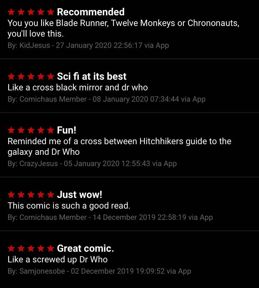
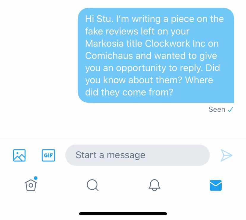
With the rise of the small and independent comics companies we saw the rise in their examination and review online. These reviews started well but fell into the trap of becoming a string of comfortable and flowery adjectives. Along with the fractured emotions of the highly strung Twitter and Instagram junkies we began to see a move towards the rise of the fake review. I’d hesitate in even calling them reviews as they represent something little more than free promotion in most cases. It is clear that a review in any adults eyes should be an independent examination of the quality of a comic. This should be critical of what is bad at the same time as being encouraging on what is good. Sadly this is mostly lost.

The reviewers joined the party. They became part of the scene and (and I include myself in the past as guilty of this sin) were friends with those that created the books on their reviewing plate. People became overly sensitive regarding an actual critique. For years they had been told that their books are perfect so how dare someone actually point out a failing. (Myself included) Reviewers have stood there with a foot pump inflating the egos of people who are, let’s face it, incapable of selling more than a couple of hundred comics - mostly to friends, relatives or easily swayed convention attendees. Are any comics perfect? Really? Reviewing of music and film never seems to hold back in being honest - but the problem in comics is that we are all in the same goldfish bowl. Swimming around quoting the same old hackneyed shite without truly breaking free and thinking for ourselves.


The Creation of your own Artistic Legendary Status.

Over the last decade I have watched the shameless rise of what I call the Self-Hype Machine. In my experience this did seem to be only initially in the land of writing but I see it more and more recently in artistic realms. Is there another industry where someone can arrive without a shred of ability but just start telling everyone that they are a ‘A GREAT WRITER’ or ‘A GREAT ARTIST’  loudly on every social media platform and at every convention without the back row of the theatre putting their hands up and giving a huge “Steady on there babes!’ That egomaniacal steam train of self-promotion is something that has always made my eyes roll but it has of recent years reached Partridge levels of cringe!

You may be of the opinion that people are allowed to do and say what they like about their own creative endeavours. (You may also believe in unicorns and honest politicians?) But the truth here is that these Self-Hype Machines often galvanise the Twitter deluded hive minds into an endless mutual masturbation of retweets without an actual read of the aforementioned comics. This rolling and rolling of that proverbial stone gathers the mass of bumptious buffoonery and begins to get the attention of publishers (cough, cough Rebellion). These ‘in crowd’ hires without an eye to quality then begin to infect the mainstream and we get badly written comics with sub-par art on the shelves in newsagents and comic shops. And every single time this happens we dilute the medium with weak piss content that stops a genuinely brilliant writer or artist being employed!

Honestly - does the world really need another Steven Universe rip-off?

This contagion of a fool’s paradise is now totally out of control. The idiots are running these companies with their goggle-eyed attention to the politics and trends of the moment rather than an eye to who can actually write and who can actually fucking draw! Professionalism seems often to be thrown out of the window with a need to be that Top Dog with Know-It-All attitudes whilst staring at the glowing screen of your smartphone. Embarrassing advice is thrown about by infants and when challenged they dive into self protective sub-tweeting.

And you know who is to blame? Us critics that’s who. I used to idiotically take pity on creators and fail to mention what was wrong with a comic. I don’t do that now and haven’t for years. I’ve got less books through because of that approach but if that’s the price I have to pay I will do. Honestly, these days I’d rather buy a comic to review than be given it - less guilt that way.

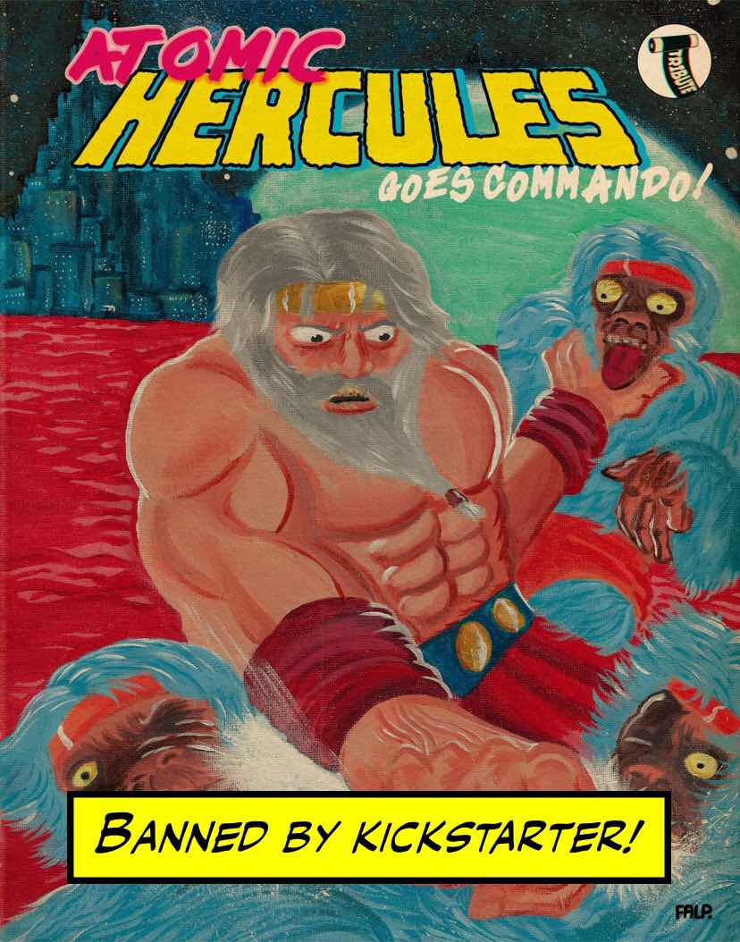
I cherish the comics of people with vision and talent. There are those out there who continue to produce interesting, transformative, funny, exciting, sensitive, insightful comics. But this crowd is shrinking as the kettling effect of the noisy idiots takes full control of the scene. Please create without a concern of what the in-crowd might think. Dare to be different. Dare to take a chance. Dare to offend. Don’t worry what others might say. It’s something that I am learning with my recent work through Tribute Press that this is the sort of comics world that will make you happy. 


Movies and Sales.

I think we can quite happily say that the success of a movie doesn’t really impact on the sales of a comic significantly for any extended period? Sales of monthly comics is an area in need of a real shot in the arm and every week seems to raise a story of distribution troubles or conspiracy theories of the failure and financial troubles of the bigger companies, distributors and shops. 

So, please, every time you feel a need to talk about a comics centric movie or TV series give a little moment to mention the actual comic!?

In the last ten years I moved my not insubstantial financial buying habits to Orbital Comics in London. An Eisner winning comic shop with great monthly comics, graphic novels and back issues. A hop and a step from work it became a Wednesday afternoon full of joy as I picked up my pull list and a few off the shelf comics and trades.

But that went belly up. Suddenly and without any real warning. 

In the busy West End of London we are left with the choice of the hipster hang-out of Gosh Comics or the sterile action figure fuckery of the Forbidden Planet. That vibrant half-mile area of comics shops with Comics Showcase as a past worthy mention seems thoroughly on the decline. Come on Travelling Man - pull your finger out and plant a flag! I have moved into a mail order pull list, a load of Ebay catch-ups and travelling to shops across the South-East to see what gold they hold. 

The hobby has taken a real hit with this virus. An immediate adaption/change in line with this new status quo is required for comics to survive. Something brave and something that will put comics back in the hands of a new generation - a move that will hopefully lift readership numbers and get the money flowing back into our hobby! We also need to stop arguing with each other! To stop creating groups on all sides of the isle. This is totally counter productive to selling the darn things - any idiot can work that one out! Stop shaming people for political/social/personal ideology and concentrate on the comics. As an example I got a message on Twitter to see if I wanted to follow ‘Comics Art’ as a subject. I clicked on it and it was a load of people in tweet after tweet talking about politics. If you go to see a romantic movie you don’t want to walk into a theatre and see a documentary about dogs shitting do you? You don’t have to check the political or moral position of every creator on everything. If you did that they would never get any sold - OH TOO LATE! I almost died last year so to me this is all bullshit - babytalk sixth former politics.

Fingers crossed huh!


Conclusions.

I write comics for fun with people I like. I don’t worry about the amorphous mass of children on the internet and what they might like or show to their Instagram buddies. There are people who have an educated opinion I respect - that’ll do for me.

I review in writing and on podcasts with honesty. I’m not looking to have a sleepover with anyone and will give you a critical opinion on what you have created. If you have the bottle then contact me. If you create something good I will say so. Without fear or favour.

I’m a lifer and will continue to buy and consume comics until I die or they kill me.

Stay off Social Media - it’ll only wind you up.


Many thanks for reading.


Friday 25 September 2020

In Preview - Murder Vol 1 by John Tucker.


Murder - Volume 1.


Created by John Tucker.

Black and white interiors - £3 delivered in the UK.


It’s hard to talk about John Tucker’s comics without spoiling - but I’m giving it a go nonetheless. (I’ve even trimmed the images to keep you safe!)


So what do you need to know? What will nudge you over to Kickstarter to pledge?


Facts! That what people love right?


Fact One - This is the new offering from John Tucker. (Volume 1 and he is working on Volume 2 as we speak).


Fact Two - This is a short two story anthology and a mixture of art, prose and Social Insanity.


Fact Three - This is about to land on Kickstarter. It will only be available for a short time. Then it won’t. Your choice cowboy!


You might well say that’s all you need to know? Well if it is then you need to head over to Kickstarter and register for the release. Here’s the link https://www.kickstarter.com/projects/johntucker/murder-volume-1 


If you fancy reading on and seeing what adjective laden waffle I throw myself into then I’ll tip my hat to you and continue.


John joyfully writes like he is suffering a randomly conceived Cheese Dream that he, or I, are never quite sure which twisted ending will be revealed. Sometimes he stirs your grey matter in the areas that elsewhere may be considered banal. Hair cuts, back street comedians, sex with old people and so on. But these stories do not lay in the boring filler of morning television, for example, but rather in the idiosyncratic absurdity of comedically crafted DIY punk comics. They are at once strange but on other levels more than a little insightful.


John takes the everyday and twists it with unique absurdity. In the past he has considered male patterned baldness and wondered how it would get even worse when a scalp becomes transparent. Or how the dumping of a hairdresser’s cuttings within view of a lighthouse turns murderous!


Both stories in this new comic are very different but play both sides of John’s storytelling coin. They are equally implausibly deranged. And are also both narrated by a wide-eyed cross between an everyman and the sort of person you regret getting in conversation with in Greggs. The hints of dead pan madness are apparent through much of John’s work and are again on show here - to this particular reader’s satisfaction.


Who thought that the evil plans of a plumber would stick in my head all night! 


I might use the bog at work?


Here’s the link to register for the launch tomorrow https://www.kickstarter.com/projects/johntucker/murder-volume-1


My only problem is that it seems far too short. Where’s that next one John?


Many thanks for reading.

Saturday 8 August 2020

When is a review genuine?

Yep. Back on the subject of reviews again. I’m asking a question of when is a review genuine and written without prejudice? Without a horse in the game? Without a few quid maybe being exchanged? When can you trust what you are reading or is it just a comment of a friendly aunt?


It’s nice to get a good review isn’t it. Something with insight and well written it lifts the spirits with a small dopamine dose. What it also does have is the propensity to bring eyes to the comic, series or creator. Some people live for that attention we see that every hour of every day on ‘Comics Twitter’ and elsewhere in social media. That crackhead need for someone to love us! Please say a nice thing!!! PLEASE!


Over the last few years I’ve been noticing the change in attitudes towards reviews. I’m sure you’ve heard or read me bemoaning the lack of actual critical analysis in comics these days. I’ve personally turned a corner and will now only be totally honest about a product. Scroll back and you will see a few examples. A piece written with no fear or favour. Without a sense that they are all mates and giving out cuddles for needy creators. If that’s what you want....show it to your mum and never sell it!


Comics reviewing is not and never should be a byword for promotion. But that is the way that they are being treated by many websites and publishers and how they are seen by many creators. Get a review and sell another couple of books? Maybe. Start getting your name out there, whether you are competent or not and there’s a chance that a publisher will spot you and consider paying you actual real money to make comics for them.


There’s also quite a bit of competition to get a review. There aren’t that many sites or reviewers these days. It can be difficult to get a review into print even when you send the site a hard copy - something that I have experienced this year a couple of times.


So what are we left with?


Sadly we are left with this.


This is from the review section on the Comichaus reading app. (I took a screenshot before the comments were deleted by the app who spotted that they were fake). It is a series of reviews for the Markosia comic ‘Clockwork Inc’. Written by Stu Perrins with art by Ron Gravelle.


Before we examine the review linguistically lets make it clear that I have no data regarding who left these reviews. I can tell you that I reached out to Comichaus and they removed them and they were not responsible. I reached out to Harry Markos from Markosia who told me that he had no knowledge of them and I believe him. I also reached out to the writer Stu Perrins. He has, at the time of writing this, read the message but has not replied (proof below). I do not have a point of contact for the artist at this time.


Comichaus is a subscription comics service who pay creators per click on views by subscribers. Full disclosure here that they also sponsor a podcast I am co-host on. The more attention you can gather to your comic on the site the more clicks it gets and the more money you make. There is a chart of the most clicked on comics as part of the home page set-up. You can register for a free month on sign-up. I highly recommend it as a great source for indie and small press comics at a reasonable rate.


It’s a great model but like everything seems to have been in the past hi-jacked with this sort of behaviour. (It is worthy of note at this point to say that the site has changed it’s protocols and will now spot this behaviour).


I first became aware of this particular example when the comic was unusually in the top five for a few months. It didn’t seem to have the quality of a book people would flock to and/or be read and reread and in doing so remain at the top but somehow it did. Who was clicking on it? I am not sure.


So I looked at the reviews.


They are all very short. They also appear to have been written quickly without a proofread. For example the repetition of ‘You you’ in the first review and a lack of full stops in three of them.


Two are written by ‘Comichaus Member’. I’m guessing that this is the default username on the site. This also shows a high possibility of rushed writing.


One is written by ‘KidJesus’ and one by ‘CrazyJesus’.  Maybe they are related?


Three use the incorrect spelling of the tv series Doctor Who and refer to it in three different reviews as ‘Dr Who’! this is a big signpost indicating that they were written by the same person.


Four of the reviews compare the comic to a TV series or movie - ‘Black Mirror’, ‘Dr Who’, ‘Twelve Monkeys’, ‘Hitchhikers Guide to the Galaxy’ and ‘Blade Runner’. Only once does a review compare it to a comic.


They are also written in a two month window from the start of December 2019 until the end of January 2020.


Let us be clear here....


I AM NOT ABLE TO SAY WITH ANY CERTAINTY WHO WROTE THESE REVIEWS.


I will leave it up to you dear reader to draw your own conclusions. It may be a creator or it may be a friend or relative. Or it may just be someone thinking they are doing the right thing?


However. 


I looked at the reviews on the Comichaus site for other comics written by Stu Perrins. And look at this! ‘KidJesus’ turns up again in Megatomic Battle Robot 1 as well as the anonymous ‘Comichaus Member’. How miraculous!


Stu Perrins also wrote a story in issue 12 of the Comichaus anthology. ‘KidJesus’ rises again like ‘KidJesus’ at Easter. This is again a short review that doesn’t say much.


In fact quite a few of Stu’s comics have very short reviews written by anonymous Comichaus members who have nothing written on their site profiles. No website, social media or identifying biographical material. One might assume they were created during the free trial period and then left? I’m no expert. Linguistically they use short statements/sentences that only say how great the book is and all give five star reviews.


In fact - Everything is a five star review. How lucky can one creator be!


Conclusion.


If somebody is benefitting financially by falsely creating Comichaus free accounts, leaving a review and then closing it down then this is highly unethical. (At least).


Why post numerous reviews of your own or friends comic? It’s can be both financially beneficial sure but you can also include in a CV or application that you have such great reviews and are clearly a creator worth working with? When there’s a good chance you are not.


It is also cheapening the reasons that we post reviews. Listen, I’m no naive millennial and understand totally that this goes on throughout the media world. I hear that Amazon will pull reviews if multiple ones appear from the same IP address. I’ve also seen a number of podcast reviews that have been written by somebody with an Apple Username that is basically the name of one of the hosts!


But it’s still jolly bad behaviour if you ask me!


Many thanks for reading.


Update - 9/8/2020.


I received a reply from Stu Perrins. I’ll let it speak for itself as I’m not completely sure I know what it means.


Saturday 1 August 2020

In Review - ‘Love on the Isle of Dogs’ by Jude Cowan Montague.


Love on the Isle of Dogs

Created by Jude Cowan Montague.

Published by Friends of Alice Publishing.

197 pages - Black and White Comics and Prose.

The Story. 

LOVE ON THE ISLE OF DOGS is a true story about my marriage to a man who was diagnosed with paranoid schizophrenia. It's a poetic tale told in pictures.

The Review.

I have settled down to read this over coffee at an outside cafe in a square in London. I was kindly sent a preview copy of this new graphic memoir by Jude herself who contacted me by Twitter. I’ll say from the outset that I found the reading experience both frustrating and involving. I will attempt to explain why.

Let’s start with the cover. It is a simple scratchy and seemingly instinctual image of Jude herself. This time in colour, as the interior art is black and white, and shows the bright yellow of her hair, the blue of her dress and the visual shortcut of a baby in her arms. Jude stands on a dark and murky background and I anticipate something emotional and insightful on the inside. The title is bold and eye-catching and overall I enjoyed the simplicity and iconography in it’s and the cover’s overall design. 


There is no doubt at all as I read onwards that this is a heartfelt account of Jude’s life, her husband, a child and a home. For those without the important geographical grasp this is a tale that is situated in The Isle of Dogs in central East London. An area I worked in the late nineties and a place embattled by the encroachment of big industry, the usual fat cat banking bastards and ridiculously expensive rentals. It is an area that has changed much since the seventies and can be seen as a mirror for what has and is happening elsewhere in too expensive to live in London without a millionaires bank account.

The initial part of the memoir is in comic form. Or for the Hampstead hipsters what is often described as a graphic sequential form - if you prefer? And so we find the area that I found frustrating. The art seems to mimic the drawings of children the type that parents pin to the front of the fridge. I’m not being cruel here as you can see above. What they have in good intentions is completely wiped away by the rushed and badly drawn figures and scenery. Initially at my first glance i presupposed that these images were part of a flashback to junior school or the drawings made by a child. They are not a momentary visual shortcut but rather fill the comic section. If I wasn’t reading this for a review I would have put the book aside. 


This book is of course a memoir a book that is personal and so should obviously be a reflection of the creator. But Jude’s  art does not communicate the story and is far too abstract and without the required personality. In basic terms it looks rushed and without skill. It’s also worth noting from a graphic design POV that the pages look like they have just been copied onto the bright white paper stock without any attempt to blend or visually join the bright framing with the dirty uncorrected scan. Of course this may be intentional and art is always subjective but for this reviewer whose review you are reading it is far from successful.

I’ve watched a couple of online videos of Jude talking about and showing her process. She makes use of a large page and a brush dipped into ink. The smudges of ink to me would be a good starting point. The child/baby imagery as below for example. But these pages need more. They need a depth that I’m not seeing. A comic page is not something so slight. It needs more.

As I say, this is purely my opinion and the eyes of others may see something else. Sure it can be seen as experimental. Comics are of course allowed to experiment and I always welcome that as a reading experience. But I am at a loss to discern what this particular book achieves. Have we had enough of this underdone style? Does it do a disservice to the more accomplished line-work that this book may sit next to on a book sellers shelf? 

I wonder if this and I are part of an elaborate artistic prank. Am I part of this mischievous act. 


The last quarter of this book is autobiographical prose which I read that with much more interest. I didn’t feel the frustration I had felt earlier. This seemed to communicate with me more successfully. It held me with its moments of reality.

‘When I found a star, it fell into my hand. But it burnt me, so I let it go.’

I felt that this was more of a direct pipeline into the mind of the creator. This was the aforementioned insight I was in search for. I’ve watched Jude’s online poetry readings and found that they have much of what I am seeing in the prose. A frankness of the realities of urban living and the rollercoasters of relationships but mixed with the romantic and fantastical. You feel the often very painful life in each paragraph. Jude shapes this prose with quick and exceptionally well crafted paragraphs. Each opening angles to see lives from a different place. 

The evenings grew dark and he grew more worried. He’d sit in the darkness. I’d surprise him when I turned on the light.’

Jude also makes some brilliant use of dialogue. It occurs to me that this could have formed the basis for a more traditional and coherent comics script. Maybe with someone more able to carry off the sequentials.

Who are you?
WHO ARE YOU!’

So what did I walk away with? I certainly have an impression of Jude and emotionally I connected with her life. But in total honesty this was due to the prose a lot more than the comic. There is something here. Something that’s should have, in my opinion, been developed artistically differently. Comics have their own special language and I didn’t feel the movement or the people. It needed more thought put into the passage of time and sense of place than I was getting. The prose was dynamic and practical yet also showed an eye to the magical and the life of the interior. I could have read that all day.

We should as always value all art. Part of this wasn’t for me but for you that may be an altogether different bucket of apples and pears.

You can find more about Jude by visiting her website here https://www.judecowanmontague.com/love-on-the-isle-of-dogs

Many thanks for reading. 

Sunday 19 July 2020

In Review - 'Victory Point' by Owen D. Pomery.


Victory Point.

Created by Owen D. Pomery.

Hardcover - 80 pages - 160mm x 210mm.
Full Colour - £14.99.

Published by Avery Hill.

The Story - During one summer we follow Ellie as she returns to the coastal town of Victory Point. In the bright sunlight she arrives by train to the place that she grew up to visit her family. As she walks around a town that has a singular architectural vision we join her in revisiting the past. 

Does Ellie feel like she still belongs here? Will this visit home refresh something she has lost?


The Review - It's been around a year since I last reviewed a comic from Avery Hill. It's not that they haven't been releasing product but rather that I hadn't been feeling what they had put out books that connected with me. I'd been looking forward to reading the next graphic novel from Owen as I'd enjoyed Between the Billboards and British Ice last year from Top Shelf Comics. 

I pre-ordered Victory Point and it arrived just a couple of days ago. 

This is a gorgeous book. A small hardback with the cover design printed straight onto the book instead of using a dust jacket. The blue of the sea draws the eye immediately and you can then roam the cover spotting the idiosyncratic buildings and flowing curves of the walls and pavements as they perfectly slice into the curve of the coast. Then relevant to the story is the image of Ellie standing alone and being part of the townscape and the shadows cast. Then above in the faint grey sky is the subtle title. It's a book cover that cleverly mimics a photographic coffee table book with it's broad shot and bold colours. It also cunningly echoes the story inside.

As Ellie walks the streets of the town she rediscovers, discovers and remembers what was there before and realises that things do change. You begin to get to know the area as she explores and the involvement her family had there. She meets up with her father, sees people she used to know and goes swimming. She even makes a new friend who has opened a local café. Ellie also has that feeling of dissatisfaction in her life that borders on moments of being a little lost and without direction. You can imagine that she has returned home to recharge and learn a little bit more about herself through that reach back into the past.

As you can see from the pages above this book is intricately drawn and Owen's background as an architect has translated over to comics with often breath-taking effects. It is this that is the highlight of this graphic novel for me whilst reading. I was straightaway drawn to this town and caught up in Owen's nefarious conspiracy to make me think that it is real.

'In 1933, the village of Victory Point was the selected site of an architectural experiment. Funded by both the government and private investors, they appointed the architect, M.L. Schreiber, to redesign the town on new principles, hoping to create a visionary example of 'a modern way to live'.

It is worthy of note at this point that if you google 'M.L. Schreiber architect' it comes back with a link to the Avery Hill website. 

Pomery!!! You are a cruel man. I was planning my next holiday.


So, we can all I agree I am sure that this is an excellently drawn and designed book. The only exception that I would make is in the faces of the characters. Owen carries on his style in Victory Point that we have seen in his previous works of intentionally counterpointing the full detail of the surroundings with a style that could be described as 'under-drawing' the faces of his characters.  He uses the technique of often just showing dots for eyes and lines for mouths. Whilst I totally understand that this is intentional I'd love to see more in the faces. Ellie's father, for example, is crying out for more craggy and lined details. As he builds a boat and sets sail or just lays down some home-spun wisdom I'd have liked to have seen more.

What is the book saying? It certainly captures a moment. You feel that time has at once stood still in Victory Point with the time capsule buildings and streets but that it has also significantly moved along for Ellie. The question floats ever present of whether or not we can return to our past. Many of us have felt this connection/disconnection when we return home from the early pressures of University or our first job. We want to feel refreshed and also at once tackle in a safer and familiar environment some of our new problems as a new out of the box adult. The world Ellie has left has changed and her father's bones creak as he walks up the stairs. As she goes to catch her train back to her life the rain falls and she pauses with a woman she'd met earlier. This woman is a vision of what she could become. 

'I study the heaven. They cause the waves at my feel' - Dr Abigail Small. 

This is a book that on an initial read I have to admit to finding a little empty. I wondered what the point was with it all. After all many of us have felt that feeling of returning home to recharge and it all seeming at once the same but new and different. But there are two things that brought me round on a second read. The brilliantly realised landscapes on show in Owen's art and the pacing. This is a book that never rushes and takes that time to explain, show and develop. It's the visually stunning and at once restful to read. It's the graphic novel version of laying on a summer beach where a clock stops. 

This is also a wonderful deception. A false landscape fully at home with it's own verisimilitude.

Nicely done- more please.


You can find a copy of this book here. You can follow Avery Hill Publishing here on Twitter. 

You can find out more about Owen D. Pomery here and follow him on Twitter here

Many thanks for reading.