Saturday 31 August 2019

In Review - ‘Maxentius - Book 1: The Nika Revolt’


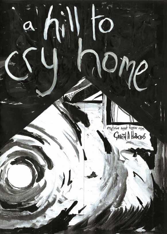
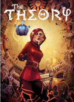
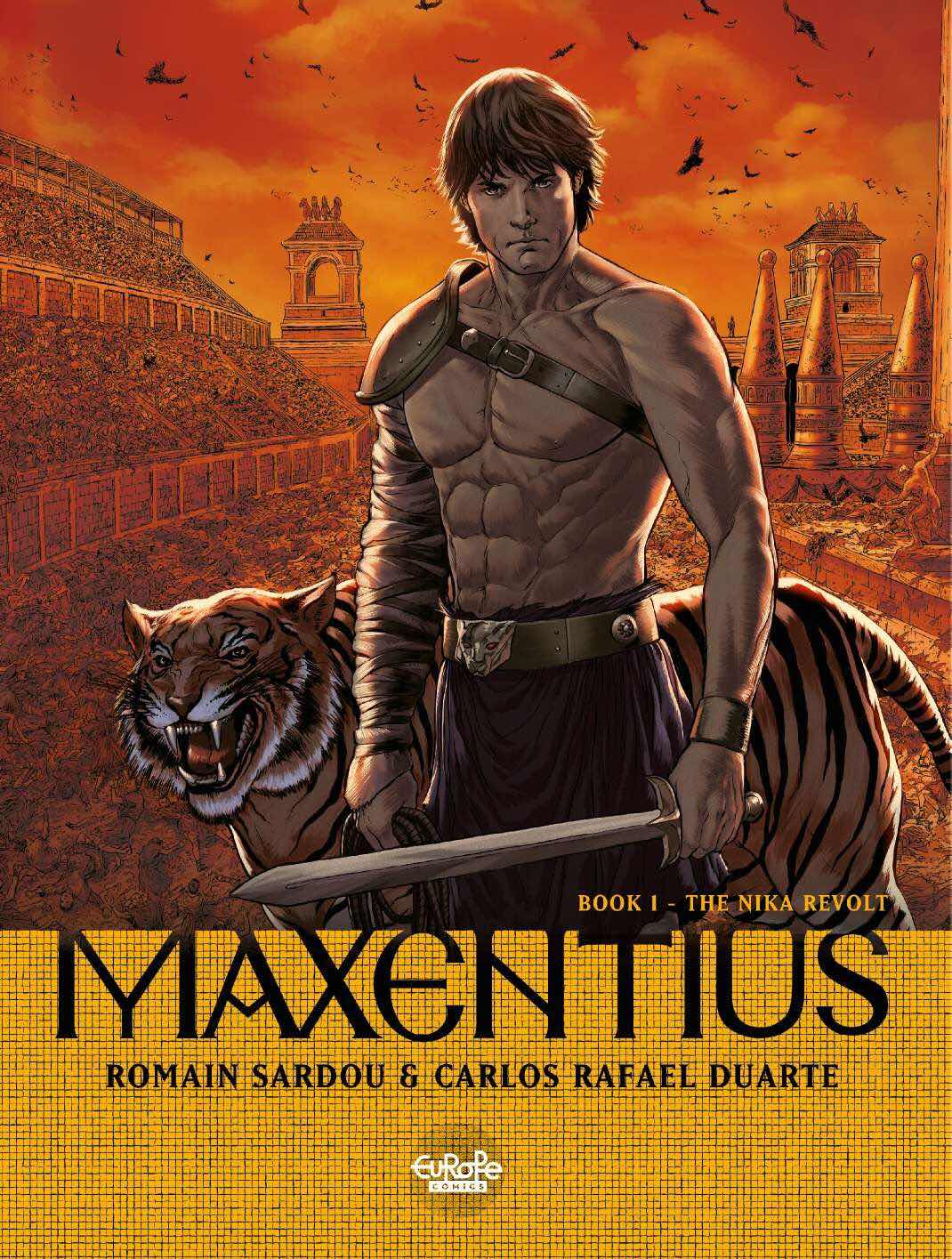
‘Maxentius Book 1 - The Nike Revolt’

Script by Romain Sardou.

Art by Carlos Rafael Duarte.

Translated by James Hogan.

Lettering by Cromatik Ltd.

Published digitally by Europe Comics - Full Colour - 56 pages.

£3.99 

Originally published by Lombard in 2016 - www.lelombard.com


The Story - ‘The year 532. Justinian rules over the Eastern Roman Empire, his wife and most maleficent ally, Theodora, at his side. From his capital of Constantinople, he dreams of restoring the empire to the splendor of Ancient Rome in the time of the Caesars.

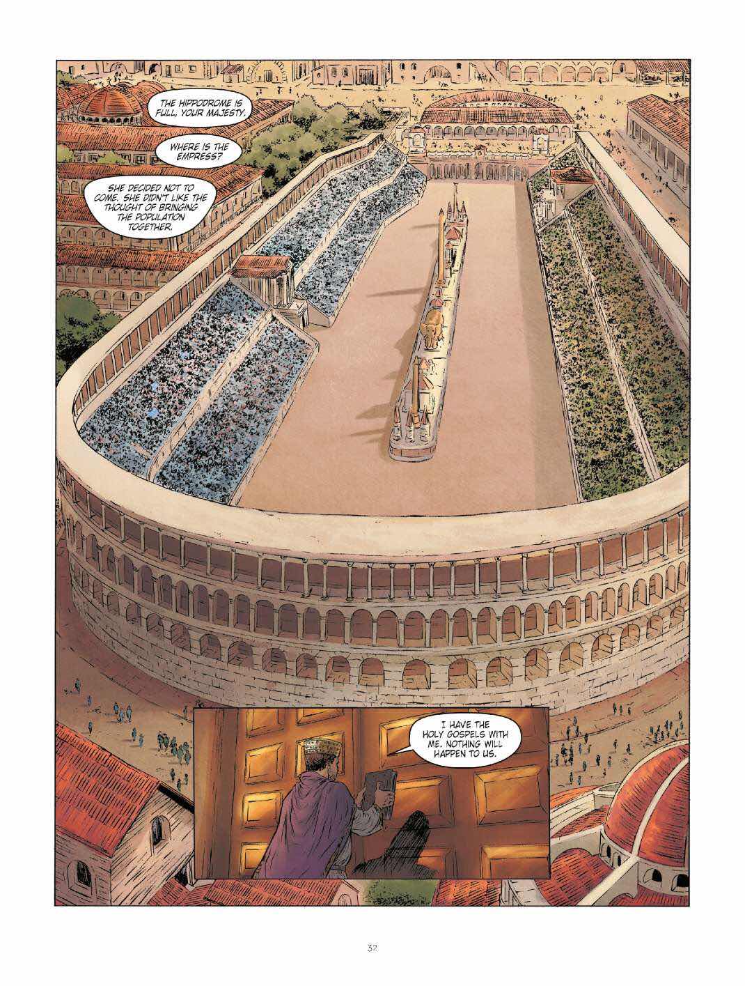
But during the month of January, following an accident during a chariot race in the Hippodrome, Constantinople is set ablaze. Now everything hangs in the balance: the throne, the imperial couple, the empire…

Maxentius, an animal trainer and the empress’s assistant, has just a few hours to save centuries of history.

A few hours during the Nika revolt, supposedly the bloodiest massacre in antiquity…’


Why do we always forget to say that the young are closer to death than the old.’


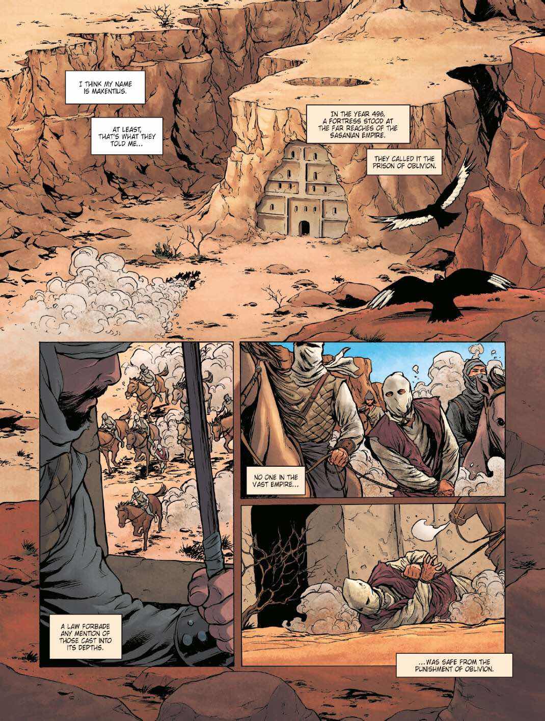
The Review - This book is the first in a series of three books that Europe Comics dropped on Comixology this month. It is a beautifully realised sprawling epic and one that picks it’s action and plot from the true history of Constantinople and beyond. Because of this setting we get a short history lesson at the beginning of the book that whilst it could be seen as a little dry by many is in fact a scene setting tool for what is to come.


The main story opens on the chariot racing at the Hippodrome arena. As the event is declared open and commences you feel an ever-present cloud of revolution and dissent above the crowd and the dignitaries watching. It is then that you get introduced to Maxentius, our hero. He sits casually in a room behind the high banked seating amongst tigers and lions who pad slowly around him. These wild creatures are respectful and watchful of their master as he carefully sharpens a pair of blades.

Although young in appearance you soon get a more developed look at Maxentius. He is a man of many skills. A trainer at the arena but also a great warrior, a cunning commander and a skilled detective. When a crash occurs in the aforementioned race and subterfuge is suspected he, along with Ofellus his hunchback assistant, discovers a plot involving hollow statues and poison tipped darts. They both walk amongst the spies and informants in the belly of the city. Spreading threats and coins to find out the truth.

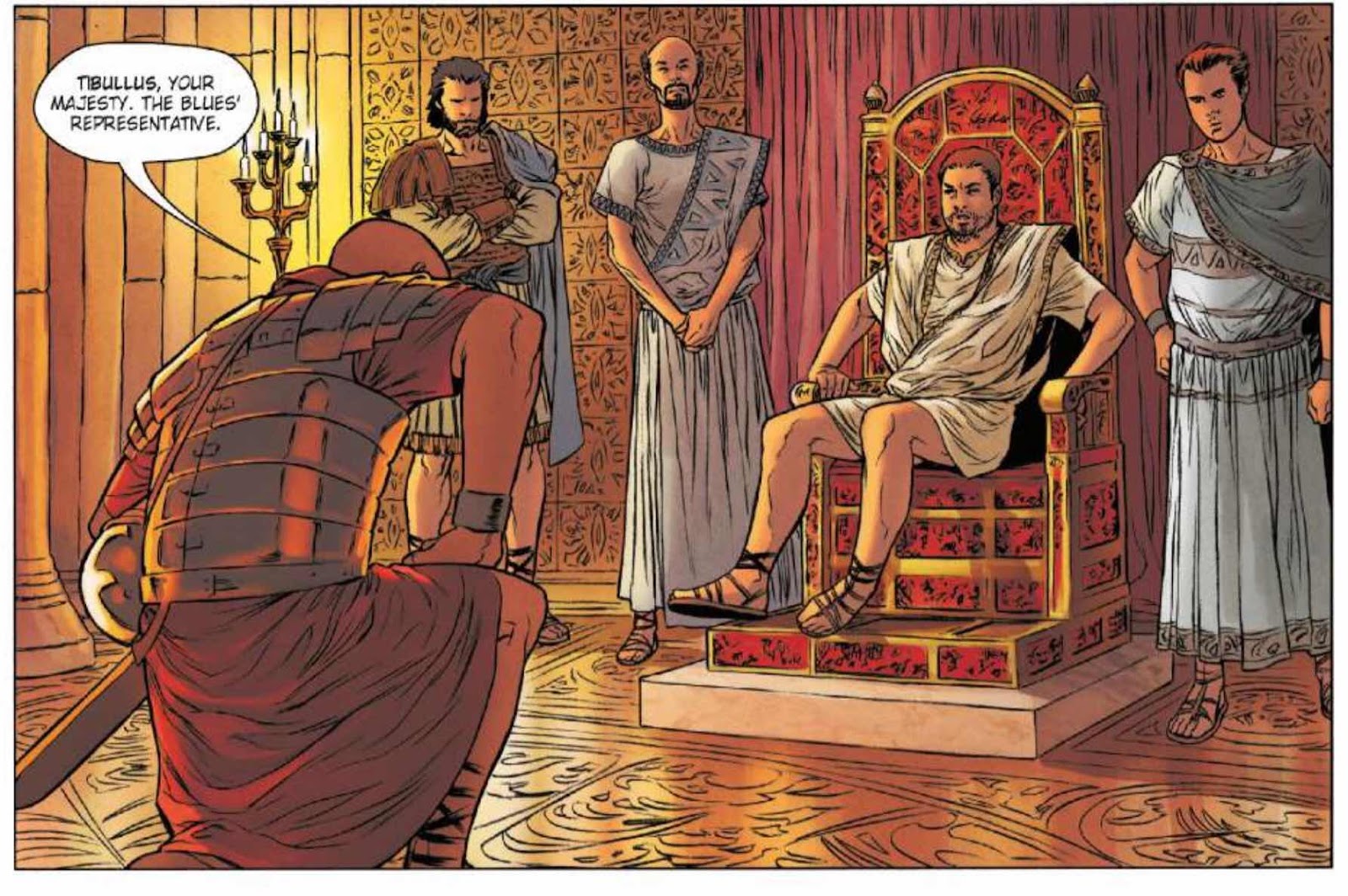
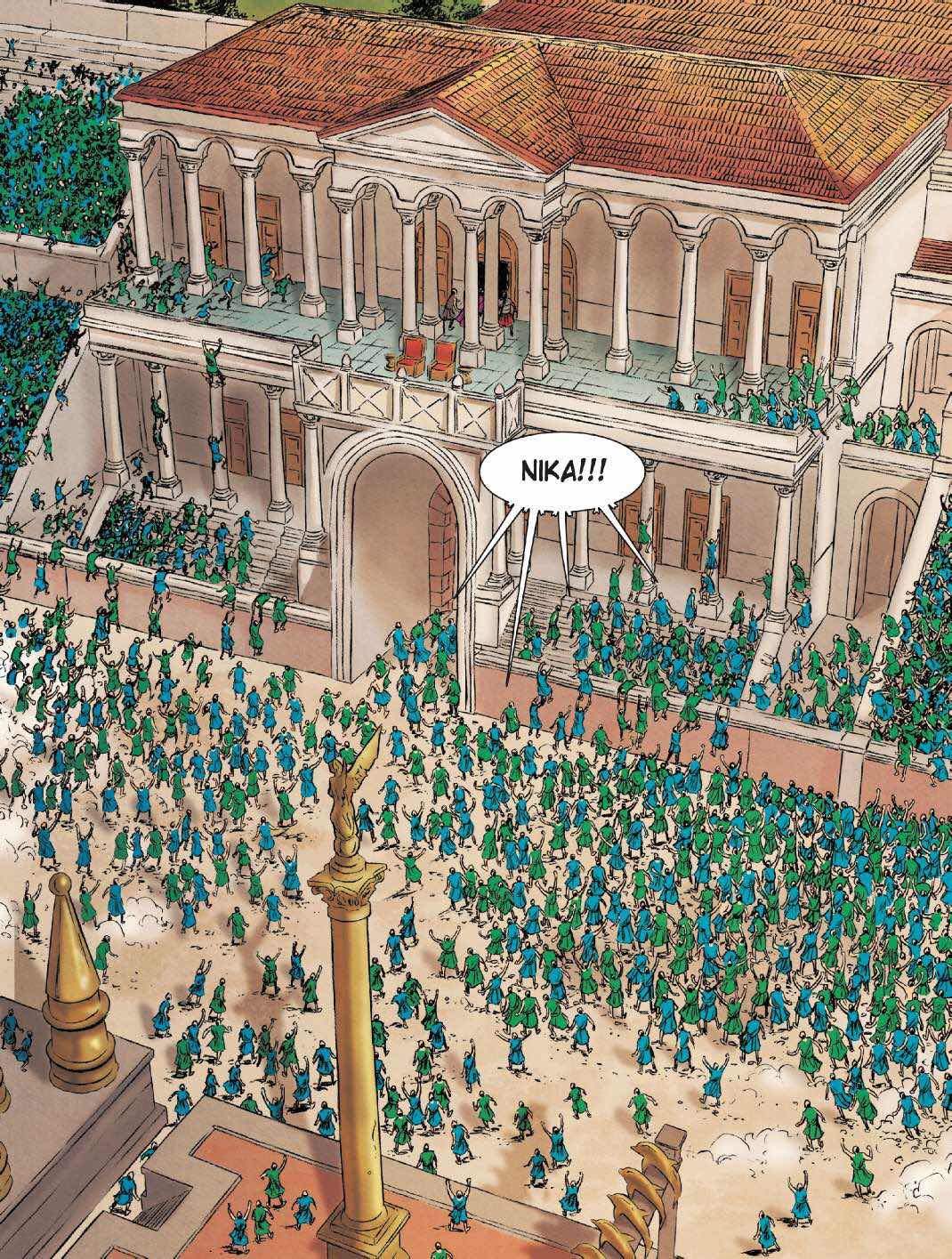
The revolt does erupt through Constantinople and is bloody and relentless. A nervous and indecisive Emperor wavers at what to do as ‘The Blue’ fight ‘The Greens’ and rip up the city, setting fire to buildings and the status quo.


You really cant help but be struck by the parallels of this story with our current messy political and social situations. Whilst historically accurate in politics and setting the blues and greens are like politically motivated eighties football supporters, creating anarchy and violent mayhem. They are divided by a political ideology that blinds them to any form of reconciliation or mutually helpful agreement in a middle ground of their small world. (Ring any bells?)

‘Even the sight of the scriptures didn’t calm them!’

Sardou’s writing cunningly links together all these events with our handsome hero Maxentius at it’s nexus. The book lacks the action early on that you get from other Europe Comics like ‘Ira Dei’ or ‘The Eagles of Rome’ but by the second half has accelerated into full on battles of blood, guts and literally hundreds of people on a page! This slow beginning may be the reason that all three books were made available at once. Like a Netflix box set available for you to consume in one day.

A double page spread in the last few pages of this first volume will genuinely leave you breathless with it’s scope and detail. Duarte is from the school of Euro Comics where no corner is cut and there is gorgeous detail at every page turn. You are never at a loss to discern who is who or what is happening and the colours he lays down alight the pages with glinting sunlight and deep red splattered bloody corpses. It is a delight to read a book with such craftsmanship.


Very highly recommended!


About the Creators.

Born in 1974, Romain Sardou comes from a lineage of artists, which includes his father, the singer Michel Sardou; his grandmother, the actress Jackie Sardou; and his grandfather, the actor Fernand Sardou. Passionate about opera from a young age, he got into theater and dropped out of high school in order to dedicate himself to the stage, with the goal of becoming a playwright. After two years in Los Angeles where he wrote stories for children, Sardou came back to France, where he completed his first novel, Pardonnez nos offenses (Editions XO, 2002). This medieval thriller, which is a bestseller in France and was published in 20 countries, was followed by the sequel Délivrez-nous du mal. Maxence (Le Lombard; Maxentius, Europe Comics) is his first foray into the world of comics.


As far back as he can remember, Carlos Rafael Duarte has always drawn. This passion quickly became a fundamental need, and at 18 years old, the Brazilian artist decided to enter the world of professional comics authors. Following his graphic design studies, Duarte studied sequential art at the Impacto Studio of São Paolo. After graduating, the young man opened a new branch of his school in Rio de Janeiro, where he still lives. In parallel, he began working with comics publishers in the United States. His first comic book, Lazarus: Immortal Coils (with the script by Joseph P. Gauthier), was published in 2008. He joined the team of Dabel Brothers, and then Dynamite Comics. Influenced by illustrators such as Jim Lee, Adam Hughes, Terry Dodson, and Adriana Melo, he illustrated his first Franco-Belgian bande dessinée in 2014, Maxence (Le Lombard; Maxentius, Europe Comics).


You can head over to http://www.europecomics.com/album/1-nika-revolt/ and order this book or buy it on Comixology here https://www.comixology.co.uk/Maxentius-Vol-1-The-Nika-Revolt/digital-comic/794909?ref=c2VhcmNoL2luZGV4L3RhYmxldC9zbGlkZXJMaXN0L2l0ZW1TbGlkZXI


You can follow Europe Comics on Twitter @EuropeComics and many thanks again to Irina for hooking me up with such amazing books!


Many thanks for reading.


Monday 26 August 2019

In Preview - ‘A Hill To Cry Home’ by Gareth A Hopkins and Erik Blagsvedt.


‘A Hill To Cry Home’

Created by Gareth A Hopkins and Erik Blagsvedt.

(A chapter from the upcoming ‘Explosive Sweet Freezer Razors.’)

20 pages.


‘Ghosts are real and they are fucked off.’

This is a tensely poetical ghost story that approaches the story with a combination of abstract art and is told in plain short verses and styles of abstracted language. It is also the sort of comic that will mean something entirely different to the reader at each pass. It is coincidentally dark and yet with a distinct character that will draw you in and art that is a genuine pleasure to watch.

I’m a fan of this comic. It is freshly original and also portrays a darkness in image and turn of phrase. 


‘A Hill To Cry Home’ opens on a walk through a house, turning off all the appliances and settling into a warm bath. 

I’ve read this myself at least a few times and come to different opinions of the meaning of this sequence at every attempt. Is it a suicide? The careful turning off the electrical ever-present hum in the house seems like a final moment of peace before a bath time wrist slashing? Or is it a peace that is needed to commune with spirits? The modern world is turned off to allow for the world elsewhere and elsewhen to appear?


The world of the strange and ghostly does appear but not in a way that you’d expect. The creators pull you over with the use of the background swirling/germinating/dilating/growing and developing black and white art with punches of colour. Then they play with you perceptions by changing the text box colour and moving into a combination of bullet delivered abstract language and paragraphs that almost make you believe you understand....

It’s a shame that this is a small lysergic delivery of a larger overdose. I look forward to the full/next instalment soon.


‘This is a story about ghosts.’


Find out more about the work of Mr Hopkins by visiting http://www.grthink.com/ and finding him on Twitter @grthink

You can buy this upon release over at https://grthink.bigcartel.com/

The book will get a physical (and spiritual) release at the upcoming Hackney Comic + Zine Fair on Sunday the 8th of September - London Field Arches, Hackney, London, E8 3SB. https://www.hackneycomicfair.com/


Many thanks for reading.

Sunday 25 August 2019

In Preview - ‘The Theory’ from TPub - An Honest Opinion.


‘The Theory - Neil Gibson’s twisted Sci-Fi.’


Created by Neil Gibson and Tpub.

Anthology Format - Ten Stories - 172 pages.

Full Colour.

Digital Copy - £10.00.

Physical Copy - £20.00.


I received this from Tpub and James Linton who is a writer himself and also works in PR but doesn’t have a web presence. This particular email reads like something Neil himself would write. Read into that what you will.

The book opens on a quote from Mother Theresa (yes seriously).  

There is then what follows an introduction from writer Connor McCreery that boldly states:

‘Neil has started another incredible journey with this book.’

This introduction is actually all about the author and doesn’t really apply itself overly to this particular project. It is however an exercise in telling the reader how great this creator is, how funny, how generous and more. It is so non-stop adulatory that it borders on sarcasm. In the email that Neil/James sent me I note that a couple of review sites have given this book a glowing report. Maybe they didn’t read this introduction? (Or the actual comic?)

This is what the email from Neil/James had to say about this project;

Humans have achieved the seemingly impossible – faster than light travel.

Despite discovering hundreds and hundreds of planets that once contained intelligent life, we have yet to discover a single planet where that life remains. These planets have one thing in common – they were wiped out, either by accident or by design.

To track and study these dead civilisations, a group of astroarchaeologists have been created to help educate humans on how to avoid the same fate.

Seemingly working on the other end of the spectrum, an elite team of time travellers have been created in secret to help minimise human suffering. They travel through time performing ‘minimal alterations’ to the timeline to help achieve this.\

Join Linda, the astroarchaeologist and Jemm-r, the time traveller, on an adventure to save our future and our past.


OK then. Let’s get started.


The cover looks great and is credited inside to Abigail Harding and Vince Sunoco. There is a great use of colour and design on show but I’m a little confused with the dead eyes of the female character? (Is she a zombie? Is she blind?) Asking a question is only a good thing and leads into a need to find out...


‘Obsession’

Writer/Creator - Neil Gibson.

Story - David Court.

Art — Phil Buckenham.

Colours - Liezl Buenaventura.

Letters - Justin Birch.

This story opens with a quote from John Waters.

Two space archaeologists who are also a couple investigate the fall of a city, a civilisation and a planet. The two scientists use a for or VR scanning that ends on an emotional moment. 

I have to admit to being weary of the laboured (over)writing before I finish panel one of the story. Here are a couple of examples from that opening panel.

‘I can’t detect any Linda. The cities are decayed but intact. Shall I head to the centre of the biggest city?’ (I know people want to identify their characters but why do it when you can’t see them?) ‘Centre of the biggest city’ (This is a really clunky phrase.)

Or

‘I am detecting the remains of humanoid forms all over the planet.’ (‘..humanoid forms..’? Why not ‘humanoids’?)

The lettering also seems to bold out words randomly? The writing is increasing in need of an editor or someone just reading it out loud and stripping back what isn’t needed. In the second panel one character opens a conversation and when replied to says ‘Hmmm?’ Like this reply was unexpected. 

The story ends on a line that would look overly melodramatic in a daytime soap opera. 

‘Oh God. That’s how this world ended? Because of misguided passion?’

‘Not Passion.......Obsession.’

The art is workmanlike and good enough and communicates through reactions and some small amount of action. The colours in themselves are also OK, albeit pretty basic, but could do with more distinction visually between the story of the scientists and the VR moments?


This is a really hard book to read. I’m finding each panel a labour to get through and pretty darn boring. I check..... 172 pages? Oh dear.

After the aforementioned last scene there is some bridging material that looks like two characters talking to each other in an ancient Street Fighter video game. It seems to be filling in short-falls in the actual story and interrupts what little flow has been created for me as a reader.


‘Pandora’

Plot by Forest Helvie and Neil Gibson.

Writer/Creator - Neil Gibson.

Art — Phil Buckenham.

Colours - Liezl Buenaventura.

Letters - Justin Birch.


This chapter opens with a quote from George Sand.

A man in the future with serious mother issues is considering a body swap for his terminally ill and very newly married wife.

I found this story much more engaging. There is more of a Twilight Zone feel to the narrative and whilst there are moments of some serious over writing and story beats that are waaaay too on the nose (a moment where after a mother/son argument and a door slam we focus in on a photo on the mother with her son in her arms, newly born at the hospital) I found it an improvement, albeit slightly predictable.

The art again works well for the story. I’d say that the last page shock/splash seemed a little simplified and I’d love to have seen more detail. The mother and son are distinctive and nicely designed with a comedic chubby faced boy effect on the son.

There is again a page of bridging material that is used to explore the bigger narrative picture - I’ll leave it there in case you wanted to read this book and don’t want it spoiled. 


‘Battlesuit’

Writer - David Court.

Creator/Producer - Neil Gibson.

Art — Phil Buckenham.

Colours - Liezl Buenaventura.

Letters - Justin Birch.

This story opens with a quote from Carl Sagan. (These quotes are really beginning to grind on my nerves, they seem both pompous and randomly chosen.)

This story is back to the space archaeologists who uncover some Mecha battle technology left on a long abandoned battlefield. Some of the batteries are still functioning and the memory packs tell a story of a civilisation obsessed with war. Soldiers are seemingly cared for within mobile life support units within large tank like mecha who all the time continue fighting.

This was a vast improvement and has some interesting story twists and visuals. It has an intriguing darkness we’ve not seen so far. More of this sort of strory-telling please.

There is then another piece of video game bridging material that I forced myself to read and neither enjoyed nor found remotely funny.


Communication’

Writer/Creator - Neil Gibson.

Artist - Davide Puppo.

Colours - Liezl Buenaventura.

Letters - Justin Birch.

This one opens with a quote from George Bernard Shaw.

This is the story again of Linda, our plucky space archaeologists who has seemingly chucked her husband, who discovers the history of a civilisation that rose and fell. Linda connects to a cube she finds that taps directly into her brain and then tells her the story of a sophisticated culture who succumbed to their need/addiction for technology.

First off, the art on this story is pretty darn good. It has a widescreen scope, some excellent designs and loads of detail. The colouring feels a little on the nose and could do with some art/colour coordination on mood and vibe but is generally serviceable.

The story lets the art speak for itself and in many ways this works. But sadly you are a third of the way through this chapter when you get what Neil is aiming for in an inevitable story twist. You realise that these cubes are an analogy for the internet and social media. You realise it quickly and easily. You realise the parallels made between the cubes and the smartphones in our own earthbound hands. Yet Gibson pushes this on and on and on (and on). This could be half the length easily in a story we’ve all seen before.


This book could REALLY do with an editor.


‘No Recidivism...’

Writer/Creator - Neil Gibson.

Illustration - Cem Iroz.

Colours - Liezl Buenaventura.

Letters - Justin Birch.

The quote is from Wesley Snipes (no, seriously).

This is the story of a future prison where humanoids and aliens are sentenced to terms of imprisonments based on real crimes and crimes of thought and intention that are judged by robotic guards and men in Marks and Spencers suits.

I found this overly slow for the subject matter. The ending felt jammed in and confusing when compared to the breadcrumbs that had previously been seemingly scattered. The prison setting seems derivative and under-realised.

The art could really do with both more detail and some consistency in settings. The main character has some kind of hairy forearms and talons/claws but the staff on the parole board could be straight out of a modern day court drama. The layout, design and backgrounds in the prison are bland and the inmates are in the most part interchangeable.


Really not for me and a book I find hard to recommend to others.


So there you have it. I’ve reviewed five of the stories in this collection. Some highs and some lows. There are in total ten stories and I will get on now with reading them and not spoiling them for you if you wish to purchase this volume.

I’ll reiterate that this could really do with an editor. Someone with a trained eye could make out the over-writing and rather too obvious plot twists. The art is pretty good on occasion but suffers a little from some really obvious colouring choices. The lettering suffers from some ‘bold’ use and issues that could do with reconsidering.

May I say to finish that Neil Gibson constantly referring to himself as ‘Creator’ (constantly) is accidentally pretty darn hilarious. Especially given that he is the only person credited on the cover.


You can find Tpub online and preorder this volume at https://tpub.co.uk/store/the-theory/ You can follow them on Twitter @TPubComics


Many thanks for reading.


Sunday 18 August 2019

'Weevils' - a short from the late 90s!

Hi all.

I found the following on an old drive. It's written by me with art by David Drapper and from memory I think it was Ed Traquino who lettered the pages.

Those were the days huh!
(apologies for the low res images).


Sunday 4 August 2019

In Review - ‘Hello To Jason Isaacs’ by Stuart Mulrain.


Hello To Jason Isaacs’
A Mini-Comic by Stuart Mulrain.

8 pages - black and white - A5.

The Story - Who is Jason Isaacs? Will he mind some random stranger saying ‘Hello’ to him? What will Stuart do? 

The Review - This is a short DIY comic that is all about a fan’s obsession with a possibly attainable meeting with a movie star, albeit it a rather short fantasy interaction. 

The cover adds to the mystery by giving it an Alfred Hitchcock/Saul Bass vibe similar to the poster for the movie Vertigo. I’d also like to comment that Stuart is wearing a rather nifty pair of Lionel Blairs in silhouette.


What you get inside is short, quirky, funny, warm and raw. The art comes from a 24 hour comics project that Stuart tried his hand at recently but doesn’t really feel like something rushed. You can see Stuart’s art improving with each outing and this one is solid readable stuff. I’ve been a pal of the creator for a few years now and was pleasantly surprised at this change of direction he has adopted in this project. 

More please!

The story and art adopts a gloriously weird inner monologue style that emphasises the psyche of an obsessive. We see single-minded plans knocking heads with nervous fanboy self doubt. Mixed up situations, feelings and narrative drive you through some excellently written and natural feeling inner thought processes.

It is also very funny.

For a comic about ‘Stalking’ there is no overt psycho-sexual element but rather the need to just say ‘Hello’ to someone you’ve seen in films. I do however suspect something deeper at play and cant wait to see where this project goes or more similar strangeness from the creator. I genuinely think Stuart is on to something here (and I’m rarely nice to him face to face!)

You can find a copy of the comic by heading to this handy link http://oktruebelievers.com/merch 

You can follow Stuart online on Twitter @TokenNerd or on Instagram @stuart_thinks_he_can_draw

Stuart is also one of the co-organisers of the True Believers Comic Convention coming at you on the 1st of February 2020. Find all the details here http://oktruebelievers.com/

Many thanks for reading.


Saturday 3 August 2019

Not Another Comicon - A Punter’s Review.


Yesterday I attended ‘Not Another Comicon’ at Aston University. It ran between 10am and 4pm and a single ticket cost me £10.00 along with a small booking fee through the Eventbrite website. In preparation I looked at their website and facebook page and they had some impressive UK comics guests that included John Wagner, John Higgins, Steve Pugh, Al Ewing and Jamie Delano.

The event was something of a mixed bag.

I got the train from Euston to Birmingham New Street and followed the map directions from the event page on their Facebook page. Here is where it took me at 9.50am.


I stood in this spot for a while looking for banners or signposts to the event without luck. I messaged a pal who was tabling at the event to get him to press the ‘Location’ button on WhatsApp but due to nobodies fault the Wi-fi was wasn’t playing ball. Then behind me across a small green area i saw someone who looked like John Wagner with what I guessed may have been a convention volunteer. I gave chase.

This is where they took me.


Still nothing showing the convention? Look closer. To the left of the door... that small dark sign, that’s a convention poster. I continued onwards. I was still unsure if that had been John Wagner I had seen from a distance or if I was walking into the right place. Usually I would have expected to see other punters or cosplayers etc.

As I reached the entrance hall this is what I was greeted with.


No line and a table set way back into the building. I headed on and collected a wristband. I was handed a leaflet that I thought was a programme or something similar but turned out to be an advert for the event I was actually standing at with something about toys on the back. The volunteer pointed me upstairs after I asked where I should go. I walked up to the right of the right of what you can see in the photo and was presented with this....


This photo shows one side of the landing I had reached and there were in fact four doors. I was beginning to feel like I was in The Warlock of Firetop Mountain trying decide which door to take. As I stood there pondering I was joined by two more punters and a man carrying coffee. The coffee man declared that it was ‘a bit confusing’ but if we followed him he’d show us where the hall was. We walked down a long corridor and into this room.


This was the main sales room with games tables and a row of retro video game stalls at the far end. You can see that even twenty minutes after opening it was far from ready. I walked round a couple of times and thought that this surely couldn’t be the whole convention, I also couldn’t see any of the comics guests or small press. I explored a couple of the corridors off this room without luck and only found a restaurant that was closed and a student kicking a vending machine. I headed down to reception again as I had seen some people heading out to an area behind the ticket desk. I asked where the other rooms were and was told there was one more and I had to go through the main sales hall and out the other side.

I headed back upstairs and explored further. I saw up a small ramp a banner for Gary Erskine (he told me later that he had volunteered his banner so that people could find the room).

I had finally found the room I was interested in and this is what it looked like (apologies for the poor photo):


I spent most of the day here chatting to pals and comics professionals and finally left at around 2pm. It was very poorly attended and I spoke to six or seven of those tabling after the event who reported extremely low sales. There was a definite lack of signage although they had some amazing guests.

Here is a photo of Jamie Delano. One of my favourite ever comics writers. His table was badly located without any noticeable signage and seemingly next to where they dumped the unused sheets?


On the plus side when a convention is really quiet it was an opportunity to have a good chat to creators who in any normal circumstances would be mobbed by fans. I spoke to Dan Cornwall and John Wagner about ‘Rok of the Reds’ and the upcoming ‘Rok The God’. Dan showed me some of the art for the new mini series that launches next month on Kickstarter and it looks amazing (more news on that front soon).


(Another view of the comics room a couple of hours after opening).


(And another).

I also got a chance to have a good chat with Jamie Delano. His Captain Britain and Hellblazer are some of my personal favourite comics ever. I bought a signed copy of one of his prose novels entitled ‘Leeping Dizzy’ and started it on the train home and am loving it!

I’m a fan of the artist Paul Williams after meeting him at the Lawless Convention last year and it’s great to see him so busy with the Megazine and 2000 AD. He was offering sketches for a mere £10 so I took him up on the offer and got this excellent Shang Chi.


Other things in the plus column was the chance to catch up with creators I’ve met through the scene and the podcast. Stuart Mulrain (and family), Adam Falp, Corey Brotherson, Rich Carrington, Steve Tanner, Sally Jane Hurst and many more. I also got to pick up a couple of cheap trades from the Nottingham Forbidden Planet stall. There were panels but I’m afraid that I didn’t get in to any of them.

Later this was seen...


I will avoid both visiting as a punter or tabling at this event in the future. The main floor was slightly busier than the comics room but could never be referred to as busy by any normal convention standards. We had been offered a table and declined some months earlier. I was told that tables were priced in the £40/£50 area for the comics room.

Why was it so quiet? I’m not sure. The lack of signage could be a reason (there was also a rumour circulating that a guest got frustrated with trying to find the venue and gave up and went home but I’m yet to confirm this). Is August a bad month? Everyone on holiday? Are there too many conventions? Is there a feeling of general apathy towards comics events? Was it due to a lack of advertising?

If nothing else this is a worrying sign for UK comics fandom and comics in general. 

I’d be interested in hearing your thoughts.

Many thanks for reading.