Monday 13 April 2020

Honest Review Month Goes Audio Again! Adam Warlock with Dave Robertson.


I sat down this evening with Dundee’s own comics creating guvnor Mt Dave Robertson. We talk about the run that leads through Strange Tales to Warlocks’ own named series and finally into a couple of Marvel annuals.


This is a book at the height of the cosmic seventies weirdness. It is beautifully drawn with a multi-levelled narrative that makes it a classic of the time and still very readable. We compare highs and some lows and examine the themes and visuals in depth. Does the story end too soon? Should it have run onwards into those gauntlet comics? What is Starlin trying to say?

We also chat all about Dave and his comics imprint Fred Egg Comics. Some great releases such as his suburban time-travel story Belltime and many more. Hop over to http://fredeggcomics.blogspot.com/ and grab some to read. You can also find Dave on Twitter @FredEggComics

Many thanks for listening.

Saturday 11 April 2020

Honest Review Month Goes Audio - ‘A Death in the Family’ with Damian Edwardson.


ON this Audio Episode of Honest Review Month my self and one half of  Art92 Collective’s Damian Edwardson take a deep dive on one of the most controversial storylines ever to hit the Bat Books.

Batman issues 426-429 featured the death of the then Robin after a public vote decided if he should die or not!


Written by Jim Starlin with art by Jim Aparo, Inks by Mike DeCarlo and Colours by Adrienne Roy this really got some interesting conversation rolling. Was it a crass commercial decision? Did it work as a story? Why did the Joker hog most of the story and get the best costume changes? Why was Superman acting so strangely? 

There’s loads to ponder in this new episode that you can find here https://neverironanything.podbean.com/e/episode-6-batman-and-a-death-in-the-family-with-damian-edwardson/ 


You can also find out about the mighty Art Collection that features Helena and Damian at their website here https://www.artninetwo.com/ Have a look for their great comics and art.

Many thanks for listening.

Friday 10 April 2020

In Review - ‘Cut-Man issue 1’


Cut-Man issue 1.


Written by Alexander Banks-Jongman.

Art by Robert Ahmad.

Letters by DC Hopkins.

Published by Action Lab - Danger Zone.


£2.99 - 25 pages - Released 


The Story - ‘Hank Kelly cannot die. With this revelation, his life is thrown into a world of fame and fortune. But can fame and fortune repair his broken family? Meanwhile, detective Rosalind Lovejoy makes a fateful discovery: Kelly’s immortality has a dark cost.’


The Review - This came out on the recent rather underwhelming New Comic Book Day. I had only a couple of weeks ago written a review of New York City Gallows that is also a comic drawn by Robert Ahmad. (He’s a busy dude!) So I thought I would buy this one and have a look.


I’ll start with the cover which I have to admit was also somewhat underwhelming. The colours and the framing are just not working for me. Who in editorial decided that such a drab colour scheme should be eye-catching in a sea of comics? The smoke from the car on the left of the page feels like it has cut or even torn the side off and the skyline with the Empire State Building in prominence is less than convincing. The lack of visible injuries also don’t really explain the large trail of blood? (It just looks like he’s had some red paint splashed on him?) It’s hardly a bold new issue is it? It’s not even a scene in the actual comic.


The story starts out with what appears to be an argumentative inner monologue within the mind of Hank Kelly. A tortured person who lays sadly on his bed in his humble apartment seemingly talking to himself. The story then switches to a discussion with a therapist after a credit box. This short discussion seems a little over-acted but I’m going with it for now. And then suddenly he’s back in his apartment having a shower. As an opening few pages I’m not exactly feeling thrilled. He then meets a girl and she comes back to his place, he calls his therapist and walks to a child custody hearing. And I’m already well over half-way through this comic. If I wasn’t reviewing it I would have given up.


Finally of page 16 of a total 25 pages something finally happens. I won’t tell you what as there is a chance you’ll want to read it.


Then in the period of only five hours a crowd of people are gathering outside a hospital and declaring Hank an ‘Immortal Man’ or a ‘Super man’. After Five hours? There’s even a banner declaring he is Jesus Christ reborn?! The end of the issue seems severely rushed. Sadly the writing and structure of the opening issue make it both dull and unconvincing.


The art makes use of the the one colour on black and white that we saw with Darwyn Cooke’s Parker books. It is in the most part very well done and communicates story and emotion (albeit at moments a little over intensified) with style. If this had a better cover and a little more of an engaging and less confusing plot (who was that voice in the opening scene?) I’d definitely be on board for the next issue.


I can’t help but think that the book would be better with more oversight from editorial. One of the panels clearly has the unused tail of a word balloon out of place over a character’s face for example. This oversight may also have spotted the uneven plot structure and failing cover.


Many thanks for reading.

Thursday 9 April 2020

In Review - ‘Starring Sonya Devereaux: Naked Are The Damned 2’ issue 1.


‘Starring Sonya Devereaux: Naked Are The Damned2’ issue 1.


Written by Nick Capetanakis and Todd Livingston.

Art by Brendan Fraim and Brian Fraim.


34 pages - Main Story in full colour with a Black and White backup.

£3.99 (digital) - Released August 2016.

Published by American Mythology Productions.


The Story - ‘No budget is too low, no dialog too cheesy, and no plotline too thin to keep Sonya from appearing in these straight to DVD flicks. From horror - to action - to erotic thriller, each issue is a laugh-filled send up of a different genre and movie – but they all have one thing in common: Sonya Devereaux and FUN! Okay, that’s two things. But just like gravy on mashed potatoes is delicious, Sonya in a crappy movie is hilarious! Now showing: THE NAKED ARE THE DAMNED 2: Satan has possessed a greedy CEO that wants the farm land owned by Camille’s (Sonya Devereaux) family. With the help of a voodoo queen, Camille must use her wits, charm, and skill to defeat a zombie army!’


Review - I know what you are thinking! You are fully expecting me to dive into criticising this comic aren’t you. Well my comics chums I’m not going to. It isn’t perfect that’s for sure but it also doesn’t take itself seriously. I read this book in my lunch break today and I absolutely loved the bare-faced ridiculousness of the characters and the plot. But (NEWSFLASH) that’s what it is meant to be. 


The comic is bookended by Sonya introducing her own new straight to DVD movie at a Horror Convention. The audience is filled with geeky male fans who both adore the buxom Low-budget movie star but are also keen to point out all the plot holes and missteps in continuity in ‘THE NAKED ARE THE DAMNED:2’. So consequently most of the comic is an adaption of this movie. A flick that has Troma or Full Moon Studios written large across the story, genre and dialogue - and to me that makes for a saucy reading experience. For anyone who likes bad horror and science fiction movies this should be right up their street for a carefree half an hour of reading.


In the faked movie portion of the comic the writers throw themselves wholesale into cheeky and trashy dialogue. ‘Camille’ is at once an innocent farm girl with a Daisy Duke style of dressing but she also resorts to Karate Kicks and the use of heavy ordinance firearms and explosives and throws herself into Lesbian pornography. The Voodoo element of the story has one eye on a smart mouth and the other on a quick buck. My favourite written sections are when all the ‘models’ get together and one of them keeps calling Camille a ‘Slut’ no matter what the sentence is about.


The art isn’t perfect and has that Zenascope cheesecake feel to many of the pages and some of the action is a little stiff but it works pretty well in the most part. The colouring is a little on the nose here as well but for me I have to admit that it’s all I wanted in this read. It’s fun and takes the piss out of it’s own T and A over exaggerations to make it pretty darn hilarious.


Other ‘movie’ experiences you can have with Ms Devereaux include Vampire Academy 4 and Debutante Desperado. Not coming to Sky Movies anytime soon - BUT THEY SHOULD BE!!!!!


Look up some more of these sordid comics at http://www.americanmythology.net I’ve just had a quick look and it seems that you can get a free digital copy of this comic over there.


Many thanks for reading.

Wednesday 8 April 2020

Some Rabbit Detective for you?


Hopper: Detective of the Strange - The Case of the Man-eating Printing Press.


Created, Written and Illustrated by Rob Barnes.

Edited by Tom Stewart.


Published by Fair Spark Books - 24 pages - Full Colour.

Release date TBC.


The Story - A suspicious death occurs in the Daily Sentinel newspaper. One of the staff after struggling with one of the vending machines is crushed to death! But the mystery does not end there. A couple of the employees at The Sentinel claim that they saw the aforementioned vending machine follow the victim down the hallway before crushing him. And why is there a Voodoo Doll in the machine?


Luckily, Hopper is here and ready to investigate.


The Review - I find these books by Rob Barnes both an absolute joy to read and a complete breath of fresh air in this locked in and cynical world we find ourselves. His previous series out of Fair Spark books was the buddy fantasy book Gallant and Amos which I also really enjoyed. But Hopper has the edge for me in quality. This is a sharply crafted comic. It has a Hanna-Barbera meets Kolchak: The Night Stalker vibe with all the right age specific tone and fun. Mix into that a portion of Roger Rabbit and some Dick Tracy and you’ve got a great ride of a mystery story.


This is also a whodunnit and I’m purposely leaving out some of the more important plot twists so as not to ruin it for you!


The Hopper cast is slowly growing and feeling familiar in this second story. We have Gladys the gutsy cab driver who throws herself into danger at a moment’s notice and possibly might have a crush on Hopper. We also have the uniformed Patrol Officer Bull who uses his hard head and horns to crash through front doors. Throw into the mix psychic advisors and voodoo curses too.


‘I think they mighta flipped their wigs.’


Mr Barnes also throws a little nod to the older comics fans amongst us..... but I‘ll let you have a look to discover that particular name/character.


The art is also the next step up for Rob Barnes and has a clean style but never crosses that line into the computer nonsense we get in some other overly glossy cartooning elsewhere. You can also spot the love that the creator has for both this style and the characters he has created. There’s a real bounce of movement in the panels! I highly recommend you have a look for this when it comes out.


A portion of the profits of the sales of this book goes to The Little Heroes Charity helping kids in long term hospital care. You can donate by going to this link https://www.littleheroescomics.co.uk/sparkcon-2020 


You can find more out about the creator at his website here http://www.arghcomics.com/ or follow him on Twitter @barnz63


Head over to Fair Spark Books at their website here https://www.thesparkmag.co.uk/ and follow them on Twitter @fairsparkbooks


Many thanks for reading.

Tuesday 7 April 2020

Honest Review Months Goes Audio (Again)!


Today we are back to the audio format with a great chat between myself and the comics creator Johnny Cannon. After a small amount of confusion that I have to cough to we decided to talk about a short run on a nineties Marvel Comic called Quasar. Why did we choose this book? Because it contains the underrated art of one Mike Manley.


For those unfamiliar with Mike’s art it’s worth noting that he moved over into the field of animation for a decade or more after a good few hundred issues of art in the pencils and inky areas. He’s back drawing comics again and currently working on the Phantom newspaper strip as well as teaching illustration.


We have had a blast reliving a bygone era and the conversation goes all over the place.

You can hear it here and leave comments on this blog or find me on Twitter @Ezohyez.

You can find old JC and his comics here https://cannonhillcomics.bigcartel.com/ and find him on Twitter @Cannonhillcomics

Many thanks for listening.

Monday 6 April 2020

In Review - ‘Kanu’s Trek issue 1.’ From King Ball Comics.


Kanu’s Trek issue 1.

Writing and Art by Justin Walker.
Colours by Nikolai Radivojev.
Cover by Teodoro Gonzalez and Justin Walker.

Published by King Ball Comics - 24 pages - Full Colour.
£1.99 on ComiXology
Released 18/9/2019.


The Story - ‘Kanu's Trek is a tale about a man who leaves his home, a crumbling Utopia, in search of a mythic forest out in the vast wastelands. He encounters an entity partly of his own making, and through their conversation, Kanu is able to reflect on his past and make tough decisions about his future.’

The Review -. This was another find on ComiXology and for a change is at a fairly reasonable price. The cover is a strange one as it doesn’t seem to reflect what is inside and also isn’t really of a design that automatically makes you click on it/reach for it. Something that shows the reader more what they are likely to get from the book would be a much better way to go in my opinion. The text also suffers from being a little illegible too. An easy fix for issue 2 I’m guessing.

I have to admit that after taking a random and blind punt on a comic this was an interesting/intriguing surprise. It is a slow character driven narrative that basically revolves about an older man in a desert talking to a pile of rocks. It shows a meditative reverence to the situation that this man named Kanu and the world around him has fallen hard into. In fact many of the panels are focused on the lined and bearded face of Kanu who quietly utters his lines whilst unsure if he is going mad. But he remains an attention grabbing study. He is also at moments both spiritually contemplative and prone to acts of sudden violence.

A warning though is relevant here too. There isn’t much that happens in this launch issue. It also takes a while to figure out what is going on and why .... but that is kind of why I enjoyed it so much. If you are in the right mood this will stretch your investigative process and be pleasing with some fresh panels layouts and a great digitally coloured set palette.


A plague has hit the planet. But what is the source of this plague. Could it be a plague of consumerism? Or war? Or anger? Or greed? This place is called ‘Utolp’ been seems a long way from a Utopia. This harsh reality clashes in this slowly told but never boring exploration of where we might go next as a race. 

The art is strong and colourful with a small nod to Manga and indie underground comix mixed together. It has scope and the world feels fresh and has a mysterious reality to even that talking stone circle.

This was a small little gem in a sea of ComiXology Submit that I will be checking back on.


You can find out more by visiting the King Ball publishers page on ComiXology here https://www.comixology.co.uk/King-Ball-Comics/comics-publisher/17164-0?ref=c2VyaWVzL3ZpZXcvZGVza3RvcC9wdWJsaXNoZXJJbmZv

Many thanks for reading.

Sunday 5 April 2020

In Review - ‘Billionaire Island issue 1’ from Ahoy Comics.


Billionaire Island issue 1.

Written by Mark Russell.
Art by Steve Pugh.
Colours by Chris Chuckry.
Letters by Rob Steen.

Published by Ahoy Comics.
£3.99 (ComiXology) - Full Colour - 32 pages.


The Story - ‘Welcome to Billionaire Island, where anything goes...if you can afford it. But the island's ultra-rich inhabitants are about to learn that their ill-gotten gains come at a very high price.’


The Review - Well this was a great antidote to the current climate of very serious news reporting and social distancing. A comic that is both a funny ride but with a cheeky satirical edge. 

The cover to me is a weak Banksy rip and needs to be less of a faux political statement and more representative of the creepy and murderous humour comic that we see inside. (In fact a reverse image search brings back at least a couple of Banksy results). It does however show a little hint at the slyly performed digs at consumerism and worshipping of ‘The Rich List’ that is going on today. A sentiment that seems somehow to hit home with more impact with what is happening in the current lockdown situation we find ourselves in. One rule for the rich and one for the not so fucking rich. Who knew?

Who could central villain/asshole Rick Canto be based on I ask myself. There’s a little of the Mark Zuckerberg visually and a little more of the Sir Richard Charles Nicholas Branson about the smug island owning/show off/bellend stuff. Canto is a villain for our time that also simultaneously reflects Lex Luther and a touch of the Loki in his never giving a fuck/people are playthings attitude. ‘Freedom Unlimited’ - yeah that stinks of a shallow marketing meeting.


I’ve been a fan of Mark Russell since enjoying Exit Stag Left: The Snagglepuss Chronicles. He has an idiosyncratic style that allows for action, pathos and humour all at once. There are a couple of page turn (guided view swipe) moments that genuinely surprised and interested me and I shall be keeping an eye out for the next issue - whenever that may be! (No slight on Ahoy intended here - but with the current situation who of us can be sure?)

The art has something very different about it and echoes something somewhere between Mad Magazine and a Horror comic. It is at once underground and satirical but also clearly a four colour monthly. Steve Pugh really pushes a couple of the more caricature/cartoony elements of his style to great results. There are some excellently performed moments of techie goodness and a lot of visual character traits that are very of the moment.

This is a book that I would recommend. Stop watching the press conferences on the news and download this instead.


It’s worthy of note that whilst the page count is shown as 32 pages the actual story is 22 pages and the rest is a text piece, a poem and a preview of another Ahoy Comic.

You can find more about Ahoy Comics here https://www.comicsahoy.com/ and follow them on Twitter @AhoyComicMags

Many thanks for reading.

Saturday 4 April 2020

In Review - ‘Modern Godhood’ - On Kickstarter Now.


Modern Godhood issue 1.


Stories written by Frank Martin and Braiden Cox.

Art by Kieran Squires and Alex Perez

Colours by Matt Van Gorkom, Lorenzo Stello and Rifan.

Cover by Chinedu Campbell.


26 pages - Full Colour.

The Kickstarter is running until the 1st of May and you can find out about it here https://www.kickstarter.com/projects/frankthewriter/modern-godhood-1-a-fantasy-action-one-shot-comic


The Story - ‘Once stripped of his immortality and banished to earth, the Roman God Jupiter ventured on a quest to reclaim his GODHOOD. Now, with his powers restored, he listens for prayers of mortals in need, helping wherever he can. It's a dangerous MODERN world filled with many supernatural threats. Someone has to protect humanity and Lord Jupiter is more than up to the challenge...’


‘This 32 page one-shot is a crossover of RECLAIMING GODHOOD and MODERN TESTAMENT. It contains three never-before-seen short stories of mythological fantasy and action as Jupiter faces new and dangerous threats:


Lady of the Night -  After visiting a brothel run by a mysterious woman named Lilith, Jupiter is convinced someone is in need of his help. On the surface everything appears normal, but looks can be deceiving. 


Mark of the Beast - Jupiter follows an endless trail of prayers for help to a dimension being ravaged by the legendary Beast of Revelation. It's the end of the world. Jupiter vs. the Beast in a slugfest with the fate of humanity at stake.


Judgement - Armageddon has begun! The Horsemen of the Apocalypse ride on. Only Jupiter stands in their way. But which of the Four Horsemen will rise to face him?’


The Review - This came in on a link to the Awesome Comics Podcast for the Kickstarter that is currently running on this first issue. So far I haven’t seen the aforementioned ‘Reclaiming Godhood’. And this is in fact two and a half stories as ‘Judgement’ is dependant on a vote from the pledgers as to who Jupiter faces in combat. That’s quite a neat twist that’s a fun added extra for this Kickstarter campaign.


The cover is one of the better ones to come out of the small press comics world recently and has a great dramatic moment featuring Jupiter and terrors who are just out of reach. When I first saw it I presumed it had been done by Bart Sears or someone with a similar style. The artist wasn’t so far credited in this preview copy I received so I contacted one of the writers and found out it is by Chinedu Campbell who has a couple of books for sale on ComiXology. I’ll keep an eye out for him in the future.


I appreciate that the third story isn’t finished but you can see that this is a pretty solid small press fantasy comic. The always helmeted Jupiter has the profile and stature of a stoic force of nature. It is simply told and with drama and action. It has an adult eye on the myths and there are a couple of funny moments in the ‘Brothel sequence’ in the first story that keep your interest. Some of the figure drawing could do with some work but it’s forgivable due to the obvious fun the creators are having.


I enjoyed the action in ‘Mark of the Beast’ the most of all and it is kept at a brutal pace with a 360 degree view of what is happening. The titular beast is a nice design that puts Jupiter in danger significantly enough for you to wonder at the outcome. It’s got a nicely rounded denouement after such a blockbuster of a battle.


Of all the three stories it was the third that didn’t rock my boat. It is also the one that remains purposely unfinished. The fault for me lays in that most difficult of artistic tasks ....Horses! Maybe this can be rectified by the time the book hits everyone’s mailboxes and inboxes. I suppose that is a regular problem when facing the mythology of The Four ‘Horsemen”.


A small niggle would be that I’m not that keen visually on the font that they have chosen for when Jupiter is speaking. It suffers from being a little unreadable and breaks up the sequential flow. The rest of the lettering is more than competent - I’d say that just with that little point they need to consider alternatives.


Overall this is a fun book and you can tell that the creators are having a blast with the material. Some of the art and the lettering could do with some changes but I’d happily see this as a series.


Many thanks for reading.


New Podcast - Dissecting the Black Crown Universe with Cliff Cumber.


On Episode 4 of the Never Iron Anything Comics Review Podcast I was joined by artist and all round bounder Cliff Cumber.


We go through the publishing history of Black Crown - this short-lived but burned brightly imprint at IDW. We dissect the highs and the lows of the books that they published and also ponder on why this model didn’t find the success it hoped for in the modern comics market.

Comics like Kid Lobotomy from Pete Milligan and Angry Tess Fowler, Punks Not Dead from Dave Barnett and Martin Simmonds, Marilyn Mansion from Magdalene Visaggio and Marley Zarcone and more get examined under the microscope of hindsight. There’s a lot of love and a little bit of WTF opinions here on the show.


This is also not for the faint of heart as there is a short discussion about the merits of dogging during the Virus Lockdown.

Let me know in the comments what you think. (And yes I know I get the episode number wrong in the first two minutes of the episode!)

Do you have a graphic novel, series or single issue you’d like to discuss during these lockdown days? Leave a comment below.

Many thanks for listening.

Friday 3 April 2020

In Review - ‘Marilyn Manor isle 1’ from Black Crown/IDW.


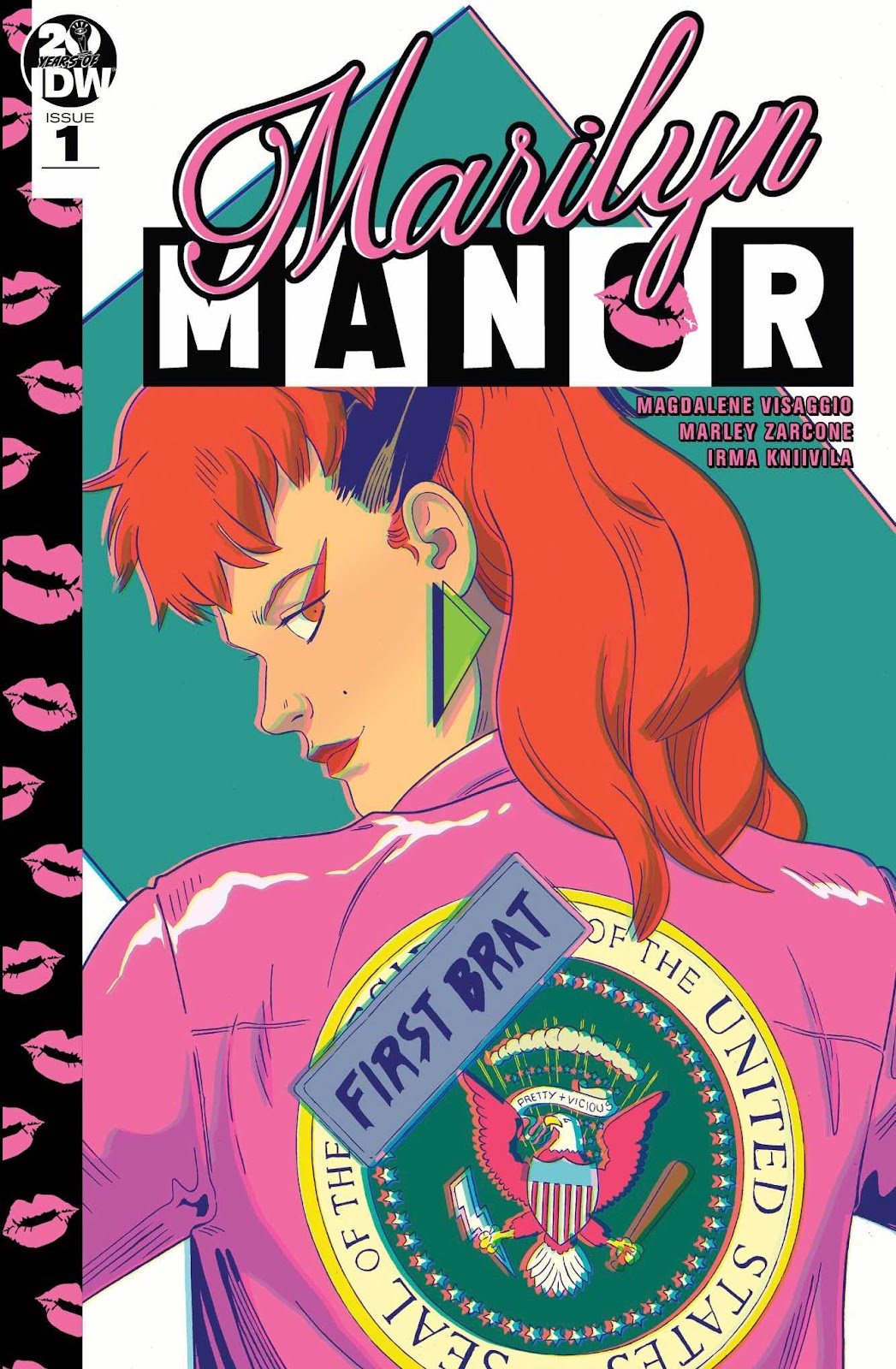
Marilyn Manor - issue 1.


Writer - Magdalene Visaggio.

Art - Marley Zarcone.

Cover Colours - Tamra Bonvillain.

Interior Colours - Irma Kniivila.

Letters - Jane Heir.

Edited by Shelly Bond


21 pages - £2.99 - 21 pages 


Here is what ComiXology enthusiastically tells us about this issue;


 ‘Where were you in ’81? When the White House goes dark for 17 days in August, the president’s spoiled daughter and her best friend Abe—who claims to be possessed by the spirit of Abe Lincoln—throw a rager at 1600 Pennsylvania Avenue, unearthing long dead historical figures and government secrets that are better off buried. Sex, drugs, rock 'n' roll séances, and secret passageways lead to time-bending mystical romps where past and present collide. But at what cost to Marilyn Kelleher, the world at large, and music television? Uniting the red-hot Eisner-nominated talents of writer Magdalene Visaggio (Eternity Girl, Kim and Kim) and artist Marley Zarcone (Shade, the Changing Girl; Effigy) for the first time, MARILYN MANOR explores identity, classism, appropriation, and friendship. It’s a rollicking, neon party gone out of bounds when we need it most—set just in time for the greatest pop cultural marriage to date: MTV.’


A quote from Visaggio at the time of release said; “We've been trying to capture the feel, the excitement, the energy of the rise of the New Romantics, of the decade that embraced excess and excitement in hugely over-the-top ways, and filled it with chaos and insanity. This is the weirdest thing I've ever written in the best way possible, like an apocalypse directed by John Hughes."


The Review - I’ve seen this issue reviewed like it is the second coming on a certain unreliable comics news site that I’m sure we have all heard about. I was lucky as I went in knowing that this was the first issue of a series that was quickly cancelled and many would not know this. To be fair the cancellation wasn’t due to the quality of the book but rather that the imprint was quite suddenly closed. This is however on a number of levels in art and storytelling an unconvincing and apparently rushed issue. I also lived through the era of the New Romantics that Visaggio mentions - she did not and that really shows. Nothing at all rings true and it’s an exercise in creating something I suppose, I’m just not sure what exactly.


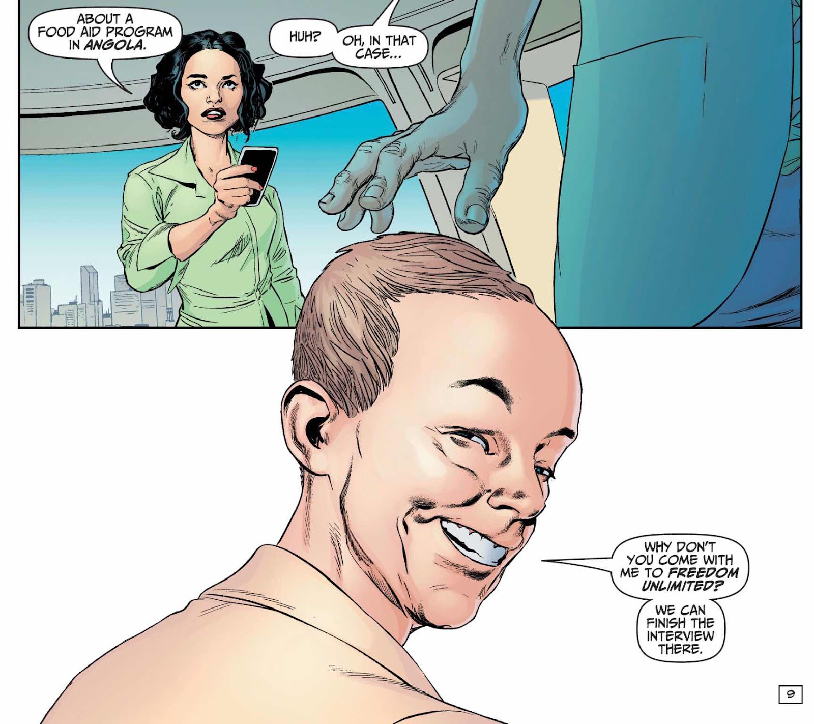
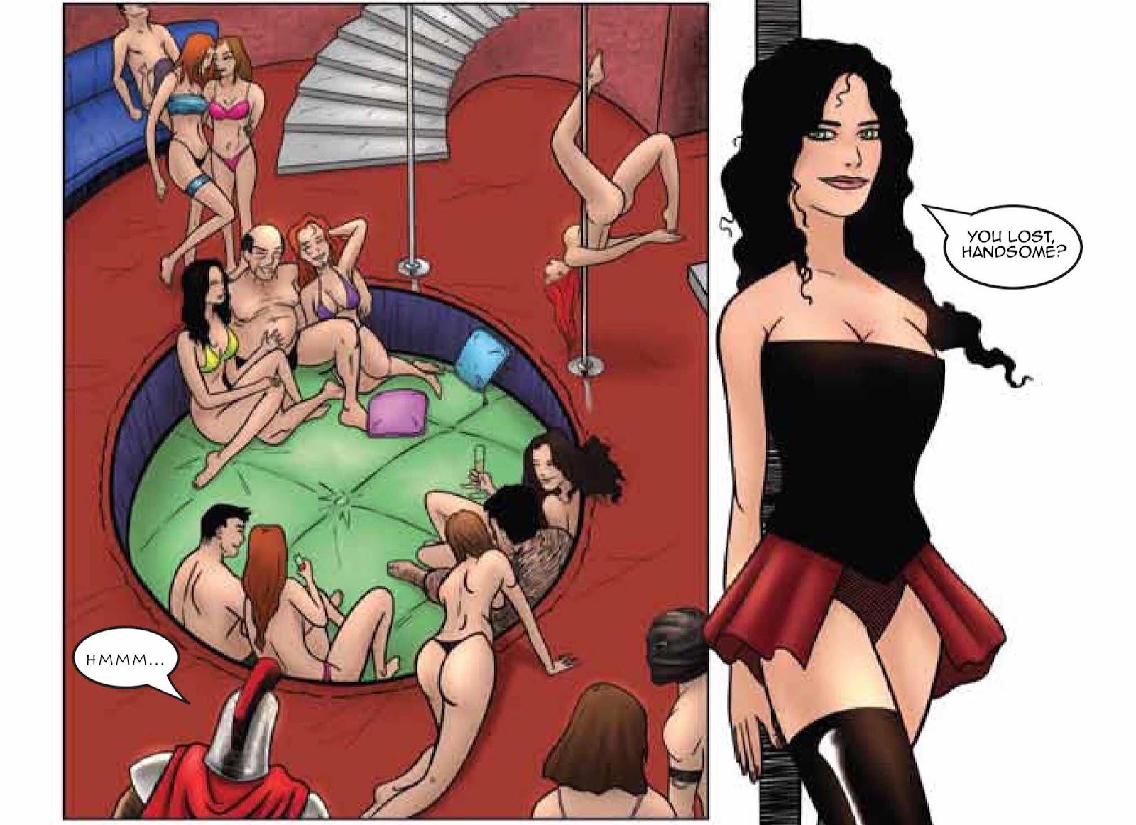
The story shows the rebellious daughter of the president and her plans to host a party in the White House. She discovers a secret underground passage and then it all starts. Marilyn dreams of Madonna and Monroe and they discover an underground sex room. And that is pretty much it. 


The dialogue echoes nothing of the era and not a single person comes off as real. It’s like someone watched a Hallmark movie and decided to do their version of the New Romantic movement and a rebellious princess story. The New Romantic element seems to be just just about mentioning that ‘Adam Ant’ and ‘Billy Idol’ are at the party with some clothes copied out of an issue of Smash Hits they had laying around. There’s none of the danger or edge that at least some of the movement in the early days exhibited. 


I actually find the following almost too embarrassing to write about but...... The Sid Vicious analogue character (who barely does anything at all) is even called ‘Harry Sykes’ - god help us! Who wrote this? Twelve year olds?


The art lacks detail and any kind of personality. With books like Eve Stranger, Punks Not Dead and Euthanauts the Black Crown line has had some real artistic high points. This is just under drawn and I suspect rushed out as the creators may have suspected the second issue would not be forthcoming. The colour also suffers from being flat and dull and genuinely uninteresting.


The question should also be asked of IDW that if you knew going into the release of this book that there wouldn’t be any more - why, oh why was it released at all? It’s worth noting at this point that although this comic is listed on the Black Crown page on ComiXology the actual cover shows it as an IDW comic.


No links - don’t bother looking for it.


Many thanks for reading.

Wednesday 1 April 2020

In Review - ‘X-Liefelds issue 1’ from Keenspot Comics


X-Liefelds issue 1.


Written and Edited by Rob Potchak.

Art by Rob Nikolakakis.

Inks by Eric Kent.

Colours by Michael Sanders.

Letters by Mike Rosenzweig.


Released digitally 01/04/2020 (Released physically 17/7/2019.)

28 pages - Full Colour - £2.99.

Published by Keenspot Comics


The Story - ‘Rob Liefeld is beloved for creating some of comics' most memorable characters of the last quarter-century... but he also created some forgettable ones. In this twisted tale of spoofery from the creator of Junior High Horrors, Liefeld's rejected, forgotten creations find inspiration from their creator's own stories and travel back in time to jealously stop his greatest characters from ever becoming popular. Join BludStayn, Pytbull, Treadmill, Yardwaste, and X-Tra as they attempt to prevent Livestreme, Checker and the man known as Coax from achieving pop culture immortality. This parody is so Extreme, it's Awesome!’


The Review - Listen! I’m no Rob hater. His style of art could never be called one of my favourites and I think he’s been responsible for quite a few artistic shortcuts in at least the last decade. But over the last few years I’ve enjoyed his podcast interviews and they’ve provided some nostalgic memories of a comics era that was both good and bad in equal measures. So, full disclosure, I bought this for a bit of a laugh and to cheer me up during  another lockdown week.


My expectations were not high and whilst the cover is pretty well drawn and with a sense of humour it’s some of the following comic cover homages that really do not hit the satirical or figure drawing mark. In fact most of them look amateur in the extreme and really bring down the overall quality of the issue. In fact if they had to be used they would have been better putting them at the end of the comic.


It takes a few pages to get to the actual story and thankfully it’s not too bad and certainly in keeping with those heady days of early Image Comics. It’s also done with some sharp-tongued humour that I whole-heartedly approve of straightaway. They roll through ‘Rob Jokes’ with a non-stop speed. 


It’s a little cruel and I feel a little guilty for enjoying it.


You get Liefeld centric gags about his characters suddenly changing size, having too many pouches, lazy designs, desperate to be friends with actors, interminable time travel stories, flakey and ill-matching teams, weird grimacing whilst talking and so on and on. There’s even a movie poster or ‘Rob Liefeld’s X-Blood’ looming over the teams as they fight.


‘.....bodyslide by 5!’


Much of the art isn’t perfect and backgrounds are a rarity. It is also a really short read with no proper story ...... funny that isn’t it! I can’t recommend that you buy or read it really. It’s just a comic I bought, I kind of regret spending the money and I’ll be reminded that I posted this review in six months and not remember anything about it at all.


Oh well.


You can find more of the comics published by Keenspot Comics over at their site here http://www.keenspot.com/ (I wouldn’t recommend it - the website is horrible). Or find them on Twitter @keenspot


Many thanks for reading. 


In Preview - ‘Reanimator Incorporated’ Chapter 1.


‘Reanimator Incorporated Chapter 1’


Written by Andy Perry.

Art by Lyndon White.


Story Editors - Fred McNamara and Chris Holmes.

Copy Editor - Jack Jennings.


Softcover - US Comics Size.

Full Colour - 62 pages.


The Story - ‘Reanimating the dead requires some serious soul-searching. In a moment of fantastic whim, I whispered questions to the reddening ears… “Where have you been?”


Bloody-minded scientist, Herbert West struggles to reanimate the dead, while his partner, Cain struggles with the morality of their morbid task. Under mounting pressure from newly appointed CEO, Erica Lee, West’s determination to perfect his atomic reanimation unit leaves his ethics, subjects and family in limbo. Meanwhile, West’s son, Mike, striving for both respect and humility from his father, makes a fatal step beyond with his experimental Tillinghast Resonator. As father and son push the boundaries of science to breaking point, ructions within the infernos of hell expose a much greater, theological threat.’


  • Warnings - This is a Preview and may contain small spoilers. Due to the current situation it is likely that the book will be getting Kickstarted in June. Then released at a convention later in the year. -


The Review - It is worth remembering that this is Chapter 1 of not just a comic but a horror comic. It does indeed spend a good deal of the time building up the story and establishing the characters that if I was totally honest did feel a little long and by the time the full on horror assault begins I was yearning for something more to happen. But it does during this time also successfully build up quite a lot of tension. Sure, this tension does ebb and flow somewhat but it’s there nonetheless.


I also feel that the cover is well worth a mention. I found it a little misleading in regards to what I found in this first chapter and it was reminiscent more of an issue of A.B.C. Warriors or maybe the movies Hardware or even Terminator. But it is a very striking image that has an iconic edge that is ideal for a ComiXology page for example. I’m hoping we see more of this image and the skeletons character it shows in Chapter 2.


The story is however well told and the characters in the most part are well realised and engaging. Personally I think that a story told in issues like this could really do with some more action front-loaded to keep the readers engaged. The ending takes quite a turn stylistically and is the most visually stunning part of the book by far. Lyndon carried out some bravely choreographed scenes with his usual style and clearly constructed visuals. His characters have an everyman appearance but I’d like to see a touch more detail in the faces from time to time - for example the father and son don’t look that distant in age. 


There is a distinct style of colouring to these pages that I immediately noticed. They boldly direct almost a theme to each sequence. The meeting in the conference room and the streets of the city use a watercolour red and pink as if the world is ending and the skies are bleeding with the rapture. Whilst the laboratory scenes often have an underwater blue or a glowing green - colours of nature and the wildness of it perhaps. But as the laboratory experiments accelerate the red begins to seep into the panels. It’s a genuinely intriguing approach.


The early slowness of the book is easily forgotten as you read the last act. There’s a lot to take in there including that clash of religion against science that is talked about earlier on. This will hopefully set up for a celestial confrontation going forward and there is one page where a ‘being’ is shown that was outstandingly realised! The dialogue also has an individual voice and I could tell the different personalities from just what was said.


I’m not as acquainted with Andy’s writing as I am with Lyndon’s art but I can say that this looks and reads like a slick and professionally produced start to a series. The uneven pacing is something that I am sure will improve going forward and with a couple of story editors on this I’m sure they will sort it out.


Watch out on Kickstarter in a couple of months for this book dropping.


You can find Lyndon on his twitter @lyndondraws or over at his site here http://lyndonwhite.com/


Andy Perry can be found here on Twitter @Quaktion 


Many thanks for reading.