So. The findings.
At the risk of offering my head to the block of raging Joe Public stupidity I decided to venture out on Honest Review Month. Being a comics creator myself I was aware of the karmic dice roll I was chancing. I even wrote an angry mission statement spurred on by the fawning infants who were lauding certain deplorable attempts at comic making as awards worthy. I wont repeat that diatribe here but some thirty-five reviews and one month later I’m going to have a think about what I discovered about comics, their creators and myself.
I got sent a lot of comics. Some of which I have not yet got to for a review. (For those waiting please hang on in there, they’re coming.... soonish). I got some great comics and some pretty darn bad ones. I had, at various times during the thirty-one days, to remind myself that this was an exercise in reviewing what I was sent and not just what I fancied reviewing. I also had to steel myself and plough through some comics that were really not the sort of style I normally read but also that were often of such bad art and a story that they were very difficult read.
I made up rules for myself. I would post each review twice and I would not ‘at’ (aka @) overly critical reviews towards the creators (that always seems unfair). This is something I myself have fallen prey to, where a reviewer sends multiple messages to the creator with their review attached hoping for a retweet to promote their own particular brand. I also told myself that one post on Facebook was enough and apart from a ‘half-way through the month’ post in the Awesome Comics Podcast Group I didn’t repost anything there either.
I also felt that I had to be honest. This did in a few late night and exhausted moments stray into sarcasm but hey I’m only human. I also made sure that if I had been contacted by a creator I replied with the link and a short line on my opinion. Something akin to, ‘I’m afraid I found a number of flaws’, or ‘It’s not a very positive review I’m afraid.’ I felt that if I had the forthrightness to post a review I should also have the balls to tell the person submitting the comic what I thought.
I also chose in four separate occasions after a sensible discussion with the creator to give a personal and not a publicly posted examination of the issue in question. I approached this differently each time and gave a more page by page analysis than a ‘For the public’ style summary and breakdown. I’ve been doing some editing work recently and found that everyone I spoke to was keen to get that type of help. Perhaps that is something I may post in the future with the creator’s permission?
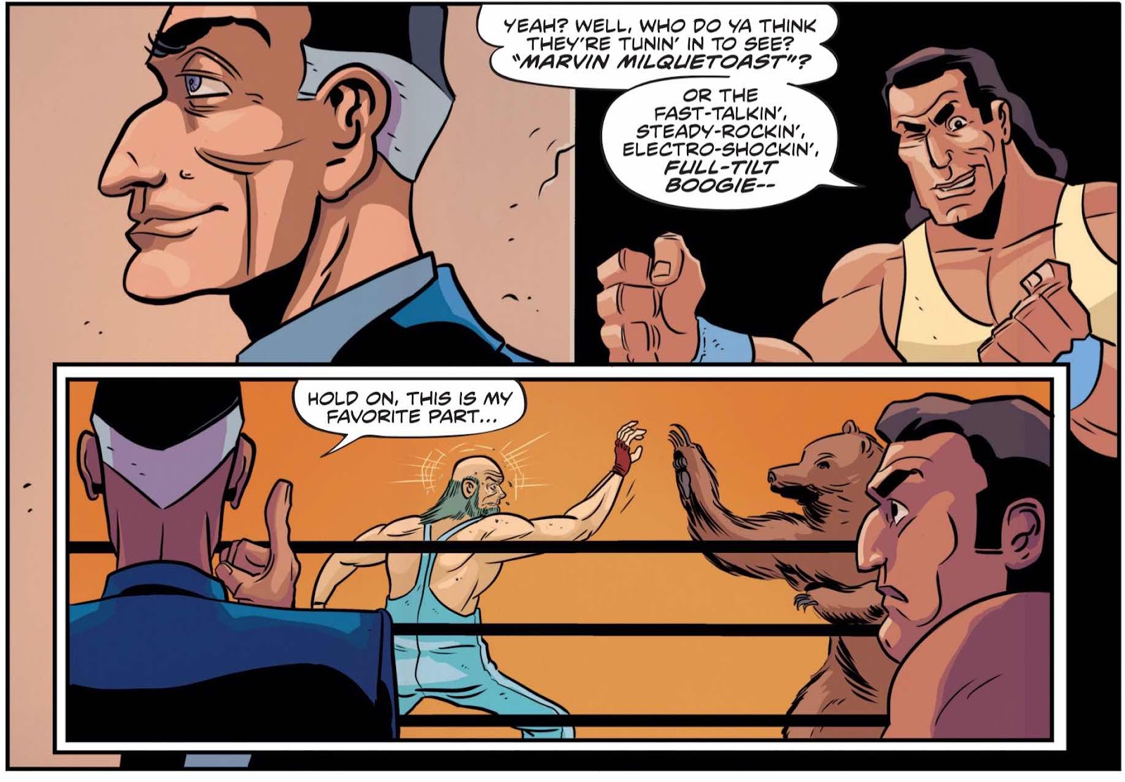
Due to an American holiday and some keenness in getting items posted I actually wrote some 35 reviews. Some comics were about to be released or Kickstarted and some got posted due to jet lag insomnia. I never felt that I was running out of material but went a couple of times for a palate cleanser with a comic that didn’t have the weight of an artist’s expectations hanging over me. The Punisher review is an example of this.
Speaking of expectations I genuinely feel that some people wholeheartedly believe that their comics are the best thing since cheese. I got at least a couple of review requests where that creator in particular strongly believed their work was perfect and on one occasion virtually compared it to the second coming! I didn’t find anything that was perfect but some were very close. Some though wouldn’t be able to spell the word or even get close to recognising it written in toilet cubicle.
One common failing was a severe lack of originality. One piece of advice I’ll suggest is don’t be derivative and do please, please, please come up with your own ideas. Too many people think ‘I’ll do an urban vigilante story’ or ‘I’ll do a unicorn story’. In basis that’s not a crime but failing to think beyond that basic theory and making a comic so dull it makes my balls itch is clearly a hangable one. This can also be very relevant in the dialogue, I recently read an indie comic (that I came by through a colleague but didn’t get a review posted as it wasn’t actually submitted to the blog) that was a space comedy. OK you might think, as did I, ‘that’s quite acceptable’ but it came with jokes so groaningly bad that I actually think they were stolen from a nineties Kevin Smith story. (Saying ‘Nerfherder’ stopped being funny before the job of herding nerfs was invented!).
Which takes me to one simple fact that applies in life as well as in comics creation.
If you have nothing to say keep your trap shut! Getting words on a page and cramming then into a comic does not a comics writer make you.
Learn your trade. Look to the good examples of comics making. These are not to be found in ‘The Guide to Guerilla Filmmaking’ or ‘Film Scripts 101 by David Mamet’. They are found in comics. So many of the scripts and comics I have read recently have been created by people who clearly know nothing of the medium. Knowing about comics, knowing about how they are created, knowing about what has been done well and badly IS REQUIRED! It seems like people just decide they are a comics creator and wait for the Eisner to roll on down their driveways while they wipe the excrement from their keyboards and mouths.
One more piece of advice - if you aren’t sure of what you are doing then please get an editor. This is simple. Many people are unable to see the wood for the trees when deep into a project and even if its just someone to bounce ideas off it can be very useful. We’ve interviewed quite a few full time editors on the pod over the years and I would say that often a second eye and one that can pay attention to the detail is of real worth. Chat through dialogue and structure and even format.
Whilst we are on the subject of dialogue I’ve noticed a fashion to overwrite. Especially in those who are producing one of their first comics. A writer, in my humble opinion, needs to think about stripping back language to make it realistic. We rarely speak in paragraphs. Also remember that a page full of writing can be a real chore to plough through. This criticism came up an awful lot and there are a lot of people who should know better.
The response to this approach can be looked at in a number of areas. The first is from the average comics reader who looks at my posts for recommendations or entertainment. Because of the small nature of our hobby there is an obvious crossover with creators who are also readers and whose books I hadn’t reviewed. Over the month I got quite a number of messages of support and agreement. Nothing negative apart from one funny bastard who suggested that I review my own comic. Sure there were a few choice comments I made that got repeated but on the whole people were supportive of what I was doing.
I also got some emails from other podcasters and reviewers. One in particular admitted that they had not been as hard as they possibly could/should have been on one of the books I reviewed. We talked about it and this brought out some interesting points about a ‘Review’ compared to a help with ‘Promotion’. In the promotion of a comic it isn’t always right to comment on quality necessarily but conversely you are putting your name or stamp on something you might not want to. It’s a really interesting distinction. One that I intend to think some more on.
Finally, the one you have been expecting, the response of those I have reviewed. The people who got mostly positive reviews were of course happy and would, on occasion, reply stating that. For those who I was more critical of I am very happy to say that I did not receive a single angry reply. When you post something critical in this internet world you hold your breath and wait for the bounce back. All I got where messages of thanks or simply radio silence. I did have to laugh though when after one highly critical review and no response I then got a mailer from the writer asking me to back their comic on Kickstarter..... It’s been, in the most part, really adult and I have tried to add moments of positivity in even the worst of the lot. Although sometimes that equated to going to a friend’s gig and telling them afterwards what great beer the pub served?
Let’s examine the numbers game. Without boring you with the specifics I can say that this month has been the biggest month on my blog in the nine or so years it has been in existence. It’s actually been over twice the audience of any month so far. The post numbers have fluctuated and whilst some of this equation may be down to the times of posting it is extremely noticeable that the more critical pieces are by far the most popular by at least around a half again in views. Don’t worry I wont be using this as a way of getting my ‘Brand’ out there but it does make you realise why some sites court controversy to get hits.
The top three posts where as follows;
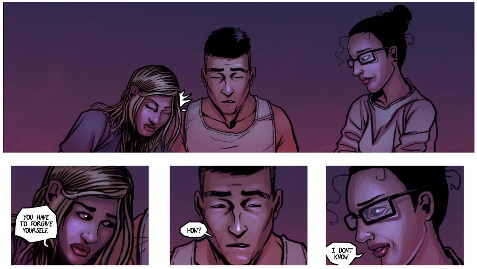
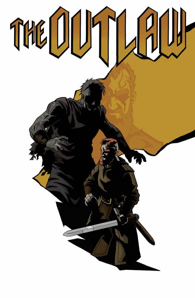
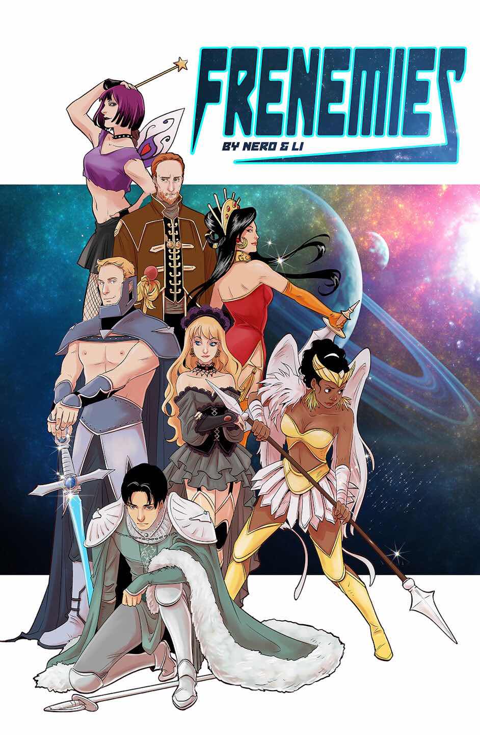
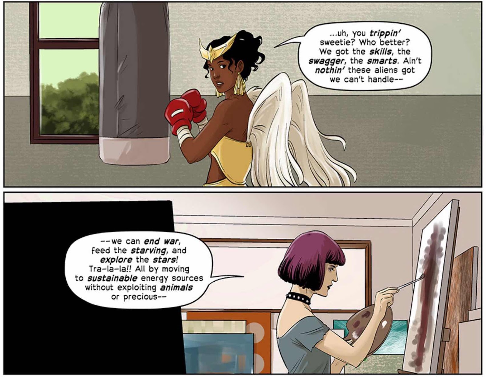
- ‘Frenemies - issue 1.’
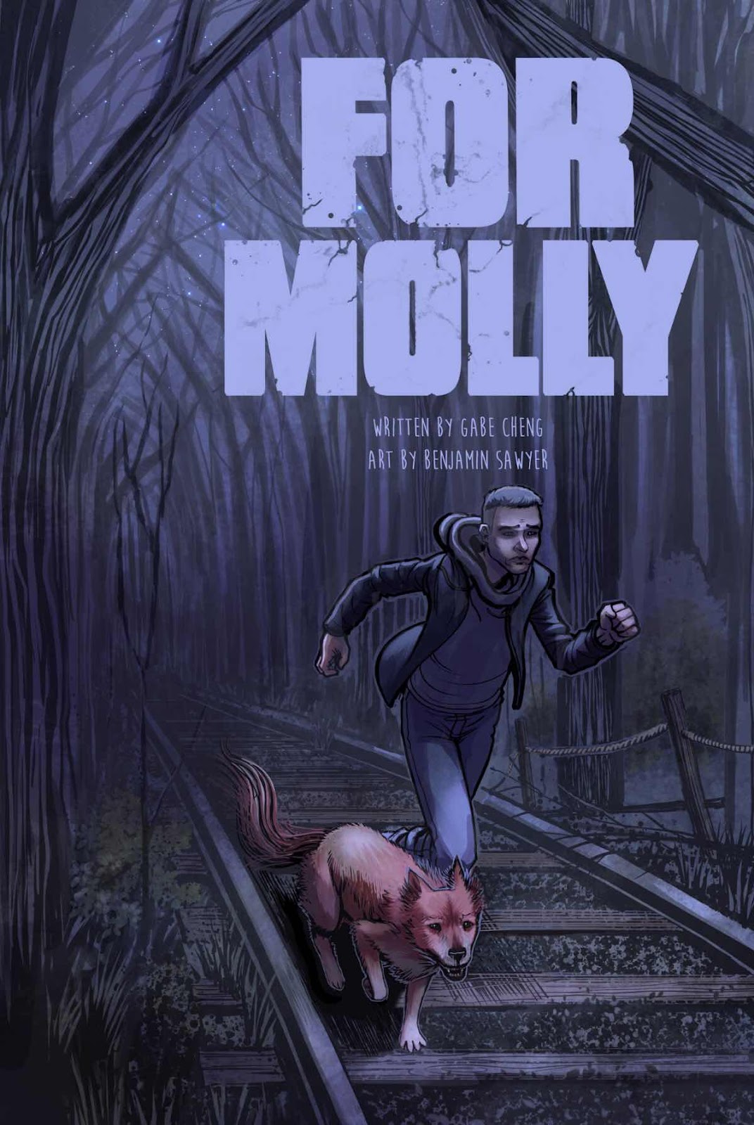
- ‘For Molly - issue 1.’
- ‘Experience the Magic of the Legend: Excavated Esoterica.’
The demographics of submissions is worth a short mention. Whilst I got submissions from female and male editors it was noticeable that not one female creator submitted her comic to me. I have no answer why this was as I have a pretty mixed and diverse readership from what I gather. The split in nationality was also pretty broad. I also tried to hit all the various tribes and areas of comics and even tackled an LGBT+ romance book which is something I don’t often review or even read. Interestingly I also didn’t get many from the more ‘Ziney’ side of the hobby. I can happily say that this month has opened my mind to a few different genres and reading possibilities going forward.
Benefits that I can see from this approach on reviewing? Hmmm. I genuinely feel that bad comics will kill our favourite medium. Very rarely is a comic considered anything but GREAT in this modern world seemingly. And as I said before this non-stop self congratulatory circle jerk will hurt us and make comics eat itself. Comics will go away. New readers will open a comic and be confused as to how any intelligent human being could possibly think that what they have open in their hands is any good. Even as a daily reader and a weekly visitor to a comic shop I feel the shiver when I open certain comics hoping that nobody else saw me looking at them and take that browse as a visual recommendation.
We need to examine what we do. Without that constructive examination there will be a lack of growth. Sure you can personally learn as you create but sometimes you are missing that crucial clarification by being too close to the work.
I will be honest and say that on some of the days in this month of May I have felt jaded and needed a good push to read and review certain titles. I suppose that’s human nature. But I truly believe that it has been beneficial to myself and some of the creators who submitted work. I intend to continue with this honest approach and hope that not everyone hates me!
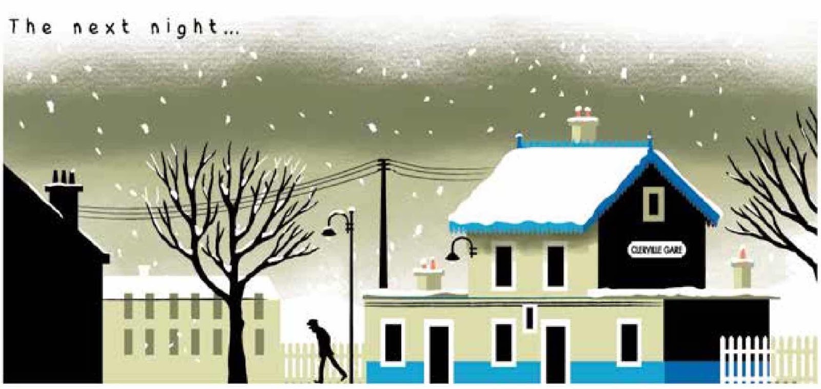
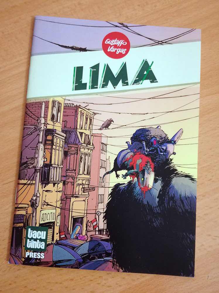
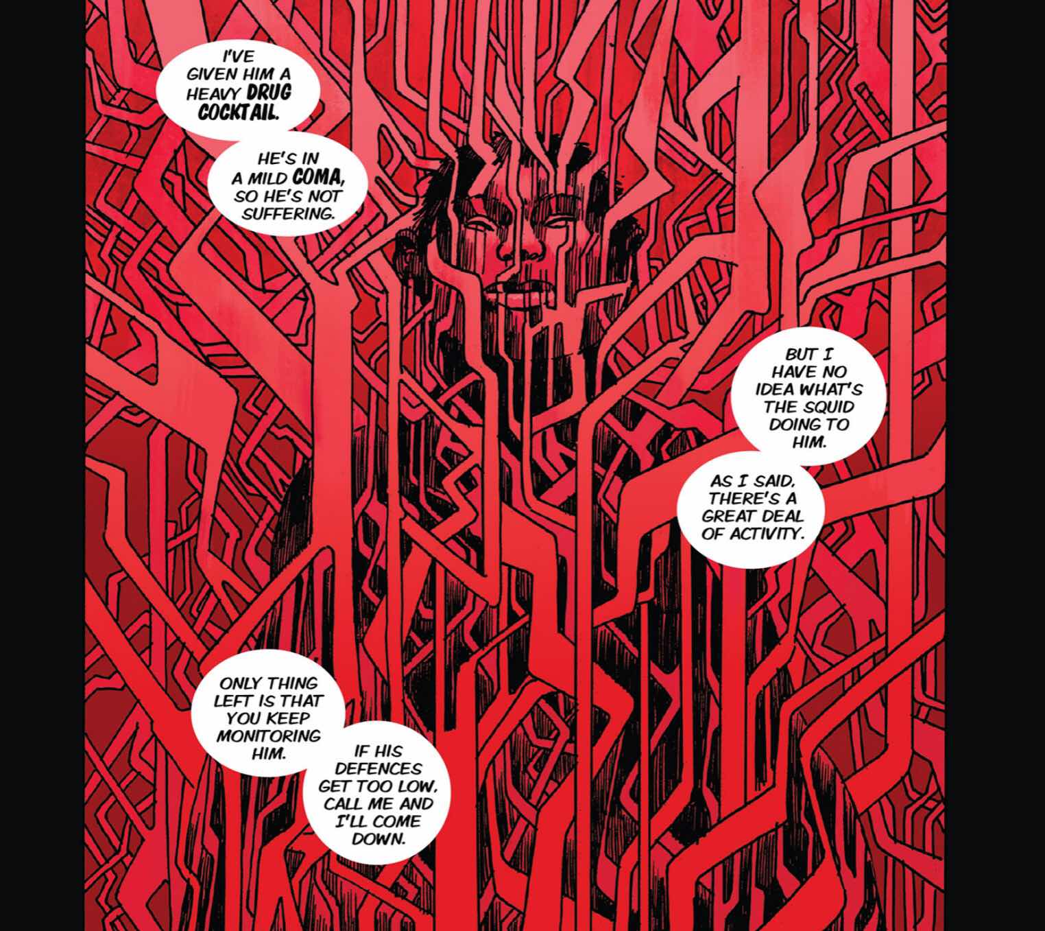
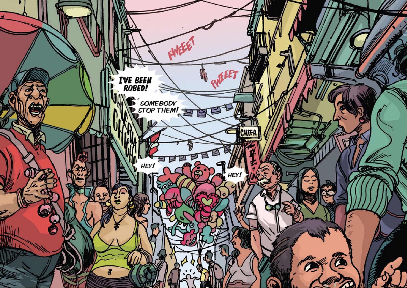
For the Record my favourite three books for no particular single reason from May are as follow;
- ‘Maggie Garrisson’.
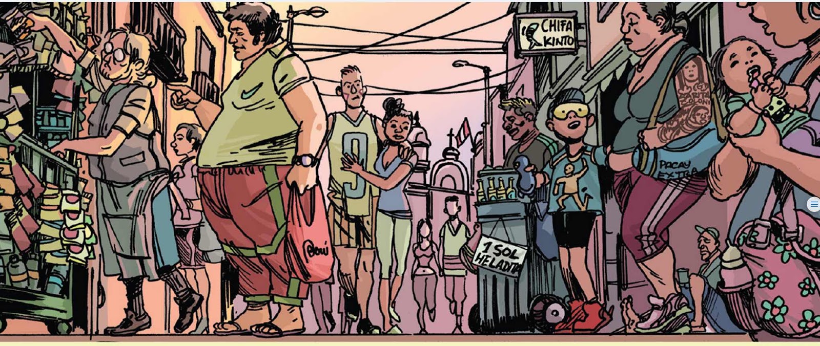
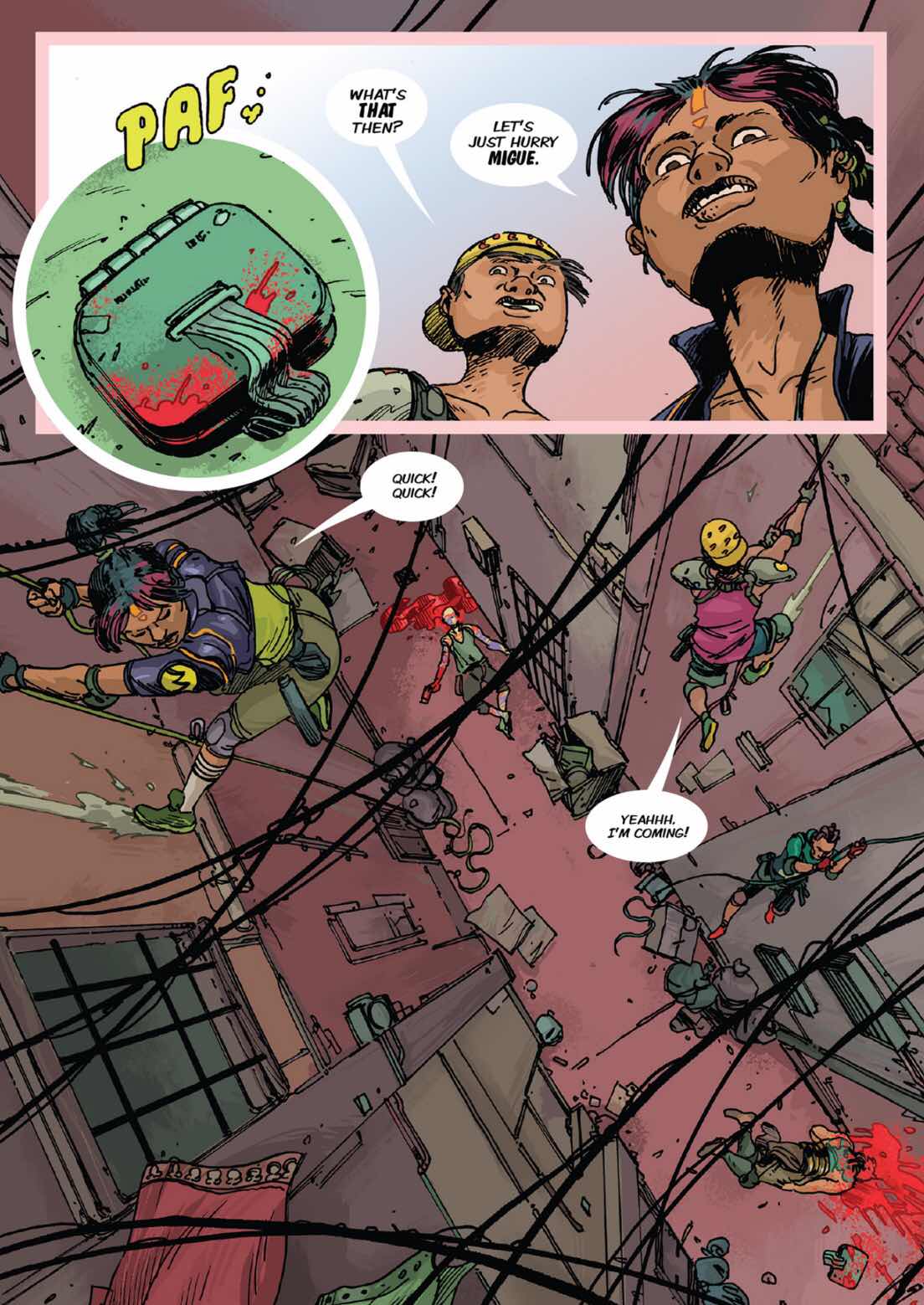
- ‘L1MA’
- ‘Black Iris.’
Now to finish that script ........
Many thanks for reading.