
‘Sprouting and Other Tales of the Curious’.
An anthology written by Asa Wheatley.
Art by Sammy Ward, Michelle Marhan, Kat Willot and Emma Gravelling.
Currently running on Kickstarter here https://www.kickstarter.com/projects/asawheatley/sprouting-and-other-tales-of-the-curious
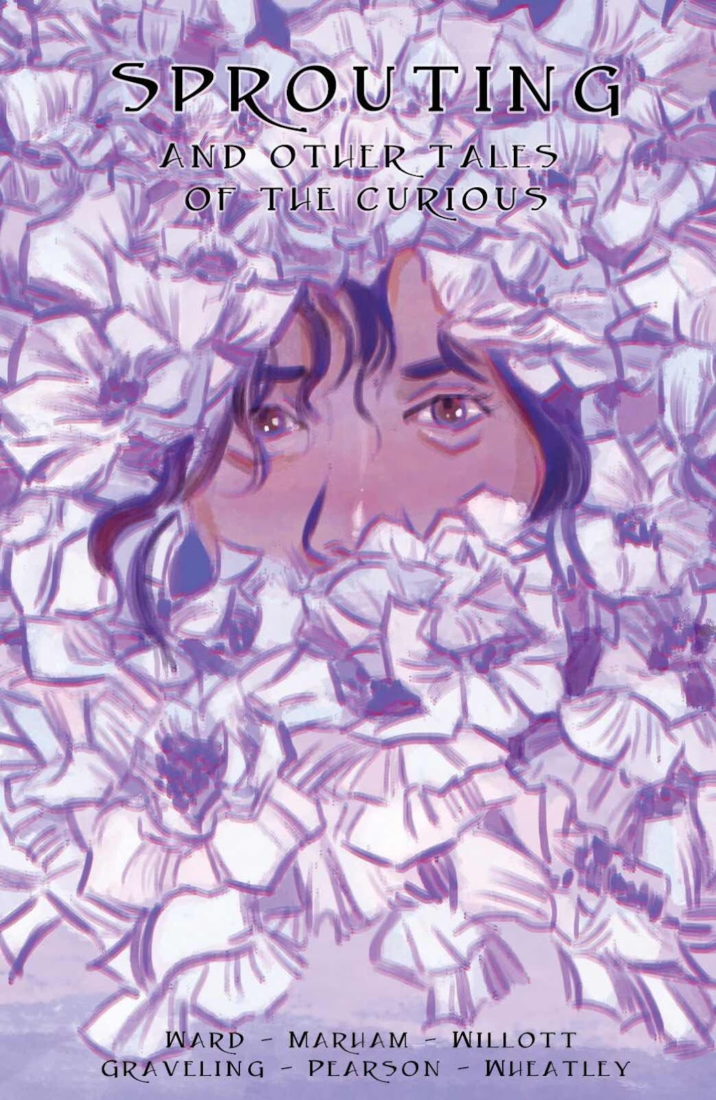
This is an anthology title that Asa Wheatley, who has written all the stories, sent me this week. The writer has gathered a number of artists for this endeavour and this comic consists of three stories and one text piece with illustrations. I loved the cover idea of the character peering out at the reader. An image that would definitely make me reach for it on the shelf.
I thought that I might take each story and give it a spoiler free (as best I can) review.
First up is:
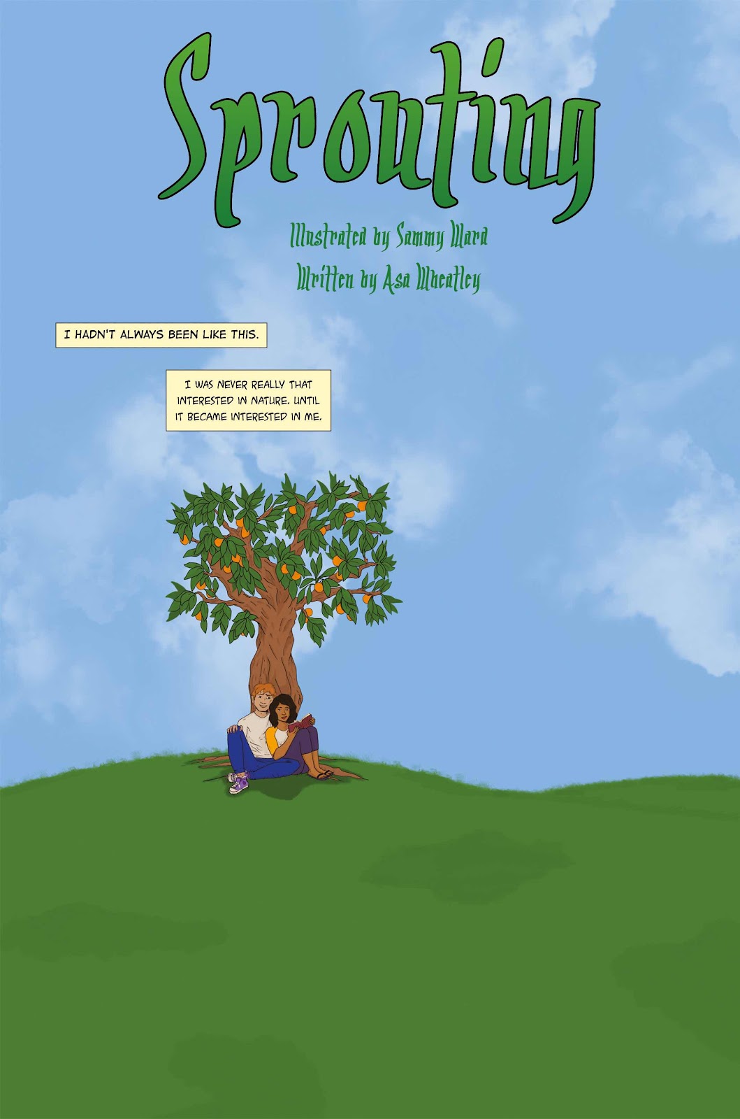
‘Sprouting’.
Art by Sammy Ward.
This is an environmental folk horror that has an interesting premise. It is a solid story and probably the best art of the anthology. It has a number of well paced twists and ends on a satisfying note.
It is bookended by the same image and I have to admit that beyond a rather trite and obvious reason I can’t work out why. It includes nudity as well but this is completely in keeping with the story and never strays beyond what is required.
The art reminds me of a solid looking webcomic but moments could do with some anatomical corrections (especially in the first couple of pages). The colouring could also do with some more rendering and there is a grass effect that looks like it’s been applied with a scrubbing brush and distracts from the scene and simply doesn’t work. Some of the big blocks of colour are often too bright especially on a tablet screen.
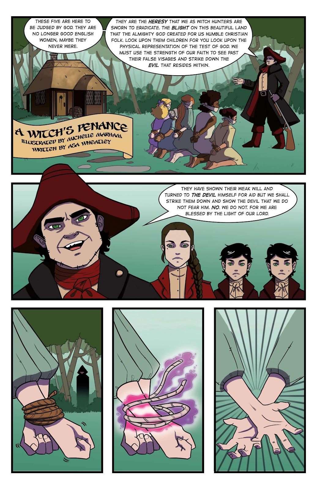
‘A Witch’s Penance’.
Art by Michelle Marhan.
This is an historical drama with a lot of running about in the woods.
Panel one on page one of this story is incredibly overwritten and in a mechanical looking font that really doesn’t work with the tone of the story. The balloons are generally formatted badly throughout (leaving too much white space) and it may help in the future to get a letterer on board to give the whole issue a tweak.
The writer and artist seem to add characters at the start of the story in each panel and swing the camera about constantly 180 degrees so that it’s hard to keep up with who is who. The art works well enough but suffers on occasion with a lack of background and a bright single colour added behind the characters instead of trees and olde worlde houses or something similar. The below child also seems to have a strangely huge hand?
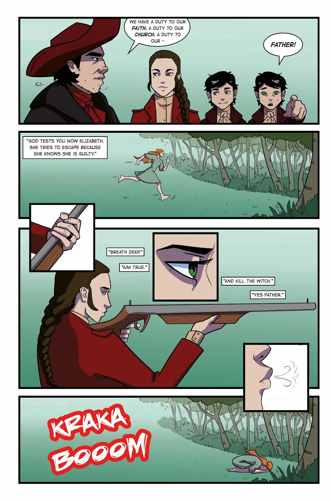
I lost track a little of so many characters and all the running and chasing. I think that this suffers from having too much story in too little pages. I would also add that in a setting that should be full of dirt and grime this has a lot of very fresh faced individuals with similar facial features. I’d love to see this artist add more lines, more character (maybe a touch of the grotesque caricature where useful) and tone down that colour palette.
One of the pages works fine however in general terms and that’s the one (slight spoilers) where the villain has one of the heroes caught against a tree in the forest. This has just the right amount of pacing and words, although it suffers from a reveal that doesn’t show enough of the character in the panel/setting.
Next up.
‘Hanging in the Darkness’.
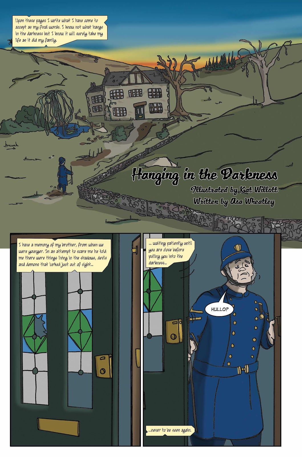
Art by Kat Willot.
This is a good try at a Victorian haunted house story. It has a likeable central character and a twist in the ending conclusion. It is sadly also the story that I enjoyed the least.
It really suffers again in the art and the lettering. The art has an amateur and unprofessional look that could really do with some time spent on perspective, figure drawing and colour. I wont spoil the end but something happens that is clearly intended to have a shock quality. This is diluted due to the scene you are presented with in both the composition, it should be full and in your face, and in the actual ‘thing’ that is drawn. There’s also a real issue with an attempt at shadow and colour that could be addressed in this big panel. At a guess it appears that the pages have been scanned in and there has been no attempt to bring up the value of the blacks, the page has then been digitally coloured.
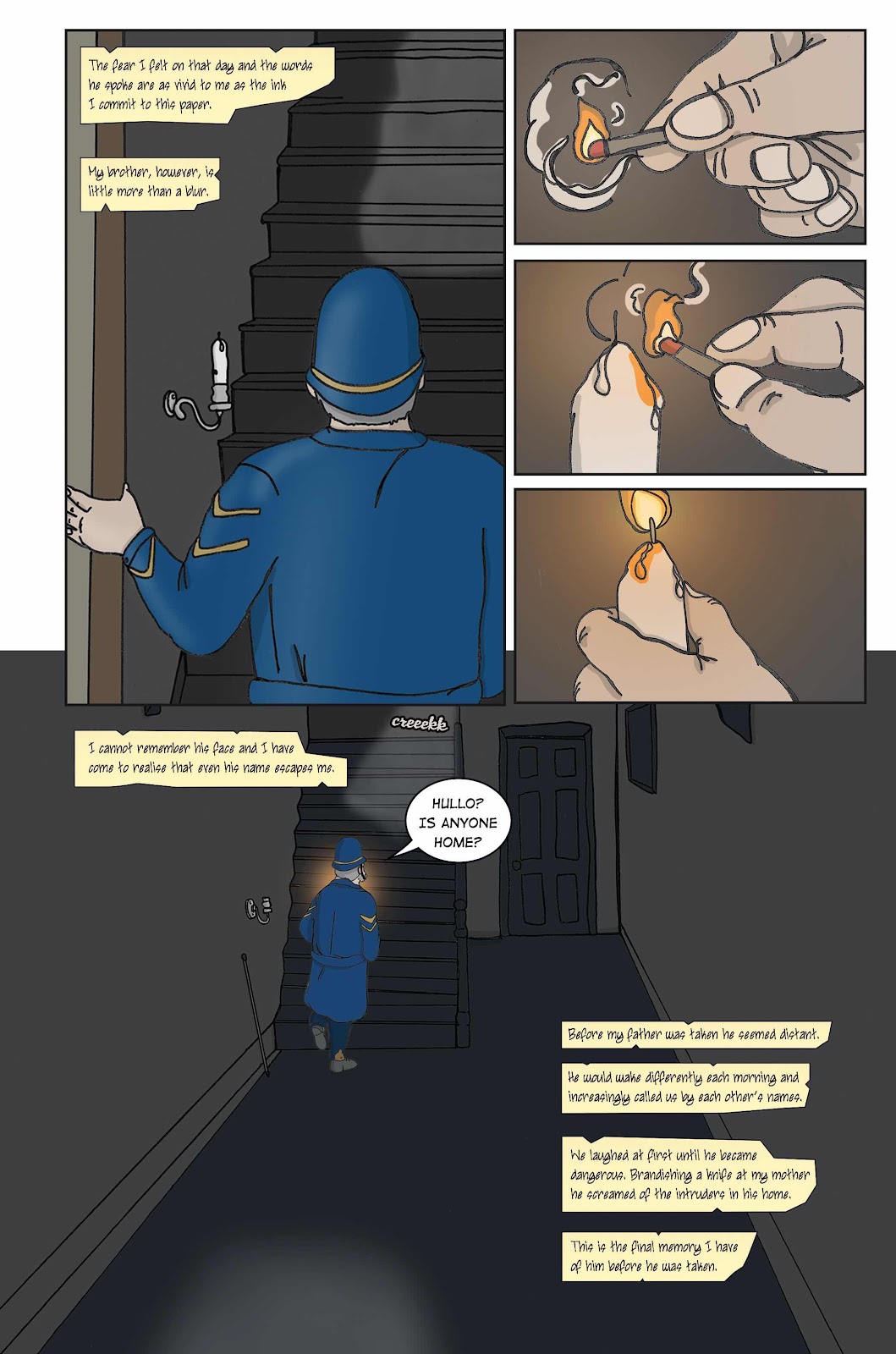
The lettering uses two separate fonts and one is a real chore to decipher as you can see above. The other font used is too far the other way and is plain and drab and dull and badly shaped.
‘Finders Keepers.’
Illustrations by Emma Gravelling.
This is a text story that I have to admit to not having read. The spot illustrations by Gravelling are great but the text itself is all in capitals and spaced strangely.
Overall this was a a comic that attempts to set up a fantasy style gothic themed atmosphere that is let down by some overwritten scenes, some lacklustre lettering and on occasion some artwork in need of quite a few tweaks.
But that’s just my opinion as it’s already met it’s amount on Kickstarter. It may be your thing so go ahead and please pledge if it is.
Many thanks for reading.
No comments:
Post a Comment