Wednesday, 25 March 2020

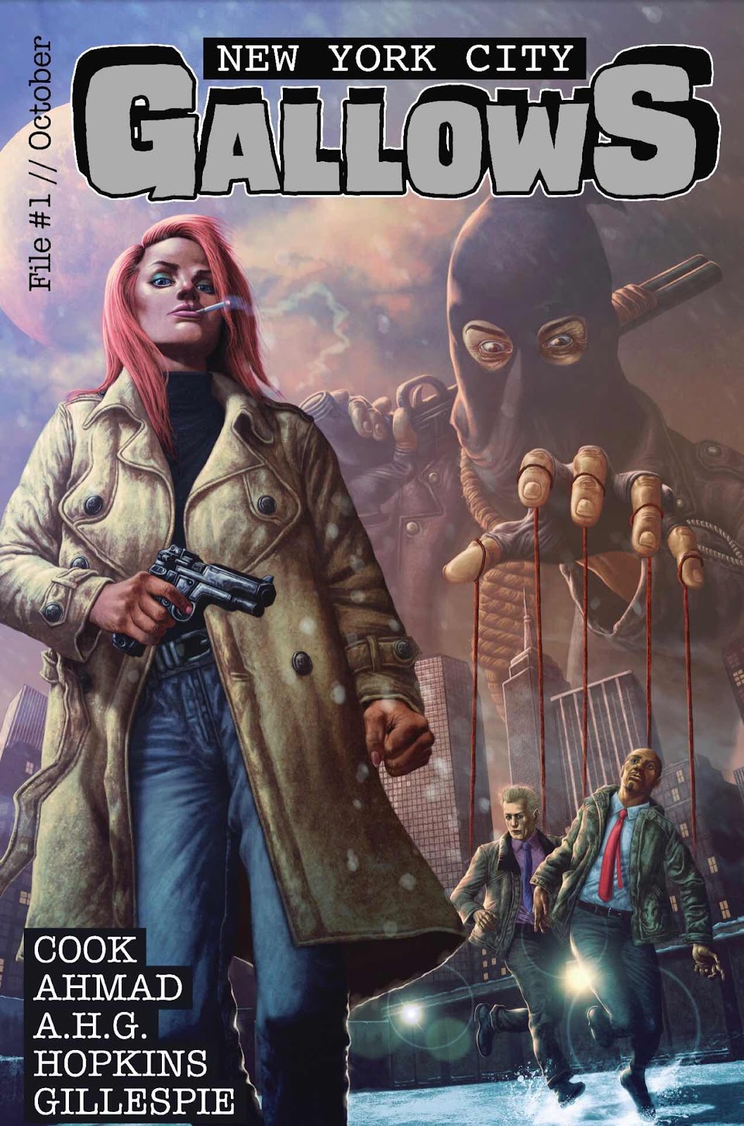
In Review - ‘New York City Gallows’ issue 1.


New York City Gallows - issue 1 

Script: Ben Cook
Art: Robert Ahmad
Color: A.H.G.
Letters: DC Hopkins
Cover: Charlie Gillespie
Logo/Cover Assembly: Jim Kersey

Available on Gum Road - £4 (Digital) £5 (Physical)
36 pages - Full Colour.

The Story - ‘Corruption and organised crime is at an all time high, eating away at what's left of the Big Rotten Apple, and Detective Cassie Delaney has just uncovered the truth. 

Cass and her partner Det. Eric Keene are hot on the trail of New York's illusive and savage vigilante, "The Hangman", but Cass is about to learn that some leads shouldn't be followed as she finds herself at the Hangman's mercy.’

This is one of the titles that are available as part of the Comichaus Digital Comics subscription.


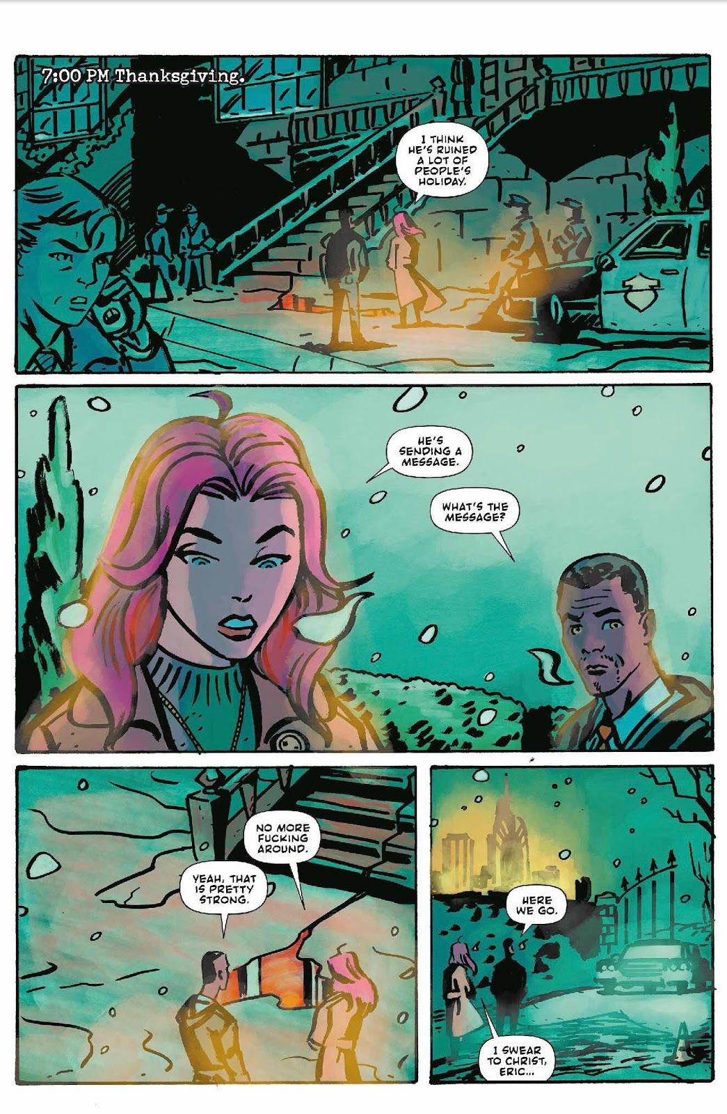
The Review - Might be a good time to talk straightaway about the cover (by artist Charlie Gillespie) to this book. It looks and brands itself like a paperback cover with the story hinted at and the main characters of issue one on show. It looks great and is the sort of cover that shows a heavy Detective/Horror street level vibe and would make me reach out for it in a comic shop (remember those?) It does not however match the art inside. The interiors by Robert Ahmad are solidly in the Michael Avon Oeming range of cartooning. As a reader I object to neither style, in fact quite the opposite but thought that it was worthy of a mention.

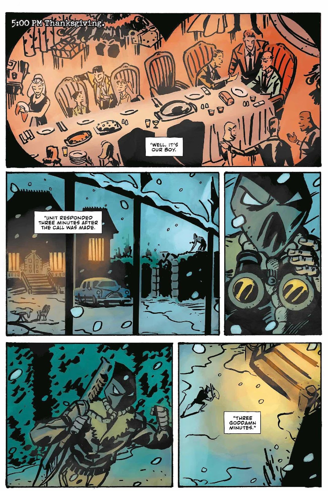
The antagonist follows that design style that we saw on DC Comics/Archie Comics and Dark Circle’s long-standing Hangman character as well as the seventies Werewolf By Night Hangman villain. There’s nothing wrong with that and the actual hanging we see in the first issue is used to a nice page turn shock effect. 

The writing flows through the comic and takes some time in building the characters. They do fall into cliche slightly - driven Detective, Family man partner, Captain who chews you out for results, corrupt narcotics officer, fat mob boss and so on. This can be used as shorthand in a story like this and I honestly found it familiar rather than annoying. I’m often critical of first issues, especially recently, that they lack action and spend time needlessly in exposition - none of this here! By the time that you hit page six we’ve already seen a few bucketloads of blood and some crafty shotgun action.
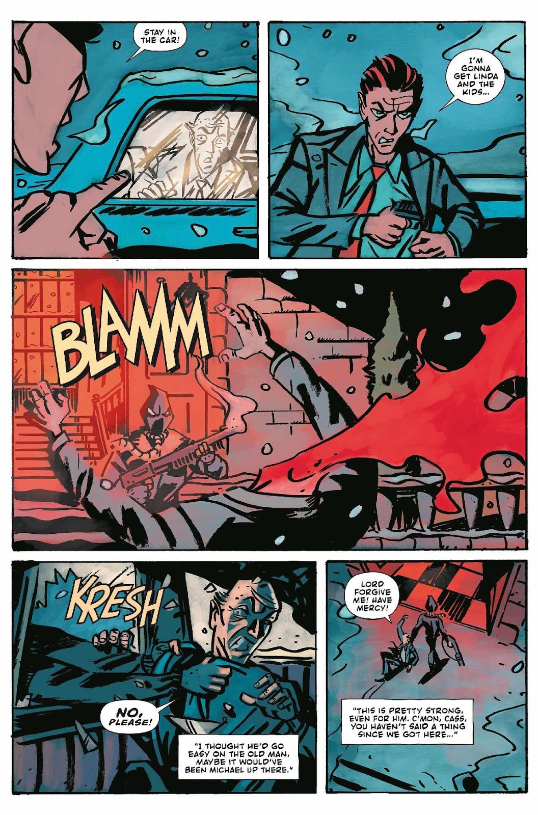

The investigation to catch the Hangman reads well although is seemingly solved with a simplicity that almost comes out of the blue and that leads me to believe there is something else going on that we are yet to see. I’m already keeping my eye on the cast to see who will get revealed as this vigilante. The issue ends on a violent cliff-hanger that has me wanting to read issue two as soon as possible.

I haven’t seen Robert Ahmad’s art for over a year at this point and he is improving in leaps and bounds. There is a genuine comparison to be made here with the aforementioned Oeming as well as artists like J Bone or even Tim Sale. He is mastering some great facial acting and even though it has a cartoony aspect the violence manages to be surprising and realistically brutal. I am however curious about some of the lighting effects in the colouring they seem to be showing a glow effect a lot, especially when Cass is in a panel. I’m curious as to whether this is part of some future storytelling twist?


You can find out more about the writer Ben Cook on Twitter @bjfranciscook and buy copies of this issue here https://gumroad.com/bjfranciscook I’m going to say that £4 for a digital copy is a little high.

You can find Robert Ahmad here https://www.deviantart.com/bedtime143 and on Twitter @rob_ahmad_art

Find some amazing 2000 AD and Warrior inspired art over at Charlie Gillespie’s page here https://charlie_gillespie.artstation.com/ and follow him on Twitter @CGillespieUK

You can sign up for the Comichaus App or visit the website here https://www.comichaus.com/ Read loads of great indie titles or if you are a creator load your books on there and start earning.

Many thanks for reading.

Tuesday, 24 March 2020

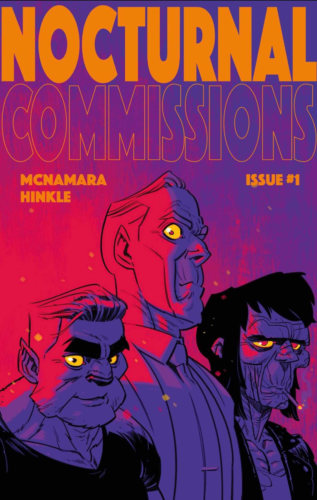
In Review - ‘Nocturnal Commissions’ from Polite Strangers.


Nocturnal Commissions.


Jason McNamara - Writer / Co-creator.

Greg Hinkle - Artist, Colourist, Letterer and Co-creator.

Paul Little - Colour Flats.


Covers by Greg Hinkle, Anke Gladnick and Jim Mahfood.


Published by Polite Strangers - 36 pages - Full Colour.

(Purchased through recent Kickstarter campaign)


The Story - ‘Are you being trolled by ghouls, pestered by the paranormal or attempting to file taxes after being resurrected? Nocturnal Commissions is the only agency with the expertise to help. A Wolfman, Vampire and a Zombie are ready to solve your supernatural concerns for a very reasonable rate (plus expenses).’


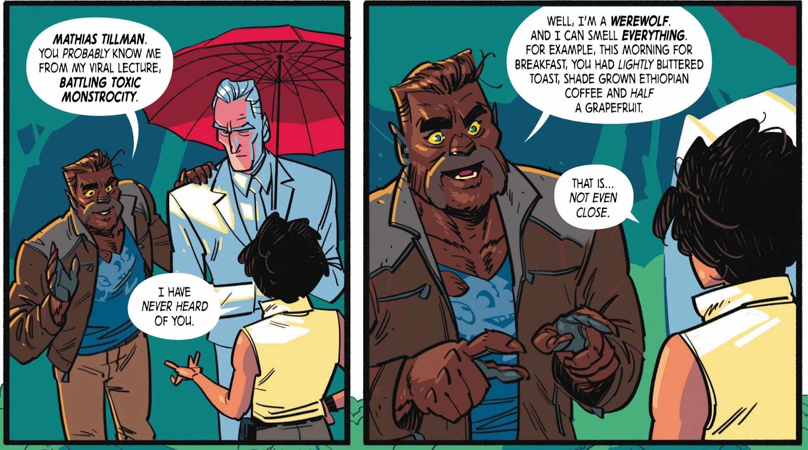
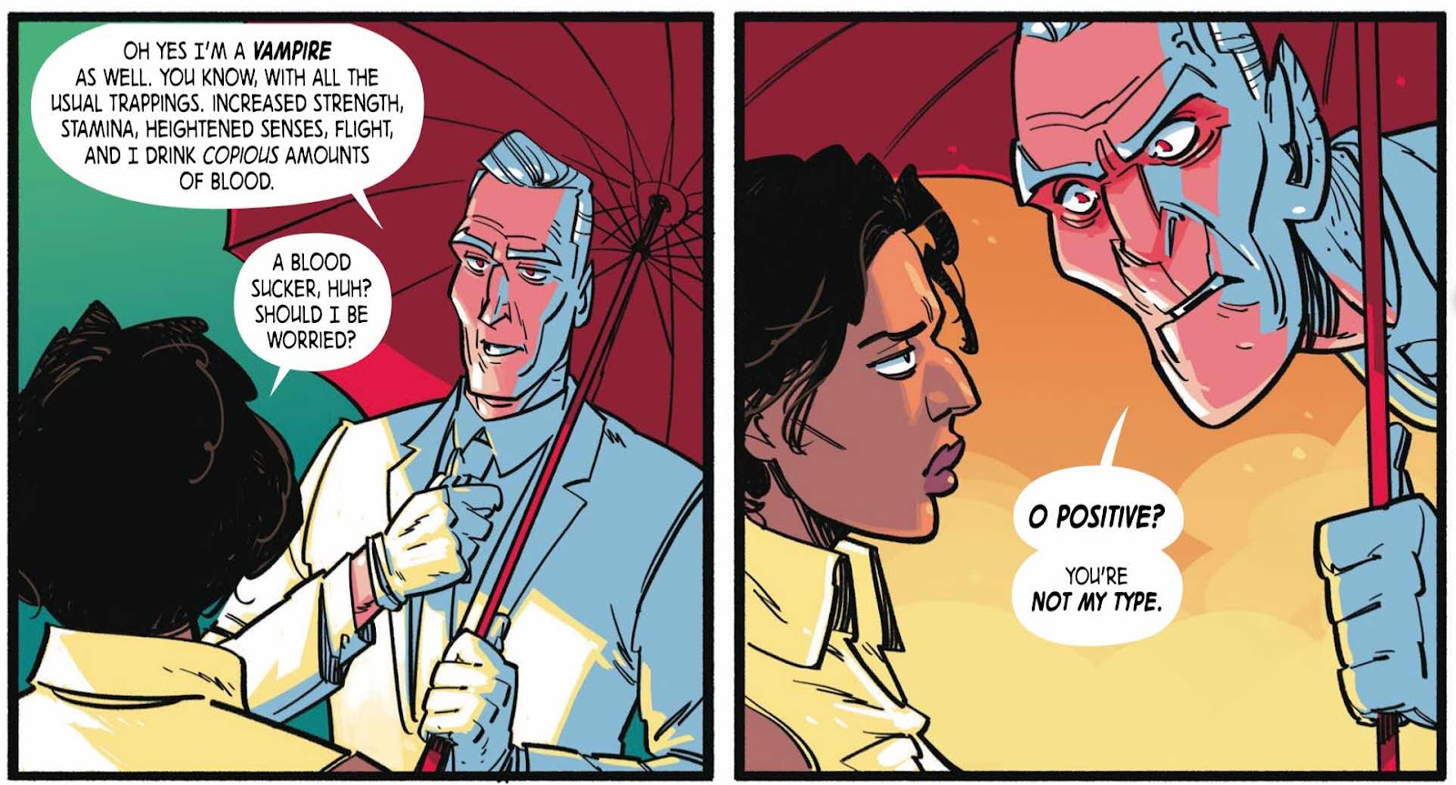
This takes place shortly after the formation of the aforementioned agency and just before Alton Allen (Zombie) meets up with Dr Bradford Peterson (Vampire) and Mathias Tillman (Werewolf).


The Review - This book sure came round quickly as it feels like I only backed in on Kickstarter about a month ago. (I just checked and it was funded on the 27th of Feb!) I’m a fan of Greg Hinkle’s art after seeing it in Airboy from Image Comics a few years ago. I’d also read and reviewed ‘Sucker’ written by Jason McNamara last May and really enjoyed what he had done with that story. (You can find the review of that here http://neverironanything.blogspot.com/2019/05/sucker-volume-1-living-after-midnight.html ).


The story opens with a mostly wordless sequence on a submarine that erupts into violence through a werewolf infestation and then heads off to a private island that is off the grid and then shows the arrival of Peterson and Tillman and the beginning of their ‘investigation’. The werewolf hippy and the pompous Vampire make a brilliant double act in this story and their interactions are the source of most of the funnies. Seems like they couldn’t detect their own backyard and go about their business to half attempt and half con their customer.


I have to say that this first issue was a blast from start to finish. It is however a series and you might find it ends a little abruptly and then heads off into a series of pin-ups/variant cover gallery. For my tastes it could have done with a ‘To Be Continued’ panel as I was caught a little off-guard. It’s probably fair to say that in this comic the story takes a back seat to the character work. This works really well as a narrative choice and you find yourself walking in the steps of these professionally incompetent but pretty deadly berks. You do feel a genuine affection for them that will have me coming back for the rest of the series.


Seriously, it’s rare that I laugh out loud when I am reading a comic but this one got me at least twice.


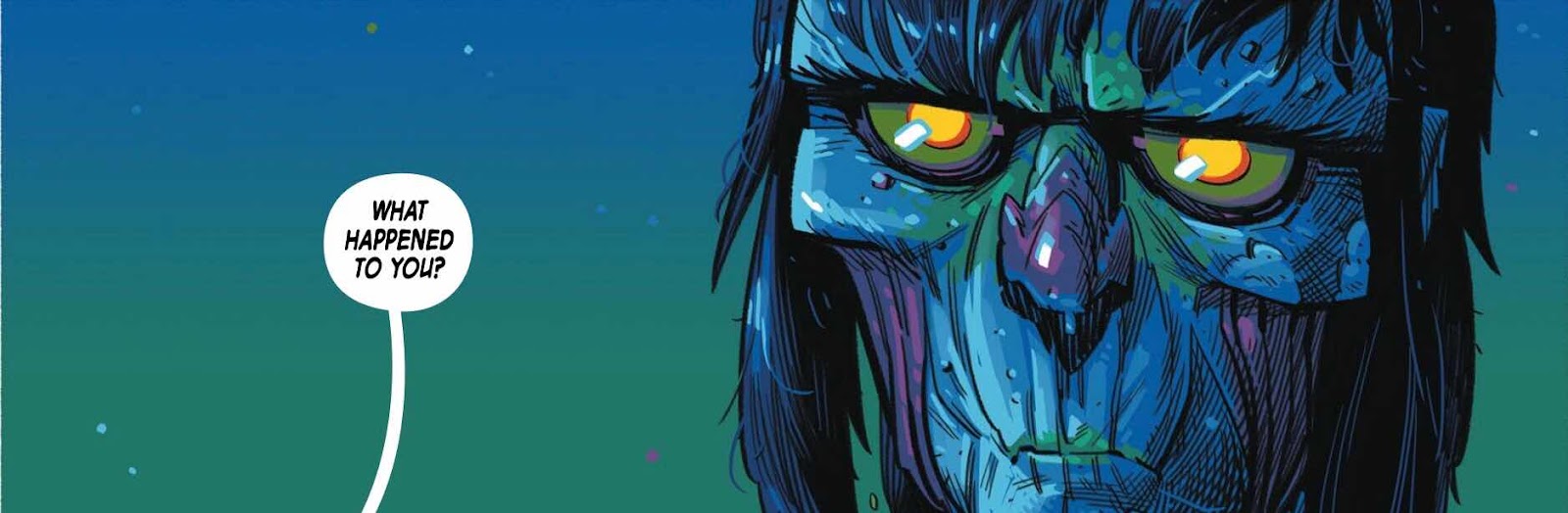
The art from Greg Hinkle is that class combination of cartooning and action. He makes everyone’s image lean just perfectly into their character and his designs, especially the transformed vampire, are cracking. The look and style of the art walks a clever line between Horror, Comedy and Action. There’s a freshness to the approach.


The colours (with flatting assist from Paul Little) are just excellently rendered in the nighttime scenes especially. There’s a gorgeous use of blacks, greys and blues in the moonlight with a strong splash of bright red Giallo homaged blood. The colour has an occasional limited palette depending on the story and setting. Keep an eye out for the flashback pages showing Alton Allen’s pre-Zombie punk band origin story - there’s a lovely use of vibrant yellow/green light in a creepy lab scene!


Highly recommended.


Jason McNamara (writer) previously co-created The Rattler graphic novel with Greg Hinkle. He is also the graphic novel author of The Cicada, SUCKER, The Crossing, Abandon, From Mars with Love, The Martian Confederacy, Short-Hand, Continuity, First Moon and Less Than Hero. He teaches comic book scriptwriting at the Pacific Northwest College of Art in Portland, Oregon. You can find him online at http://jason-mcnamara.com/ and on Twitter @JasonMcNamara

Keep an eye out for the next Kickstarter. Here’s a useful link https://www.kickstarter.com/projects/ramonesome/nocturnal-commissions-a-ghoulish-comic-book-adventure/creator_bio


Greg Hinkle (artist & letterer) Greg co-created The Rattler with Jason, and was the artist on AIRBOY and Black Cloud, both published by Image Comics. He lives in Los Angeles with his wife Shay and dog Penny.   You can find him on Twitter @greg_hinkle


Paul Little (color flats): His color work has appeared in titles from publishers including Image Comics, BOOM! Studios, Dark Horse, IDW, Joe Books, and more.  


Many thanks for reading.

Monday, 23 March 2020

In Review - ‘Starship Down’ issue 1 from Dark Horse Comics.


Starship Down - issue 1.

Written by Justin Giampaoli.
Art by Andrea Mutti.
Colours by Vladimir Popov.

22 pages - Full Colour - £3.99.
Published by Dark Horse Comics.

The Story - ‘Mankind discovers its startling origin! A cultural anthropologist consults with US Naval Intelligence to investigate the discovery of an extraterrestrial ship buried under the ice for thousands of years in Siberia. The meddling Russians, Vatican officials, the international media spotlight, and her own insecurities all threaten her efforts to keep the fabric of society from crumbling.’ 

(Spoiler Material at the end of this review).


The Review - This was an impulse buy for this bored self-isolating comics reading adult from the profoundly overpriced but have me by the balls ComiXology. £3.99?!?! Really? I based the impulse on a couple of factors. Firstly that Dark Horse rarely put a foot wrong in my opinions and two Andrea Mutti has the sort of well-crafted realistic style that I am drawn to over and over. I hadn’t heard from the writer before but after some Googling I have discovered that he is reasonably new to the profession of writing comics but does have some Small Press projects under his belt and has been writing for the Comic Bulletin for quite a while.

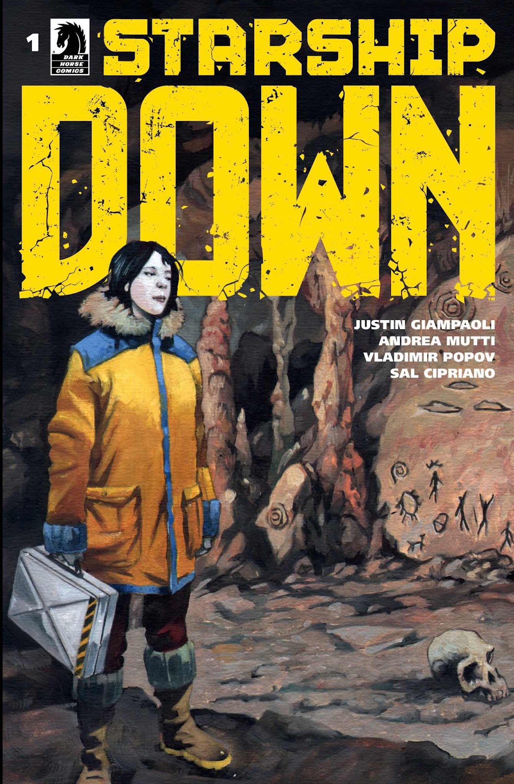
The cover is a little understated and shows the central character Dr Young standing in what appears to be an archeological dig with a skull on the floor at her feet. It’s a tiny bit misleading and doesn’t really hint at the science fiction elements strongly enough. (Although there is a hint of flying saucers on a wall cave painting). When I first looked at it I thought that Young may have been ‘turned’ or ‘the undead’ through the strange colouring?


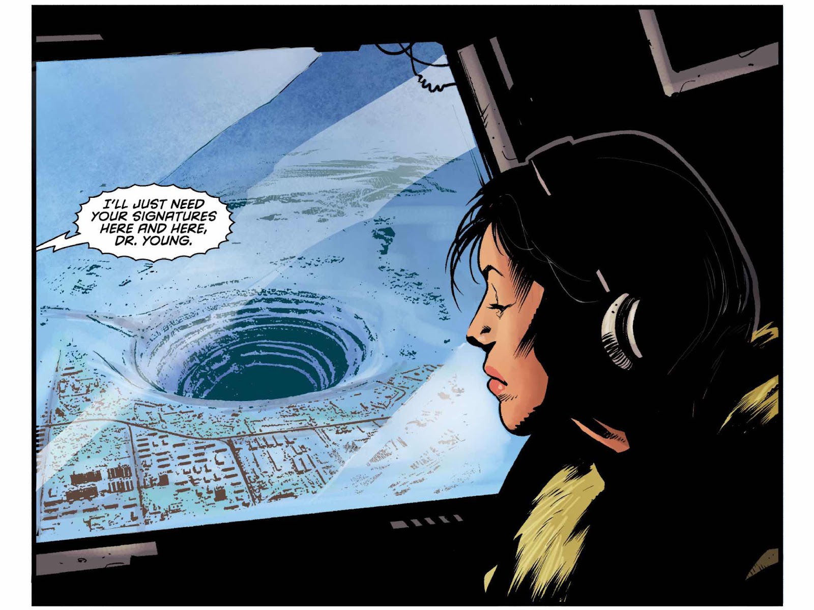
This comic actually opens like the first twenty pages of a BD album. Something like ‘Carthago’ or ‘Irons’. It spends a lot of time building the characters and setting the stage/s. It also tracks like the first twenty minutes of a disaster movie with impressive ariel views and some melodramatic conversational exposition. It must be said that if you are looking for a comic that is fast-paced or action packed this will most certainly not be your bag. In fact apart from the last couple of pages which could be classed as ‘action’ but in many ways are just ‘scene setting’ there’s not much that goes on in this comic apart from a lot of talking and a couple of impressive looking wide-shots.

That’s not to say that some of the dialogue can really intrigue the reader. I was ready to opt out and mark it up at four quid down the drain when we get the arrival of the Catholic Church. Cardinal Dominick Arns is outstanding and the perfect antagonist in the situation. Whilst outwardly pompous, rude and overbearing he also brings up the theme of Science v Religion but adds and extra element making it Science v Religion + Alien Spaceship.

You cultural anthropologists are the worst breed of scientists as far as the Vatican is concerned.’

And the rather creepily commented upon;

Yes, we know ALL your sins Commander.’

As I read I am trying not to second guess the story that will continue in future issues but I can’t help but hope that we get a bit of a ‘Chariot of the Gods’ vibe going further. It's the one thread of narrative that seems original in a rather predictable book.


SPOILERS!!!!

The spaceship design is a little bit obvious and uninspiring and looks a little like a squashed version of the USS Defiant.It could have done with something slightly more original.

SPOILERS!!!!!

When the scientific team finally get into the crashed spaceship they discover smashed stasis tubes that contain what they describe as ‘Neanderthals’ but in fact just look like Terry Jones in a wig from an old Monty Python episode.

I’ll be honest and say that I probably won’t stick with this as a monthly but may consider picking it up in trade if one is eventually forthcoming. It’s a little too slow paced for my tastes and the price of £3.99 for 22 pages is far too high.

Not posting any links on this review as I think it may be better for you to save the cash.

Many thanks for reading.

Sunday, 22 March 2020

In Review - 'The Last Arrival'


 ‘The Last Arrival’ issue 1.

Written by Daniel A Prim.
Art by Gergely J. Szabo and Szabrina Maharita.
Letters by Toben Racicot.

Published by Tripolar Comics.
(Previously – ‘Free Fantasy Comics’ as shown on the cover).
41 pages – Full Colour - £6.00.

Here’s what the comic tells us about itself on the old back cover blurb;

‘Planet C'adaei is in danger.
Five aliens flee their planet in a desperate attempt to find a new habitable home. Although Olak, Aome, Acrok, Rirke and U'on have conflicting ideas about the nature of their mission they have to come together to face an unexpected encounter.'

(Avoid the description of this comic on the Comichaus App as it contains big spoilers for the end of issue 1).

The Review – This is the first in a series and looking at the Tripolar Comics site I see that there is another issue released and available for sale. I found this to read on the Comichaus digital comics reading app. The cover has taken care to showcase the central characters on the cover but isn't making use of the deadspace around them. This could/should have a much more dramatic image to pull the eye in and get a reader to pick it up. The character images are also much too small to work out when browsing digitally.


I have to admit to finding the text/prologue/introduction page a nightmare to read, and to be honest I didn't bother in the end. The choice of background colours and text make it quite difficult. This is something however that could easily be fixed in future presentations of the comic. These days a designer always has to consider the possibility that their comic will be read on atablet with a back light.

From straight off the bat you can recognise that this is a well thought out and visually inventive story. The organic techno variety of the machines, spacecraft and living environments has some real old school sci-fi inventiveness. There is a relaxed style to the narrative that allows the reader to fully bed-in with the characters and their world/worlds before pushing back into the action adventure elements. The writing takes care to delineate a family feel to this story, not unlike Lost in Space but in a weirdly much more alien way. This has that exploration at all costs feel to it but added with some pre-Star Wars sixties/seventies science fiction that is wonderfully strange and a tiny bit disconcerting.

To add to the haunting quality of the atmosphere and story beats the writer makes some excellent use of wordless panels and pages. There are sequences that have some great pacing to them throughout issue 1.


As I’ve said above this is the first issue and there are a few teething problems on show. The colour is used in the character designs and is a little overplayed and lacks subtlety. We almost recognise people by the skin colour – green, blue, grey etc. This isn’t needed and a few more conversation centric close-ups would solve this problem. As aliens they can still have personality to their features. These colours are just far too strong. There is also a reveal at the end that kind of feels like the last two pages of issue one are in the wrong order. A reversal might cause less head scratching? 

There are six pin-ups in the back of the book that vary in quality and don’t really add anything to the story and are worth reconsidering as an added extra for future issues.

This is a book that shows some great promise and a genuine attempt to try something fresh. I will be looking out for issue 2 when it hits Comichaus.


You can find more about this series and the other books on offer at Tripolar Comics over at their website here https://www.tripolar.co.uk/about or follow them on Twitter here https://twitter.com/tripolarcomics

This is what the creators from Tripolar Comics had to say about themselves on their site;
‘We aim to make comics that are original, fun, creative and cerebral. We work in a wide variety of genres from gut-wrenching horror to fun kids adventures, hence the name TRIPOLAR COMICS. We are constant in changing.’


Many thanks for reading.

In Review - 'Female Force: Stormy Daniels'


Female Force: Stormy Daniels.

Written by Michael L. Frizell and Joe Paradise.
Forward by Stormy Daniels.
Art by Joe Paradise.
Edited by Stormy Daniels, Darren G. Davis and Michael L. Frizell.
Cover by Dave Ryan.

32 pages - £3.99 (ComiXology).
Expanded edition released 18/3/2020.
Published by Tidal Wave Productions.

This is what the publishers had to say about this book.

'Stormy Daniels, film star and director, rose from the strip clubs of Baton Rouge to the top of the lucrative adult film industry. She's also a savvy media mogul and entrepreneur, turning her brand into a worldwide phenomenon while empowering women to stand up for themselves and defy those that would marginalise them. Catapulted into the mainstream as the spicy centre of a hush-money scandal involving President Donald Trump. Stormy has weathered threats, lawsuits, and politically motivated arrests by steadfastly refusing to back down in her demand to hold the President responsible for his actions.'

The Review - What the above doesn't tell you is that there is a good comic trying to get free somewhere between the covers of this intentionally salacious and News of the World reader friendly summary.

Let's start at the beginning. Tidal Wave Productions are what we used to know as Bluewater Comics (and before that were Stormfront Publishing). They have always seemed to me to be the spiritual descendants of Rock and Roll Comics who came to legally injunctional prominence in the late eighties and early nineties. This is further emphasised to me as I discover that Tidal Wave had the publishing rights to some of Rock and Roll's output for a while before (allegedly) a legal disagreement. What people tend to forget is that this business venture started as a production studio at Image Comics in the early 2000s with such titles as The 10th Muse and The Legend of Isis. There was a long road after that involving some bankruptcy issues and they are now what you can easily find on ComiXology a line of unauthorised biographies.

Throw themselves into the biographical world with no hesitation can sum up their 'Hot at the Moment' publishing practises. They, like Rock and Roll Comics, have faced their fair share of legal humps in the road but they are still out there putting books out. There's a lot to choose from! Comics on such a disparate wavelength/s that you MUST be able to find something you'll like. Who wouldn't want a comic on Sarah Palin, Margaret Thatcher, Nick Jonas, Adele, Demi Lovato, Princess Di and so on. They've also published some titles that cry out to be read from my own point of view - 'Sinbad Goes to Mars', 'War of the Elementals', 'Logan's Run: Aftermath', 'Plan 9 from Outer Space Strikes Again', 'Leprechaun' and the utterly brilliantly names 'Dirk Benedict in the 25th Century'.

Listen, I'm not having a go at this company. Sure they could be said to have gone a little 'trashy' but there's space for that in comics isn't there? I personally kind of dig that side of the tracks. Some people can be so full of their own carefully plumped self-importance that a little bit of shameless sales sauce is all that is needed to bring them with a bump back to earth.


So onto Ms Stormy Daniels. This is a book that is thematically part of the 'Female Force' series of comics that have also featured such characters as Liza Minelli, J.K. Rowling, Carrie Fisher and Ayn Rand. It is also notable that Stormy (who used to go under the name Stephanie Gregory) is a participant in this production, unlike many of the other subjects presumably have been. The story is hers and tells all the events you would expect but also swerves in the road to avoid certain other perhaps more litigious moments. She is also the writer of the introduction and co-edits this short story.

There are a couple of covers and the overly photographic version you can see above is the one I bought but you can see an animation stylised cover 'B' I the extras section at the back of this issue.

As the slightly overblown ComiXology summary suggests we do find out about Stormy's life growing up and finding her way in to being a porn performer and latterly an award winning porn movie director. But it's the interactions with the current President of the United States that takes up most of the story unsurprisingly. These are told well and I find it an interestingly and well told tale. It's done with a combination of humour and satire that tells the reader much more than if it had been just a boring interview on NPR or a piece in The Times. 

The writing captures that now infamous repetition and intonation that President Trump spews similarly on my television now daily. The writing, in my cynical opinion, also catches a slightly too naïve to be believed reaction from Stormy when she is asked to perform a (mostly) unrevealed sexual act - C'mon! You must have guessed something slightly freaky was about to happen? He wears pyjamas to dinner!


I really enjoyed the art. It had that little touch of Don Martin and could have felt at home in an issue of Mad Magazine (Rest in Peace). It hits a great caricature vibe that adds to the satirical grotesquery of Trump and makes you feel a tiny bit sordid for reading/buying this issue. The black and white style works well but the comic section is far, far too short, especially for the whopping £3.99 that I paid for it. It feels a little rushed as in the latter pages you get some illustrated text pieces and a variety of pin-ups. This really does need to be half the price - but comics huh? What you gonna do?

I really did enjoy that small section of comics however and am now off to fully research Ms Stormy Daniels...…..


You can find out more about Tidal Wave Productions at their Twitter @TidalWaveProd

Or you can buy a copy (if you have significant savings) from this overly long link 


Many thanks for reading.

Honest Review Month - Starts Early.


Morning,

What with all this current fashion to stay indoors and avoid people I thought that it was the perfect time to start 'Honest Review Month 2020'.

For those that missed out on last year's cuddlefest here's the link to the ground rules and attitude I worked from in 2019 http://neverironanything.blogspot.com/2019/04/a-challenge.html

I won't be pulling any punches but also won't be going out to be horrible. A review should be critical of what it is reviewing - otherwise just give a copy to your grandparents so they can pat you on the head and tell you how 'brilliant' you have been.

So that I am being totally transparent I can tell you that reviews last year got between 300 and 1000 reads per post. I intend to do one a day from the 22nd of March 2020 and will be linking it twice a day on Twitter and once a day on Facebook. I got quite a few through last year and may not get round to all of them.

So if you have a book that you would like reviewed then send it my way. You can reach me on @Ezohyez over on Twitter or at email tony.awesomecomicspod@gmail.com

I look forward to hearing from you.

Many thanks for reading.

Friday, 20 March 2020

In Preview - 'Raze' by Claire Spiller.

Hi Folks. I've been on the missing for a few weeks as the day job has been over-taking my life and I've also been finishing up a few comics projects that you will soon be seeing. 

I decided to jump back into the reviewing with the below book from Good Comics. It's a doozy and one that jumpstarted a few ideas ticking in the brain box.

So, here you go.


'Raze'

Created by Claire Spiller.

36 pages - £5.00.
A combination of Black and White art with some added colour.
Published by Good Comics.
Released on April 4th, 2020.

This is how Good Comics describe the book;

'Reminiscent of the pastoral beauty of Hayao Miyazaki and the speculative genius of Ursula LeGuin, RAZE is a story of old gods, rewiliding, and the balance in the world between man and beast. Claire Spiller's artwork elegantly uses shining gold against a black and white landscape to remind us of man's destruction and pollution, and to muse on what might happen if the animals and old gods reclaimed the land from us.'

The Review - This is a book that delves into our world and what we are doing with and to it. It uses strangely savage yet beautiful iconography that pulls you in before presenting the reader with real-world consequences. It's quite a feat. In allowing the reader to bask in that reality, swaggering grace and immediate risk of the natural world we are brought back down with a bump when shown a mirror to our own behaviour that can put this environment at risk.

'Too lost in the brilliance of his own light...'

Using some gorgeously bizarre designs that are worthy of something by Jim Woodring we see Claire Spiller pull all the strings of reality in a little bit tighter. The reader initially watches the brutality of natural selection between creatures. God/Animals that have been carefully crafted through almost absurdistly cubist geometrical shapes and then she has added the lines/textures of real mammals. This adds an alternative nature theory to the narrative that allows the jolt of realism at the end to be even more defined and affecting. 

There is a reverence to nature here on show. We see it at once both fragile yet strong and proud. I get a feeling of prehistoric cave paintings in the hunt and death element to the images on show in moments. The arrival of man as the destroyer is dealt with brilliantly like a cross between aboriginal art and a Christian stained glass window. He appears and begins to destroy the old gods and tear up the forests with a nasty old testament plague of rage.


Halfway through the pages you will immediately notice the addition of colour. But not just an added colour because what this yellow signifies is the addition also of light and an almost quasi-religious feeling of angelic wrath. The stag in many cultures is used as a figurehead for the spiritual strength of nature. A proud yet enigmatic beast empowered and dangerous. Claire rears this native animal before our eyes and we watch as if goes from vulnerable fawn to war-like and vengeful stag. And she does so with some breathtaking art!

'....and turning it all into strength and a quiet fury.'

There is also a poignant poetry to this story both visually and in the narration. It is minimally written and never becomes pretentious. This is a comic that never preaches but does teach. It shows the merits of careful and respectful co-existence. There is some advice in the last page that is very worthy of note.

I have not seen the finished physical book and hope that this is formatted large and bold. It would seem a waste to have this as just another A5 indie comic? I would also make more use of the golden stag on the cover as the titles seem a tiny bit dominating. But this is a small criticism in a book that says so much and looks so elegantly brutal. 

Highly recommended.


Find more about this creator at https://www.clairespiller.co.uk/ You can also find her on Twitter @claireaspiller

Claire Spiller is a comics artist from the Bristol area of the UK. She is also part of the comics collective Wine & Zine. She has previously released 'Lost Light' that is a comic about light pollution and it's effects on wildlife.

You can find those comic making and publishing folks from Good Comics at their website and webstore right here https://www.goodcomics.co.uk/ and on their Twitter @Good_Comics

Many thanks for reading.